RPGTVW POPUP TESTING
The RPGTVW Pano2VR project is an interactive, cross-platform experience that allows users to explore multiple nodes and hotspots. Each node contains a set of interactive hotspots featuring galleries, videos, websites, information, and more. The project is designed to be compatible with a range of devices and operating systems, ensuring a seamless experience regardless of the user’s platform. The hotspots open both fixed and responsive popups, allowing users to access content quickly and easily.
I am looking for feedback and comments on this project as I continue to refine and improve the experience and I’m
currently testing on Mac OS, Windows 10, iPad Pro (12.9-inch)(4th generation), iPhone 11 Pro & 13 Pro (Simulator) and Google Pixel 5. I would be grateful for feedback and comments if you have the chance to give it a run on some of your devices. You can contact me via email at tony@tonyredhead.com.

Splash Screen with Start Button & Language Buttons
Update 16 July, 2023
360˚ Video Panoramas added to the renamed 360 & Linked Video section: Using the Video popup window a 360˚ Panoramic image is loaded into the interface. If selected a Fullscreen button can be displayed that opens the 360˚ panorama into a fullscreen view.
Currently compatible with: Safari, Chrome, Firefox and Edge on
Mac OS desktop: Safari, Chrome, Firefox and Edge
iPad Pro (2nd Gen): Safari, Chrome, Firefox and Edge
iPhone (11 Pro): Edge
Google Pixel (6): Chrome and Edge
To see more go to the 360 & Linked Video section
Update: 27th June, 2023
Audio Descriptions/Slides in Multiple Languages: If translations are available within the tour specific language audio versions will automatically play when that language is selected within the tour.
Audio Ducking: A Max and Min value can be used to set the volume of pinned sounds playing in the background. If Audio is enabled for a popup the background audio will change to the Min value for the duration of the audio. If a video popup is opened the background audio will change to the Min value regardless of wether or not audio is enabled.
Custom Images: can now be added to a Point Hotspot and various modifications applied to the custom image such as shape (square or round), border, round corners, and shadow.
Update 22 Mar 2023: Based on some client feedback I’ve made a number of changes to the existing test tour as well as adding in some new functionality.
Galleries can now contain up to 15 slides and can show both normal and alternative versions of the image.
Show Large Image: any slide can be assigned “Show Large Image”. When activated a mouse over the image in the Gallery will show the title “Click to View Fullscreen”. Clicking opens the image into a fullscreen window with scrollbars if the image exceeds the browser borders. Clicking on the fullscreen image closes it.
Mouse Over “Click to View Fullscreen”
Fullscreen image with scrollbars
Audio Descriptions: an .mp3 audio file can be added in addition to the text description. When active a small icon of a speaker will appear next to the Close button. Clicking on the icon will start the audio playing. See the Audio section for examples.
Audio for Slides: individual .mp3 audio files can be added to a slide in addition to the text description and image. When active a small icon of a speaker will appear next to the Close button. Clicking on the icon will start the audio for that slide playing. The audio will automatically play as the slideshow progresses unless it is turned off. See the Audio section for examples.
Audio Overlay: when applied this allows audio to play over the active video without pausing it. Useful for a video that doesn’t have any audio of its own. See the Audio 02 example.
Responsive Info Popups: info popups will now change size depending upon the amount of information entered. At the moment the width is 30vw and the minimum height is 30vw*0.5 and the maximum size is 50vw*0.5. See the Info & Web or Audio section for examples.
Update 28 Feb 2023: I’ve spent a bit of time trying to document this beast so I can target where to do modifications such as increase the number of slides per gallery. In V2 there were 5 slides per gallery, in the new version uploaded today you can have 10. There are so many touch points to make the change documenting it was vital. I also had to develop a workflow whereby logic blocks containing up to 70 expression created a real bottleneck when adding new expressions.
You can find the latest testing tour online at https://expedition.photography/demov1
Navigating the Test Tour
The Nodes
The tour consists of 8 nodes, Square, Responsive, Landscape, Portrait, Video, Info & Web, Audio and Custom Image
Note: click on any image to enlarge it
Square
Landscape
360 & Linked Video
Audio
Responsive
Portrait
Info & Web
Custom Images
Popup Modifiers
In RPGTVW there are a number of ways you can globally modify the look of the popup but the basic modifiers are Shadow, Round Corners and Outline.
In the Gallery examples (Square, Responsive, Landscape and Portrait) node the vertical rows of Point Hotspots show the modifications starting with Plain at Row 1. As you progress down the rows the modifications are cumulative.
1 = plain popup without any modification
2 = + shadow
3 = + shadow + corners
4 = + shadow + corners + border

Plain

+ Shadow + Corners

+ Shadow

+ Shadow + Corners + Border
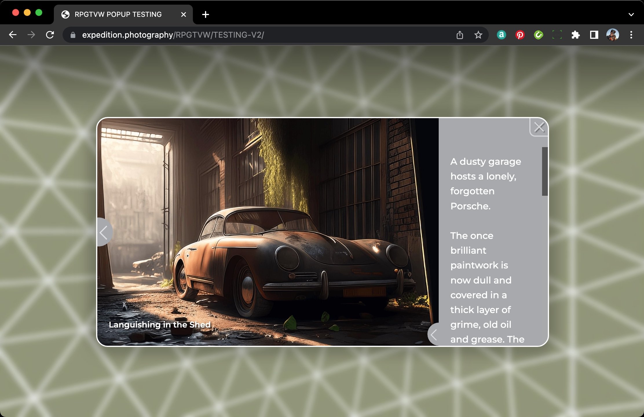
In RPGTVW there are a number of attributes you can assign to each hotspot type they include fixed or responsive response to browser resize. You can have single slide, multiple slides, slides with unique captions, descriptions with large or small holders and large popup images.
In the Responsive Gallery examples below, with the browser in a Landscape orientation, the horizontal rows of the Point Hotspots show the modifications starting with Single Image + Slide Title as you across the rows the attributes are as follows
A = Single Image + Slide Title
B = Multiple Images + Slide Titles
C = Multiple Images + Headline + Slide Titles
D = Multiple Images + Headline + Slide Titles + Small Gallery Description
E = Multiple Images + Headline + Slide Titles + Large Gallery Description
F = Multiple Images + Slide Titles + Small Gallery Description
G = Multiple Images + Slide Titles + Large Gallery Individual Slide Descriptions
Note: because these popups are responsive the Gallery Description in landscape orientation is fixed to the right hand side of the popup. In the examples D, E, F and G the description area looks the same even though they are defined as small and large. If the browser size is <1 or Portrait orientation then the responsive portrait versions will show the different sizes.

If we look at the example of each hotspot in line 4 we can see the attributes assigned to them. The samples below show the result of Row 4 Point Hotspots which have the modifications: Shadow, Round Corners and Border
Row 4 - Column 1A: Single Image + Slide Title
Row 4 - Column C: Multiple Images + Headline + Slide Titles
Row 4 - Column E: Multiple Images + Headline + Slide Titles + Large Gallery Description
Row 4 - Column G: Multiple Images + Slide Titles + Large Gallery Individual Slide Descriptions

Row 4 - Column B: Multiple Images + Slide Titles
Row 4 - Column D: Multiple Images + Headline + Slide Titles + Small Gallery Description
Row 4 - Column F: Multiple Images + Slide Titles + Small Gallery Description
Additional Attributes
The Row 4 Column F & G examples have a '‘Click to View Fullscreen” option shown when you mouse over the image.
Click to View Fullscreen
Fullscreen View
Clicking in the Description field will open it and fill the popup, clicking again will close it.
Closed individual slide description

Open individual slide description
The examples in Column G display Individual Slide Descriptions
Slide #3 showing individual description
Slide #4 showing individual description
Changing the language to Italian is reflected in the Individual Slide Descriptions and the Slide Titles
Desktop viewing, change of Aspect
On desktop a change of orientation changes the aspect of the Gallery popup. An additional feature is the ability to show an alternate image when the responsive gallery popup is in portrait mode. This is Line 4 in portrait mode.
Row 4 - Column A: Single Image + Slide Title
Row 4 - Column D: Multiple Images + Headline + Slide Titles + Small Gallery Description
Row 4 - Column G: Multiple Images + Slide Titles + Large Gallery Individual Slide Descriptions
Row 4 - Column B: Multiple Images + Slide Titles
Row 4 - Column E: Multiple Images + Headline + Slide Titles + Large Gallery Description
Row 4 - Column C: Multiple Images + Headline + Slide Titles
Row 4 - Column F: Multiple images + Slide Titles + Small Gallery Description
Additional Attributes
The Row 4 Column F & G examples have a '‘Click to View Fullscreen” option shown when you mouse over the image.
The examples in Column G display Individual Slide Descriptions and changing the language to Italian is reflected in the Individual Slide Descriptions and the Slide Titles
360 & Linked Video
Video works in a similar way to the fixed responsive popups but has a fixed video player size of 16:9 and has 4 variations made available via two Point Hotspots (360 & Linked); 360 Panoramas, Local file, YouTube and Vimeo. In the Video examples node the vertical rows of Point Hotspots show the modifications starting with Plain at Row 1. As you progress down the rows the modifications are cumulative.
1 = plain popup without any modification
2 = + shadow
3 = + shadow + corners
4 = + shadow + corners + border
5 = 360 Panorama + corners + border
Plain
+ Shadow + Corners
+ Shadow
+ Shadow + Corners + Border
In the Video examples below the horizontal rows of the Point Hotspots show the modifications starting with Single Image + Slide Title as you across the rows the attributes are as follows
A = Local File
B = Local File + Large Description
C = YouTube Video + Small Description
D = YouTube Video + Header
E = Vimeo Video + Header + Large Description
F = Vimeo Video + Header + Small Description
G = 360 Panorama + Header + Large Description + Language Button + Fullscreen Button
If we look at the example of each hotspot in line 4 we can see the attributes assigned to them. The samples below show the result of Row 4 Point Hotspots which have the modifications: Shadow, Round Corners and Border
If we look at the example of each hotspot in line 4 we can see the attributes assigned to them
Row 4 - Column A: Local File
Row 4 - Column C:: YouTube + Small Description
Row 4 - Column E: Vimeo + Headline + Small Description

Row 5 - Column G: 360 Panorama + Headline + Large Description + Language button + Fullscreen Button
Row 4 - Column B: Local File + Large Description
3Row 4 - Column D: YouTube + Headline
Row 4 - Column F: Vimeo + Headline + Large Description

Row 5 - Column G: 360 Panorama (in Fullscreen) + Video Controls + Exit Fullscreen Button
Info & Web
Info popup is a variation on the Square configuration but without any images assigned to it only text. Web popups have the option to open in the tour or in a new tab on the Desktop. On mobile devices they only open in new tabs.
In the Info/Web examples (Info and Web) nodes the vertical rows of Point Hotspots show the modifications starting with Plain at Row 1. As you progress down the rows the modifications are cumulative.
1 = plain popup without any modification
2 = + shadow
3 = + shadow + corners
4 = + shadow + corners + border
Plain
+ Shadow + Corners
+ Shadow
+ Shadow + Corners + Border
In the Info/Web examples below the horizontal rows of the Point Hotspots show the modifications starting with Single Image + Slide Title as you across the rows the attributes are as follows
A = Short Message
B = Long Message
C = Web URL
D = Web URL + Header

If we look at the example of each hotspot in line 4 we can see the attributes assigned to them
Row 4 - Column A: Short Message
Row 4 - Column C: Web URL
Row 4 - Column B: Long Message
Row 4 - Column D: Web URL + Headline
Audio
The following Video, Gallery, Info and Web popups have Audio Enabled set to true in the Custom Properties. This shows the small Audio play button next to the Close button in the top right corner of the popup.
If video is playing and the audio button is clicked the video pauses until the audio finishes or is finished by clicking on the button
If a video isn’t playing and the audio is played the video will start playing when the audio finishes or is finished by clicking on the button
If the video has no sound and the Custom Property “Audio Overplay” is selected the video will continue to play and the audio will continue until the audio finishes or is finished by clicking on the button.
If the video has “Show Slide Descriptions” set to = false, then the audio file defined in the Custom Property “Audio Description” will play across single or multiple gallery images.
If the video has “Show Slide Descriptions” set to = true, then the audio files defined in the Custom Property “Audio File #1 - #15” will play. Note: you can pause the video, advance the slides, and then resume the audio from the current slide.
If the hotspot is Info or Web then then the audio file defined in the Custom Property “Audio Description” will play.
In the Audio examples below the horizontal rows of the Point Hotspots show the modifications as you proceed across the rows the attributes are as follows
A = Silent Movie + Audio Overplay
B = Local File + Audio
C = Vimeo File + Audio
D = Vimeo File + Audio
E = Gallery (Portrait) Single Image + Audio
F = Gallery (Portrait) Multiple Images + Audio Overplay
G = Gallery (Portrait) Multiple Images + Individual Audio per slide + Auto Play
H = Info (Small) + Audio
I = Info (Large) + Audio
J = Web + Headline + Audio

A: Local File (Silent Movie) + Audio Overplay
B: Local File Video + Audio
C: Vimeo Video + Audio
E: Gallery - Single Image + Audio
G: Gallery - Multiple Images + Individual Audio + Auto Play
I: Small Info + Audio
K: Web URL + Audio
D: YouTube Video + Audio
F: Gallery - Multiple Images + Audio Overplay
H. Gallery - Multiple Images + Headline + Description + Individual Audio + Auto Play
J: Large Info + Audio
Custom Images
Aside from the standard icons within the skin; gallery, video, info and web other icons can be embedded into the skin. Alternatively, custom icons can be added to any Point Hotspot.
In the Custom Images examples below the Point Hotspots show the modification that can be applied to a single image. In this case the original image was the one in column A.
A = Square .png + icon shape = square + shadow
B = square.png + icon shape = round + icon border + shadow
C = square.png + icon shape = square + icon round corners + shadow
D = square.png + icon shape = square + icon round corners + icon border + shadow
In turn the Point Hotspots open the following Popups
A = Gallery + square + single slide + slide title + shadow
C = Gallery + square + multiple slides + slide title + slide title shadow + shadow + round corners
B = Gallery + square + single slide + slide title + shadow + border
D = Gallery + square + multiple slides + slide title + slide title shadow + shadow + border + round corners
EDIT SKIN CONFIGURATION - COLORS
If you have any questions or comments please send them to me at tony@tonyredhead.com