Responsive Panorama Slide Reveal
The Responsive Panorama Slide Reveal is a 'Before and After' application, developed in Pano2VR, designed to show 360˚ panoramic equirectangular and still images while working seamlessly across all devices.
The Slide Reveal comes in two flavours; Constrained and Hybrid.
Constrained reveals have a fixed orientation for the slider element regardless of the browser orientation. A vertical slider will always move from left and right, while a horizontal slider will always move from bottom to top and vice versa.
Hybrid reveals are responsive and the orientation of the slider element changes with the browser orientation. When the browser is in portrait orientation the slider will be horizontal, while in landscape orientation the slider will be vertical.
In this tutorial, we’ll will;
1. Build a basic Constrained and Hybrid reveal using placeholder 360˚ panoramas.
2. Build a Hybrid reveal using before and after 360˚ panoramas shot at Mingun Bell in Myanmar.
3. Finish with a Hybrid reveal using still images of faces generated by AI in Midjourney.
Note: For this example I’ve used a panorama I shot in Mingun near Mandalay in Myanmar. This is a very famous location with a huge 90 ton bell, the world’s largest ringing bell until 2020. Because it is a well-known location, it can be very crowded and to achieve the final result with only our guide Mann at the bell I photographed a number of different angles as people moved around. Then I replace areas with people with clean patches from the different photographs. Any images in the tutorial are copyright Tony Redhead and are not to be used in any other project.
Project Overview
In this tutorial we will be following these steps;
Step 1: The Finished Slide Reveal ⇑
The Slider Reveal embedded below is the result you will create at the end of Step 4.
In this reveal we have the following:
2 labels with the titles Before and After
3 buttons; zoom in, zoom out and reset
Central Slider Reveal: manages the view between the two panoramas
Note: In addition to the zoom buttons you can zoom in and out using the mouse scroll wheel, pan by clicking and dragging with the mouse or if you are on a touch device by using “pinch” or “swipe”
New Feature: Support for Flat Images: Multi-Format Asset Support: Beyond immersive 360° environments, the engine fully supports 'Flat' image assets. This versatility allows you to use the same professional slider tool for standard architectural photography, side-by-side renders, or traditional 'before and after' photo comparisons.
State-Aware XML Swapping: The "Swap" feature (double arrow button) doesn't just flip the images; it intelligently re-labels the UI. When you swap the "Before" and "After" panoramas, the labels update dynamically to reflect the new state, preventing user confusion.
Fixed Sliders: A new .ggt file, .js file and .css file gives us a checkbox in the HTML Template Properties panel to choose between fixed horizontal and fixed vertical. See the samples below:
I will be updating the tutorial to include instructions on building “stills”
Step 2: Tutorial Folder ⇑
The tutorial folder contains all the required files to complete the tutorial. (figure #1)
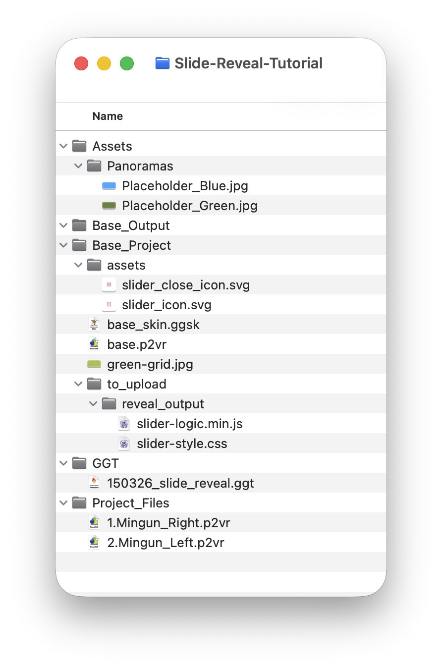
Figure #1: Tutorial folder
From the top we have the following folders and content:
Assets > Panoramas: 2 x Placeholder panoramas that you can replace with your own panoramas
Base Output: this is our final output folder that will contain the virtual tour and the interface that displays the Slide Reveal.
Base Project > Pano2VR project files base.p2vr, base_skin.ggsk and green-grid.jpg.
Base Project > assets > the icons used for the show/hide reveal button.
Base Project > to_upload > reveal_output > this folder will hold the combined output from the two reveal p2vr projects. It currently contains the slider-logic.min.js and slider-style.css files (do not delete these files)
GGT > this folder contains a custom .ggt template file, 150326_slide_reveal.ggt, that provides links to the code to manage the Slide Reveal output
Project_Files > these are the two p2vr project files that create the Right and Left project files.
Note: Access to the Tutorial Folder is available after the Tutorial has been purchased. See the Summary for details.
Step 3: Setting up the custom .ggt file ⇑
Note: the first step is to locate the folder where your .ggt files are stored.
MacOS
1. Open the Base_Project > base.p2vr file
2. In the top menu select Pano2VR > Preferences
3. Click on the “Files” tab
Note: you are looking for the section “HTML Template Directory” in there you will find a long list of locations. (figure #2)
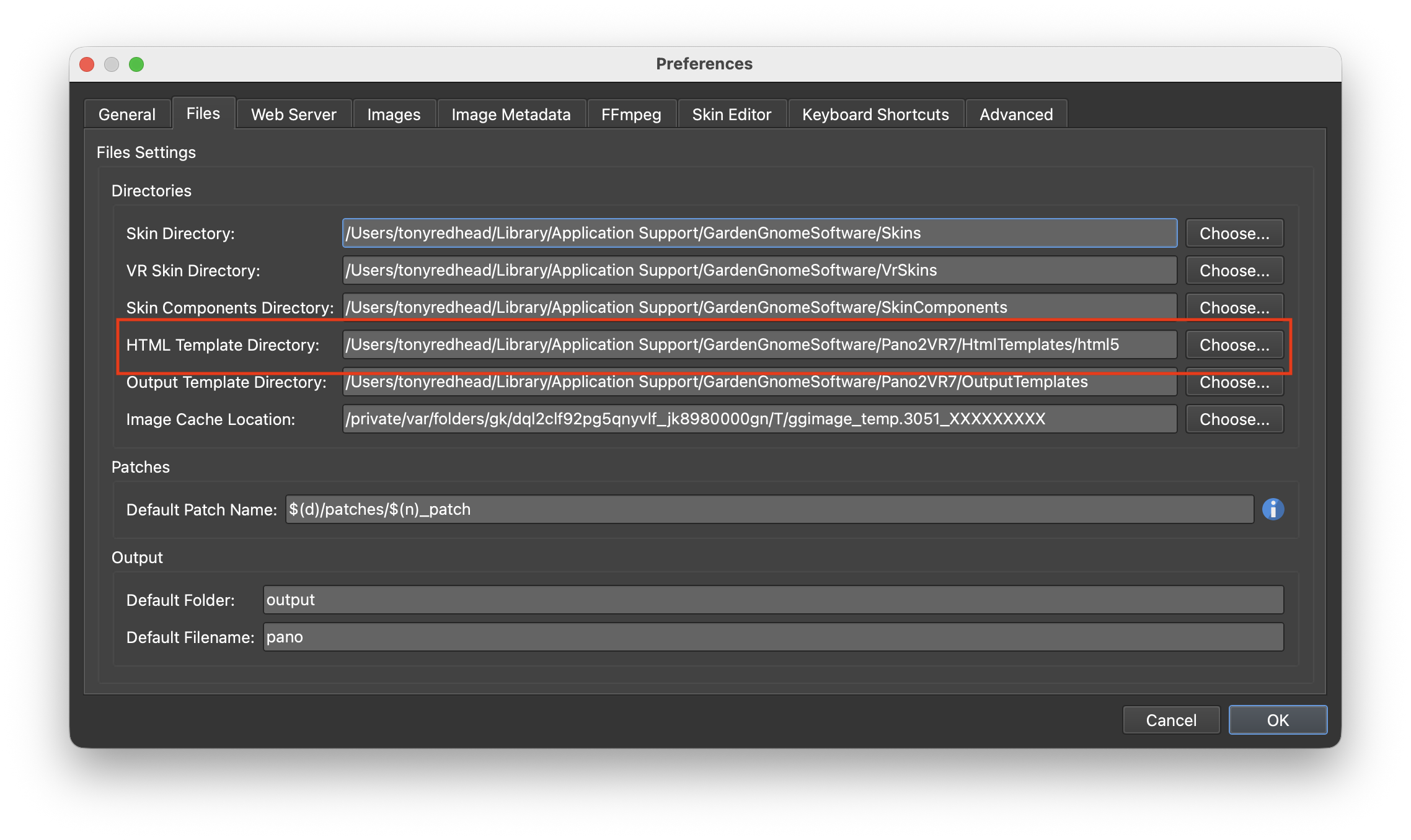
Figure #2: HTML Template Directory
4. Copy the location string
5. In the top menu, select Go > Go to Folder
6. Paste the location string into the data field and select return to open the html5 folder
7. Copy the 150326_slide_reveal.ggt into the html5 folder and close the folder (figures 3 & 4)
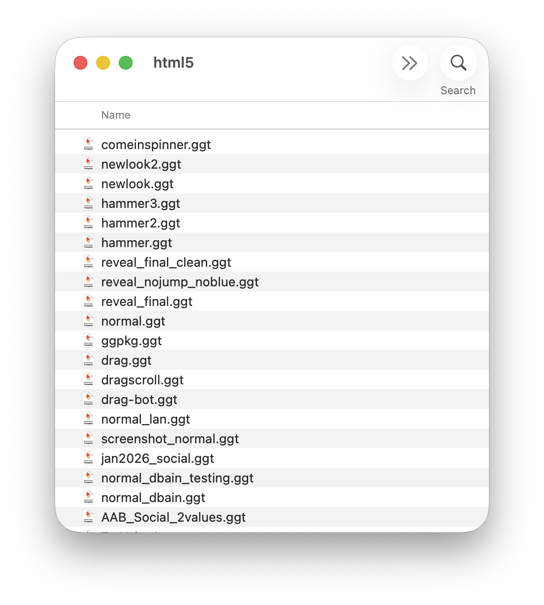
Figure #3: html5 folder
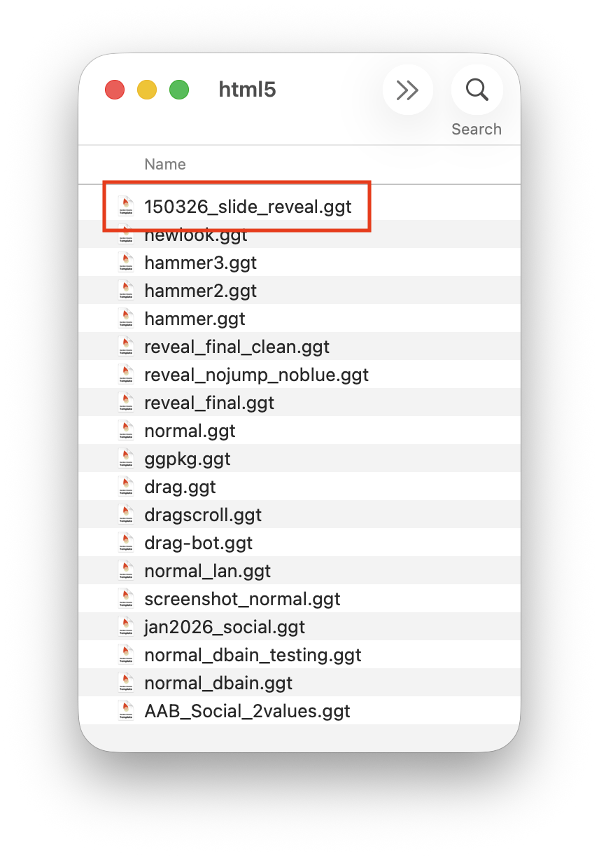
Figure #4: html5 folder with new .ggt file
8. Close the base.p2vr if it’s open
9. Open the Project_Files > 2.Mingun_Left.p2vr
10. In the Properties - Web Output open the HTML section and click on the Template dropdown.
11. From the menu select 150326_slide_reveal.ggt (figure #5 & 6)
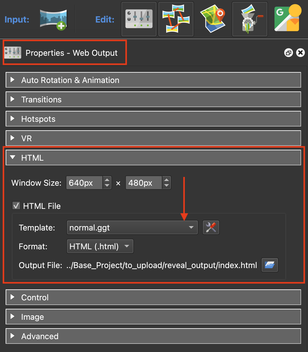
Figure #5: Template dropdown
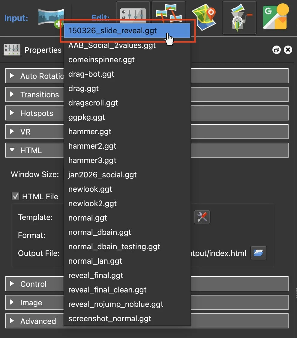
Figure #6: Select 150326_slide_reveal.ggt
12. Save the Project
PC Version
1. Open the Base_Project > base.p2vr file
3. Click on the “Files” tab
Note: you are looking for the section “HTML Template Directory” in there you will find a long list of locations. (figure #7)
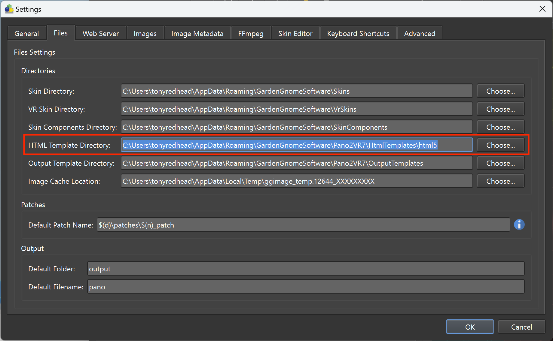
Figure #7: HTML Template Directory
4. Copy the location string
5. In the menu, click on the File Explorer folder
Note: make sure you have View > Show > Hidden Items checked
6. Paste the location string into the data field and select return to open the html5 folder
7. Copy the 150326_split_screen_final.ggt into the html5 folder and close the folder (figure #8)
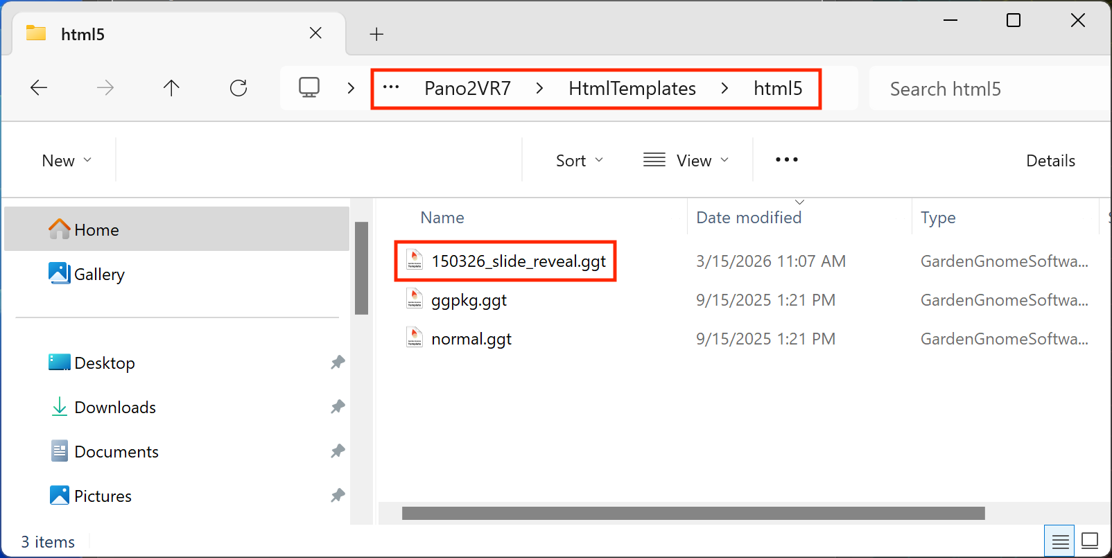
Figure #8: HTML5 folder
8. Continue by following steps 8 - 12 from the Mac instructions
Step 4: Create the Slide Reveal ⇑
To create the Slide Reveal we have to publish two pano2vr projects using the projects: 1.Mingun_Right.p2vr and 2.Mingun_Left.p2vr. Both projects create .xml and Tile folders with unique names right and left but it is important they are executed in the correct order #1 first and #2 second. It’s done in this order because #2 will contain the coding that enables the reveal and overwrites any code created when #1 is published.
We will be outputting to the Base_Project > to_upload > reveal_output folder. We are using this folder because it has already been added to the base.p2vr project for automated uploading when the base.p2vr project is published.
Note: in this tutorial all of the p2vr projects have been pre-configured with the exception of the addition of the 150326_split_screen_final.ggt file for 2.Mingun_Left.p2vr.
1. Open the 1.Mingun_Right.p2vr project (figure #9)
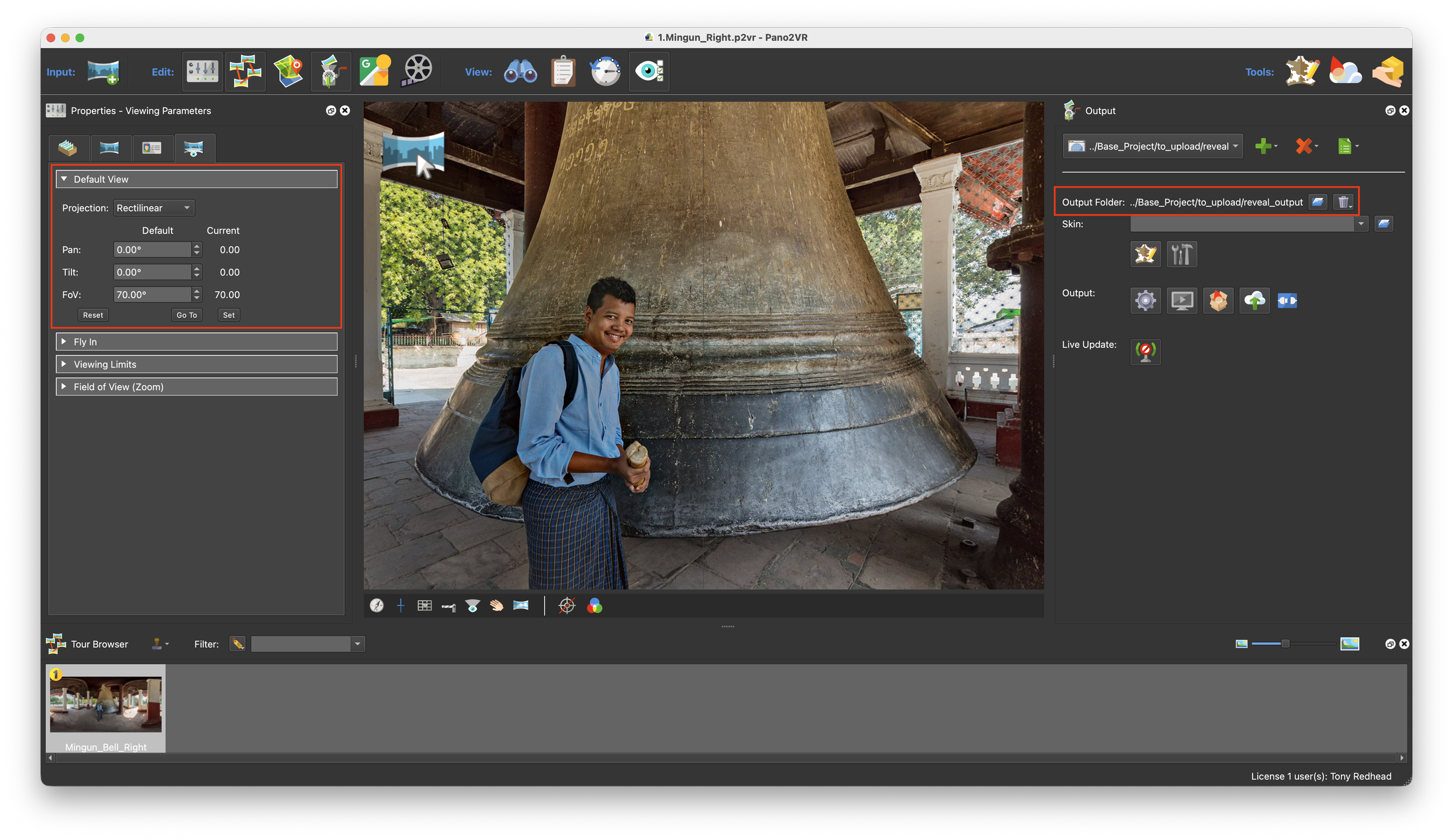
Figure #9: 1.Mingun_Right.p2vr project window
In the image above, we can see that the Default View is set at Pan: 0˚, Tilt: 0˚ and FoV: 70˚ and the output folder is set to ../Base_Project > to_upload > reveal_output (figures #10 & #11)
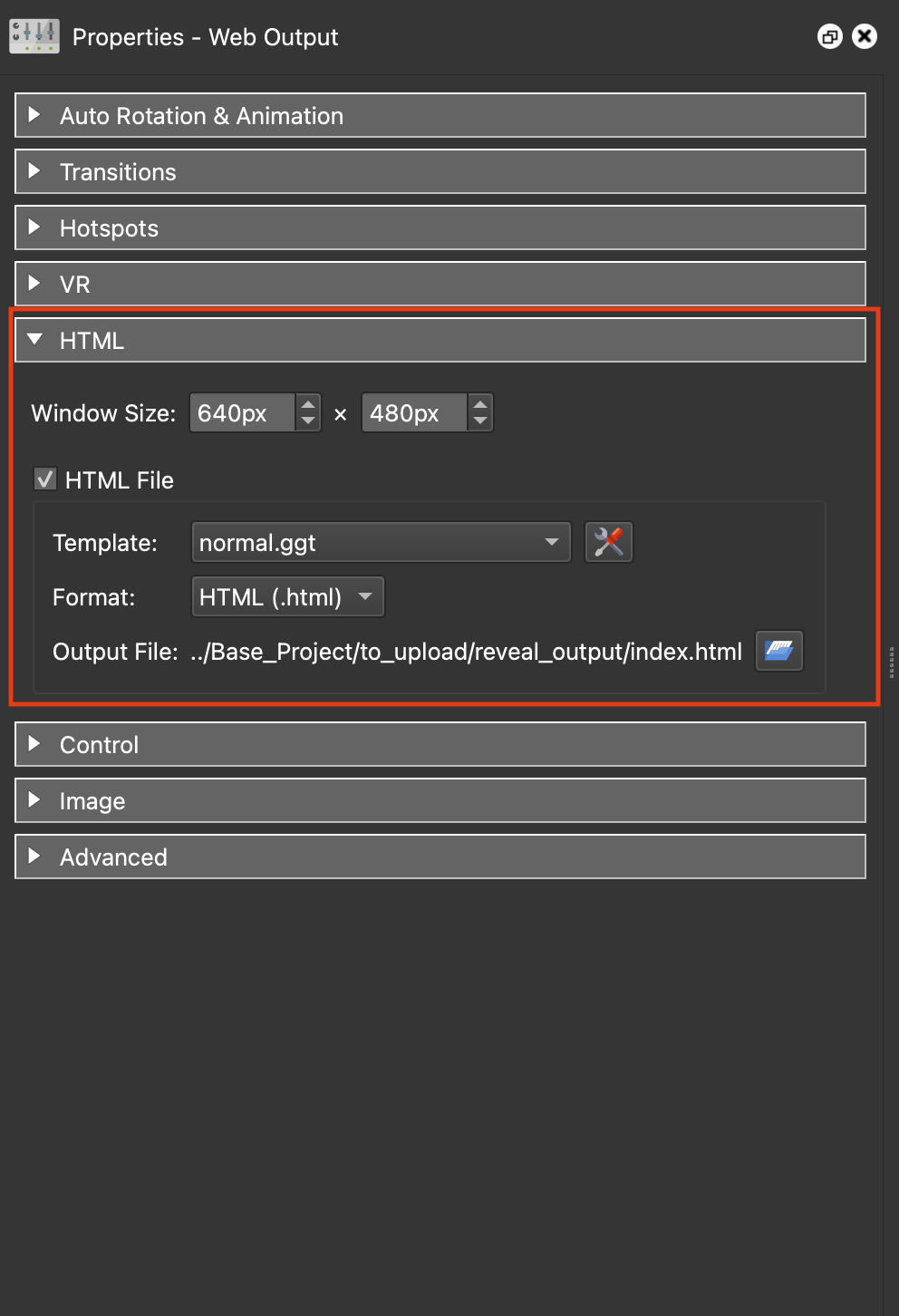
Figure #10:
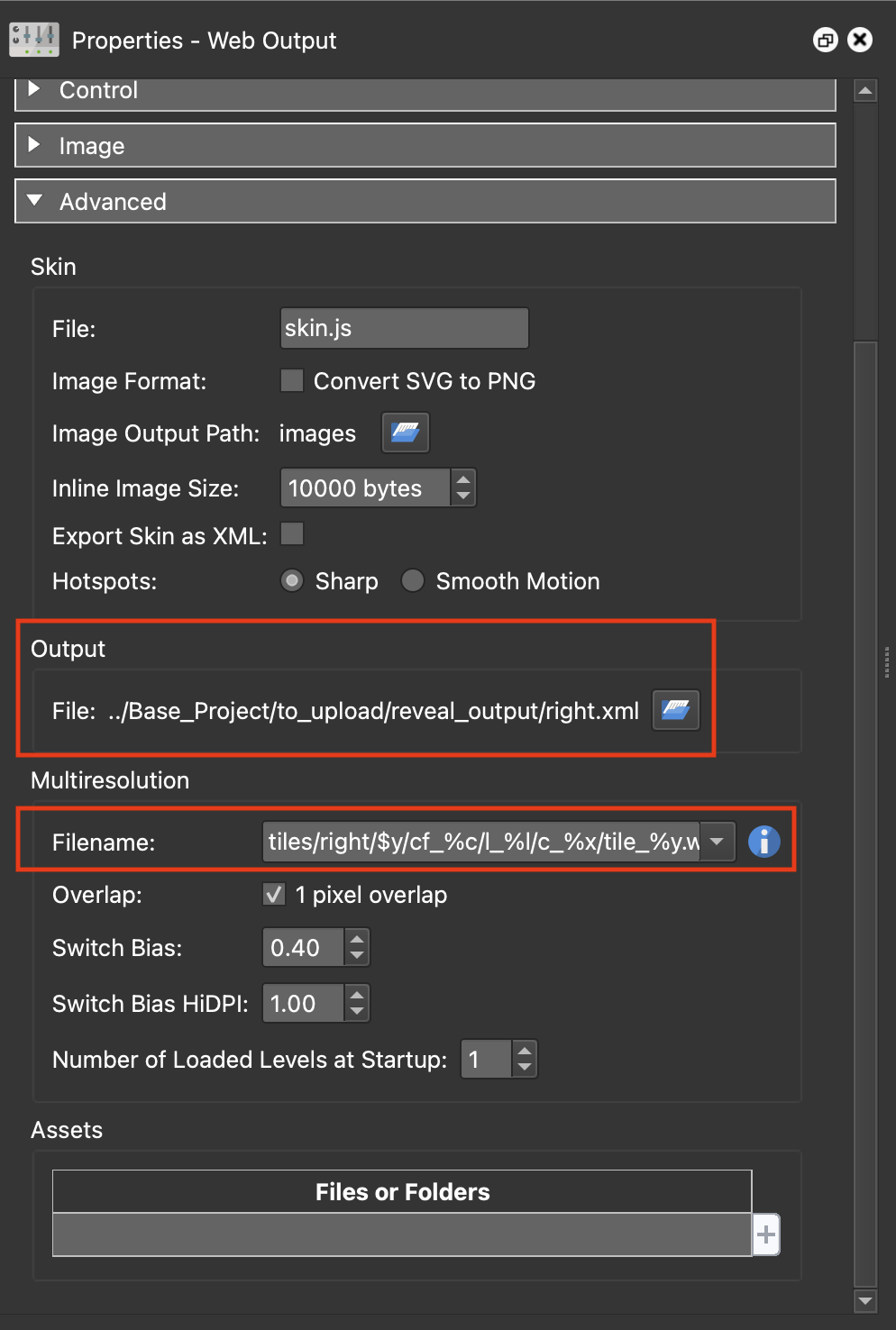
Figure #11:
In the image above left we can see that the HTML Template is the default normal.ggt and the Output index.html file is being saved into the reveal_output folder.
In the image above right we can see that the Output XML is named right.xml and is being saved into the reveal_output folder. We can also see that the Multiresolution tiles are being saved into the tiles/right folder.
Note: it is very important that these values are not modified.
2. Publish the project and close the project
The result should look the same as the sample below. This is the “After” version.
3. Open the 2.Mingun_Left.p2vr project (figure #12)
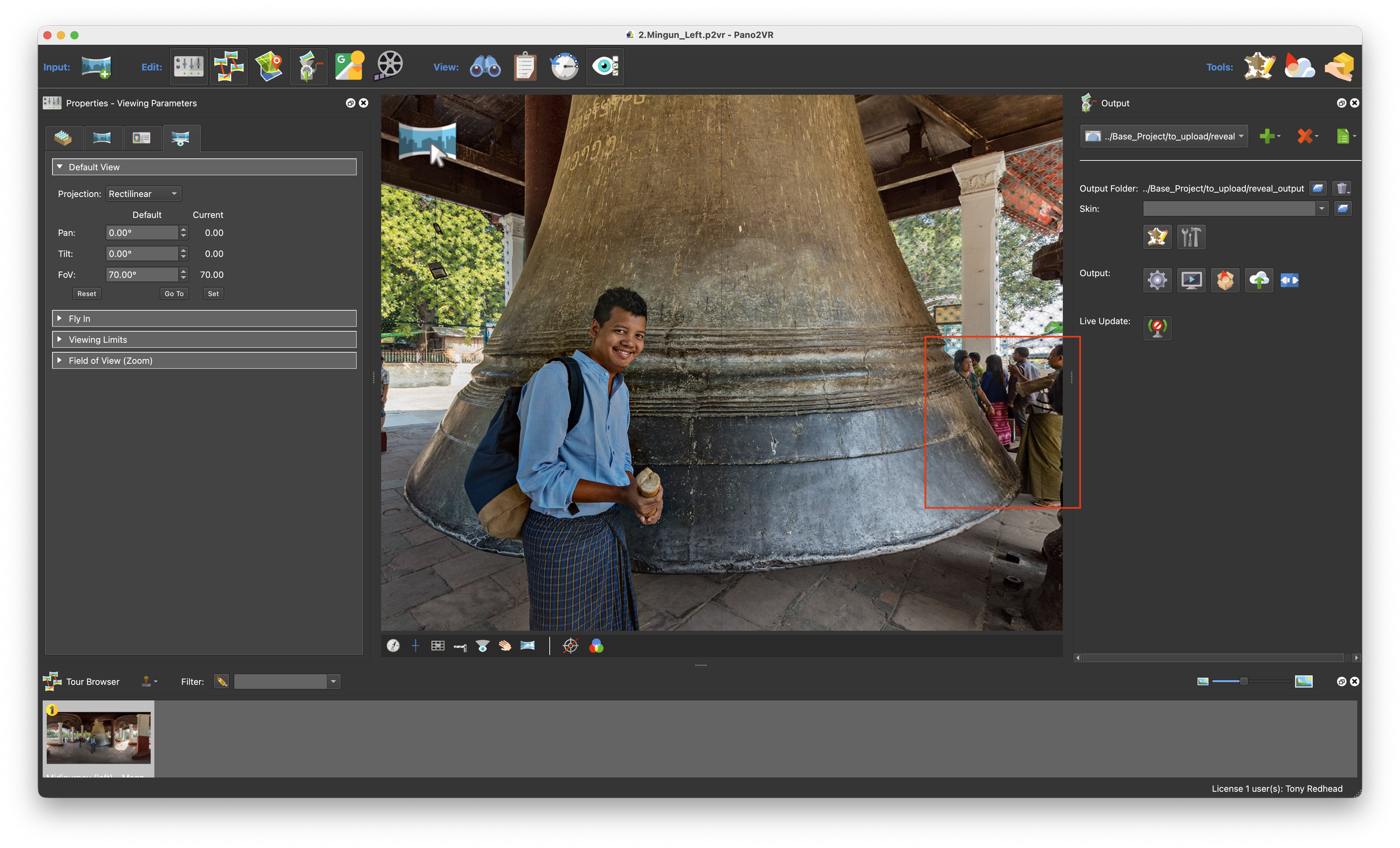
Figure #12: 2.Mingun_Left.p2vr project window
This looks very much like the 1.Mingun_Right.p2vr with the exception that we can see a group of people behind the bell. The output folder location and Default view are the same as the first 1.Mingun_Right.p2vr.
4. Open the HTML section and click on the template dropdown menu (figure #13)
5. From the list of templates select the 150326_split_screen_final.ggt (figure #14)
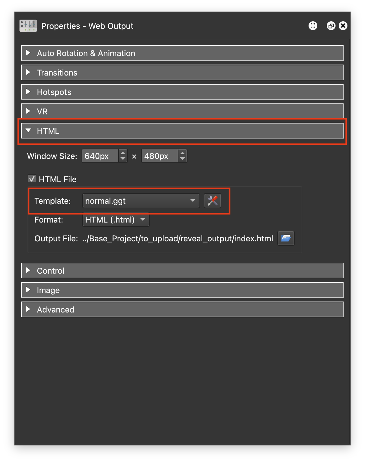
Figure #13: HTML panel and template dropdown menu
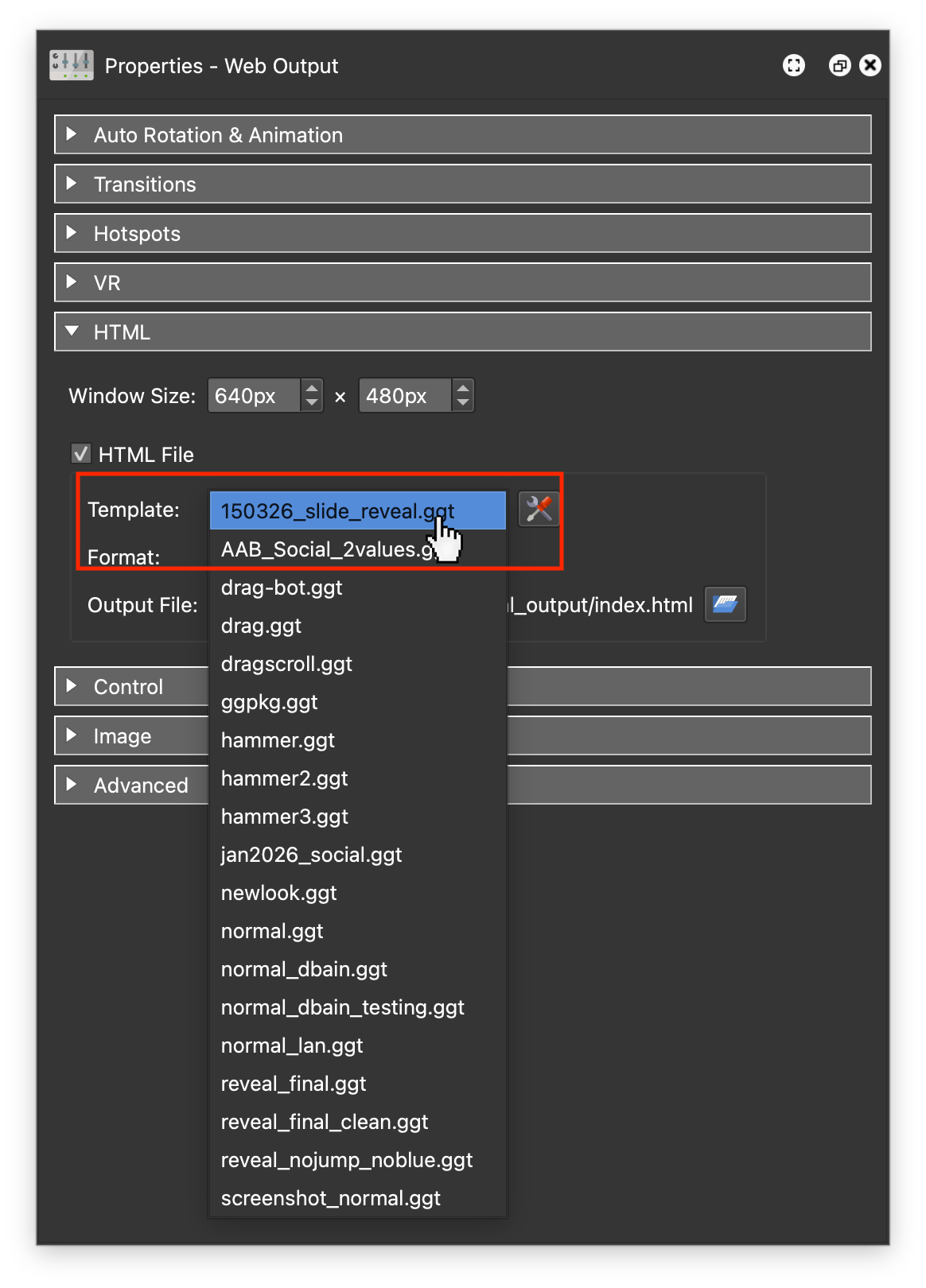
Figure #14: List of Templates
6. Open the Advanced section
In the image below we can see that the Output file is named left.xml and is being saved into the reveal_output folder. We can also see that the Multiresolution tiles are being saved into the tiles/left folder (figure #15)
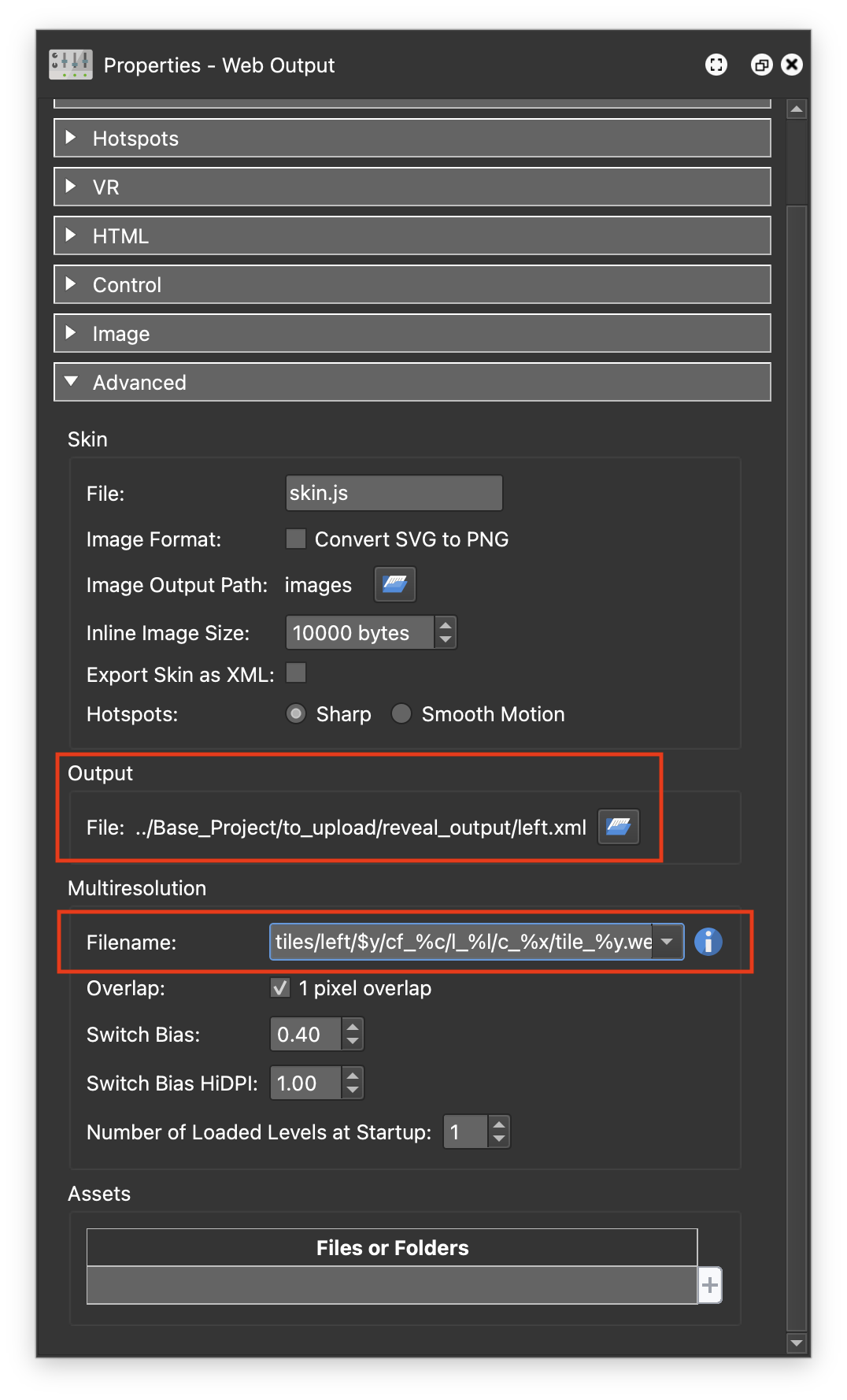
Figure #15: Advanced panel
.
Note: it is very important that these values are not modified.
7. Save the project
8. Publish the project
9. Close the project
The result should look the same as the sample below. This is the finished Reveal the “Before/After” version.
In the output you can see the Slider Reveal, the Before/After labels, the Zoom in/out buttons and a Reset button that takes you back to the default view. Below is a portrait version of the same output.
Step 5: The Embedded Base Project ⇑
The Reveal Project can be displayed in a “stand-alone” mode, as shown above, but will more likely be integrated into an existing Pano2VR project.
1. Open the base.p2vr project
2. Publish the Project
The result should look the same as the sample below. This is a single node Virtual Tour with a button that loads the Slide Reveal created in the previous step.
Let’s take a quick look at what’s in the skin
1. Click on the Edit Skin button
In the Tree there is a Code Element, local_fonts, that has all the font information and some CSS Classes. There is our slider button with a text title and two icons. Below that is a text element called the reveal_loader this is a blank text box. In the Properties Panel > Variables there is a variable vis_slider that has a true/false type. (figure #16)
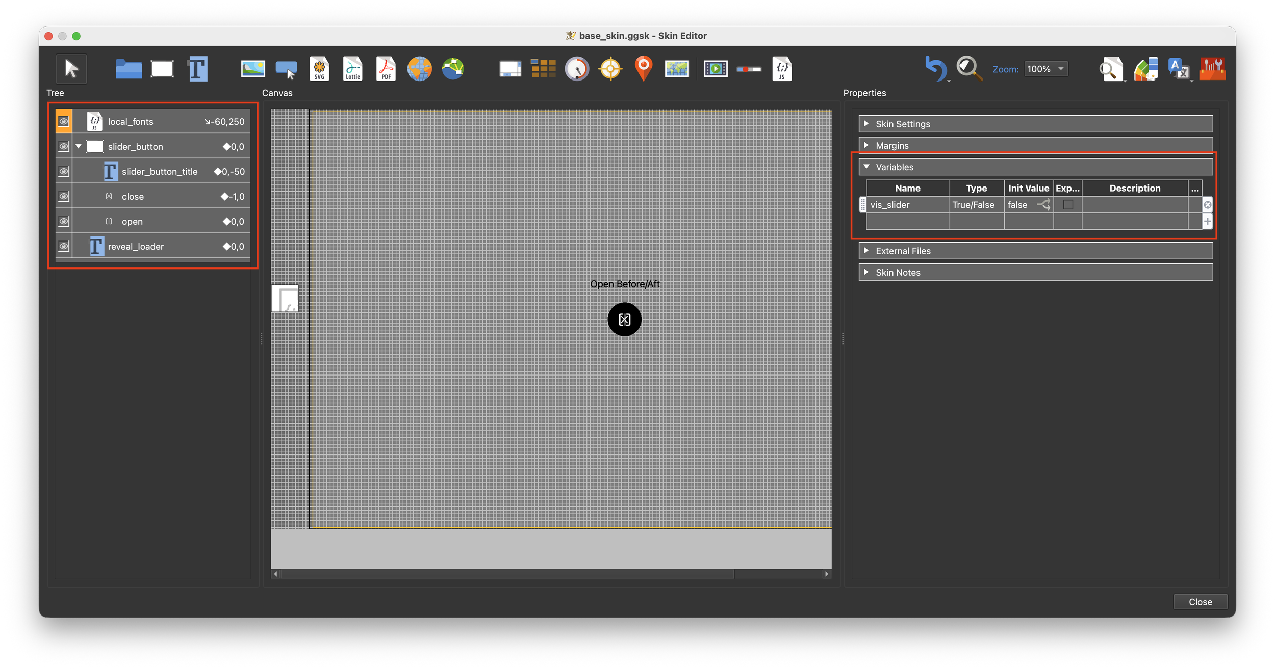
Figure #16: base_skin
2. Select the slider_button to make it active
In the Properties > Position panel the position of the button is defined by the CSS settings. In the Position Logic Block we have two triggers that change its position when the variable vis_slider = true and the Player Aspect Ratio is less than 1 (portrait).
This logic moves the slider button to the left when viewed on a mobile or a browser that is higher that it is wide so the button doesn’t cover the label. (figure #17)
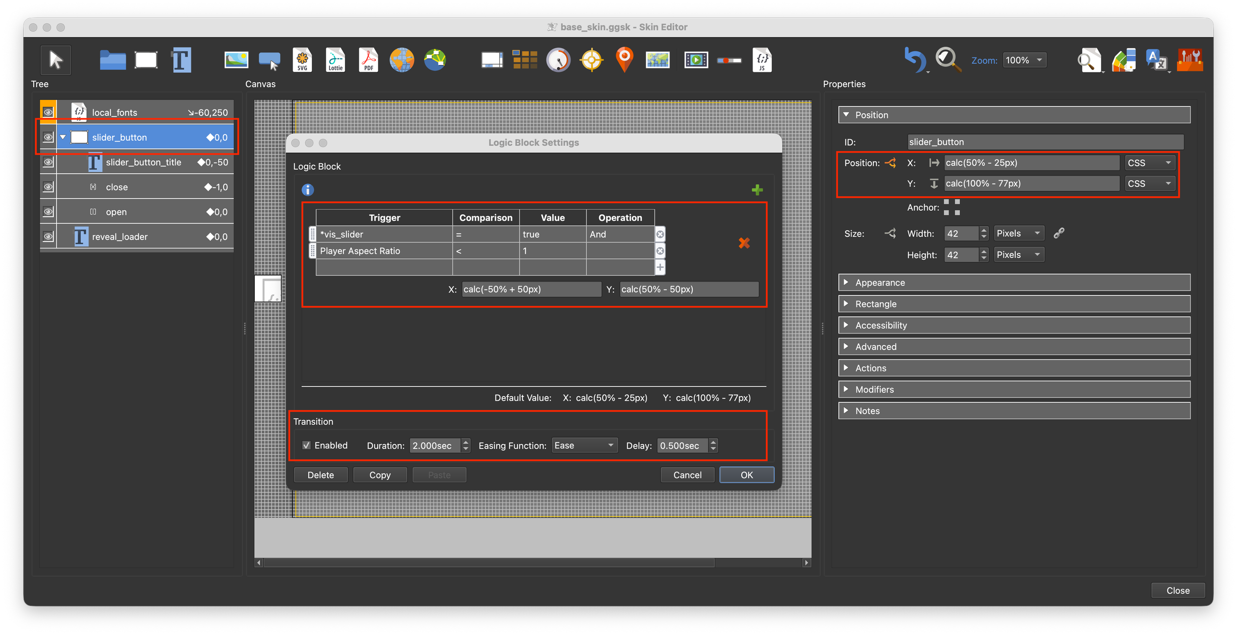
Figure #17: Slider_button Position
In the Properties > Appearance panel Scaling Logic Block we have a trigger that changes the scale when the mouse is over the button. (figure #18)
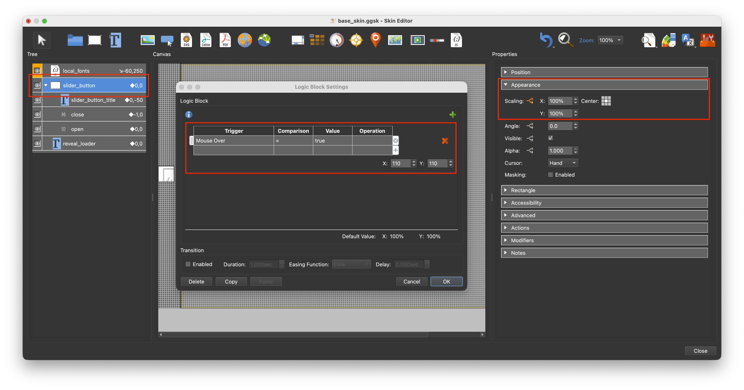
Figure #18: Slider_button Appearance
In the Properties > Advanced panel CSS Classes Logic Block we have a trigger that on mouse over sets the CSS class to buttonshadow. So when the mouse is over the button the shadow is displayed. The definition for the class is in the local_fonts element. (figure #19)
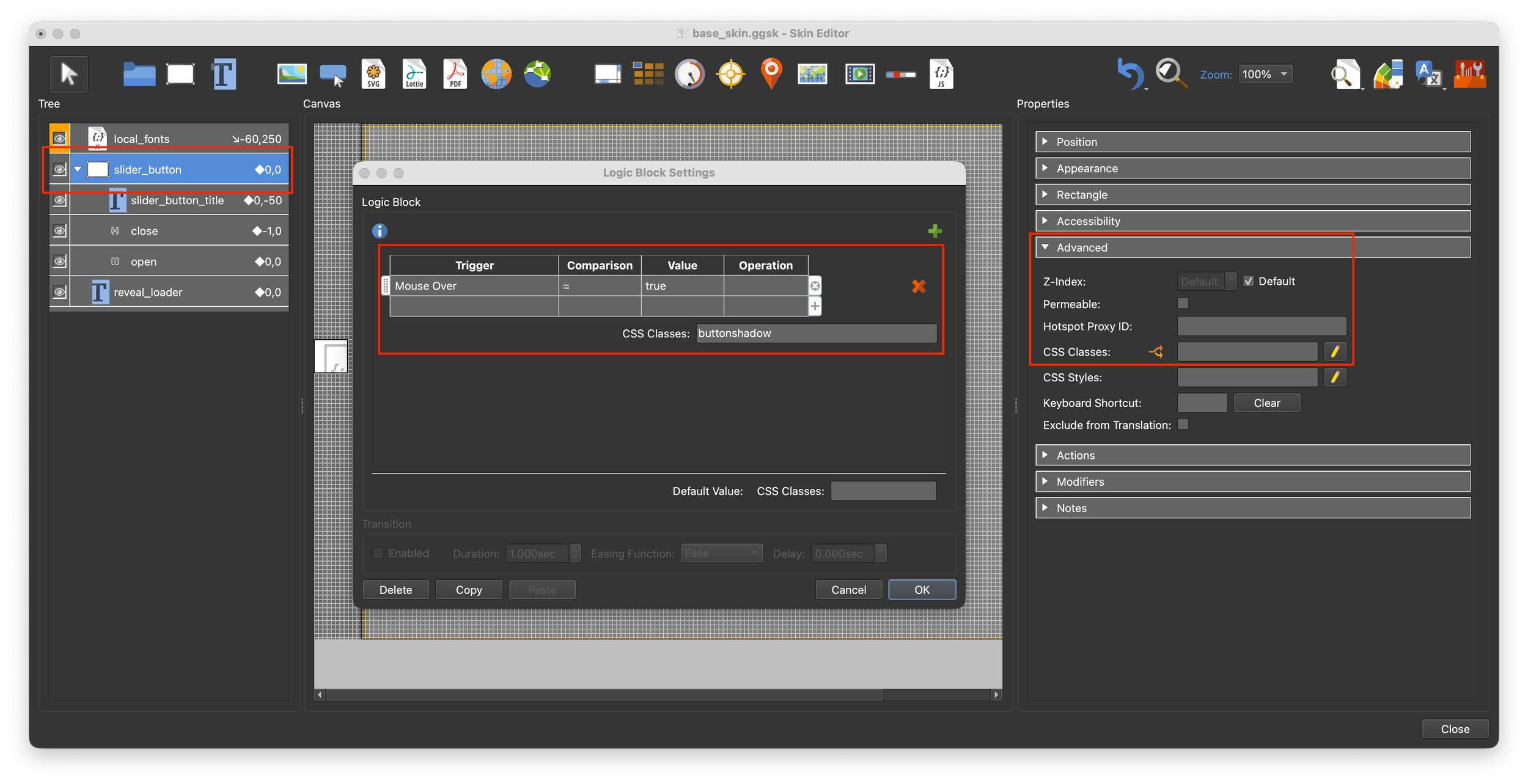
Figure #19: Slider_button Advanced
In the Properties > Actions panel we have two Mouse Click Actions. The first toggles the variable vis_slider from false to true and vis versa. The second sets the value of the text box reveal_loader.
The value that is set in the text box is <iframe src="assets/reveal_output/index.html" style="width: 100%; height: 100%; border: none; display: block;" scrolling="yes" allowfullscreen="true"></iframe>
The text box reveal_loader is set to false by default. It has a Properties > Appearance > Visible Logic Block that changes the visability when the variable vis_slider = true. (figure #20)
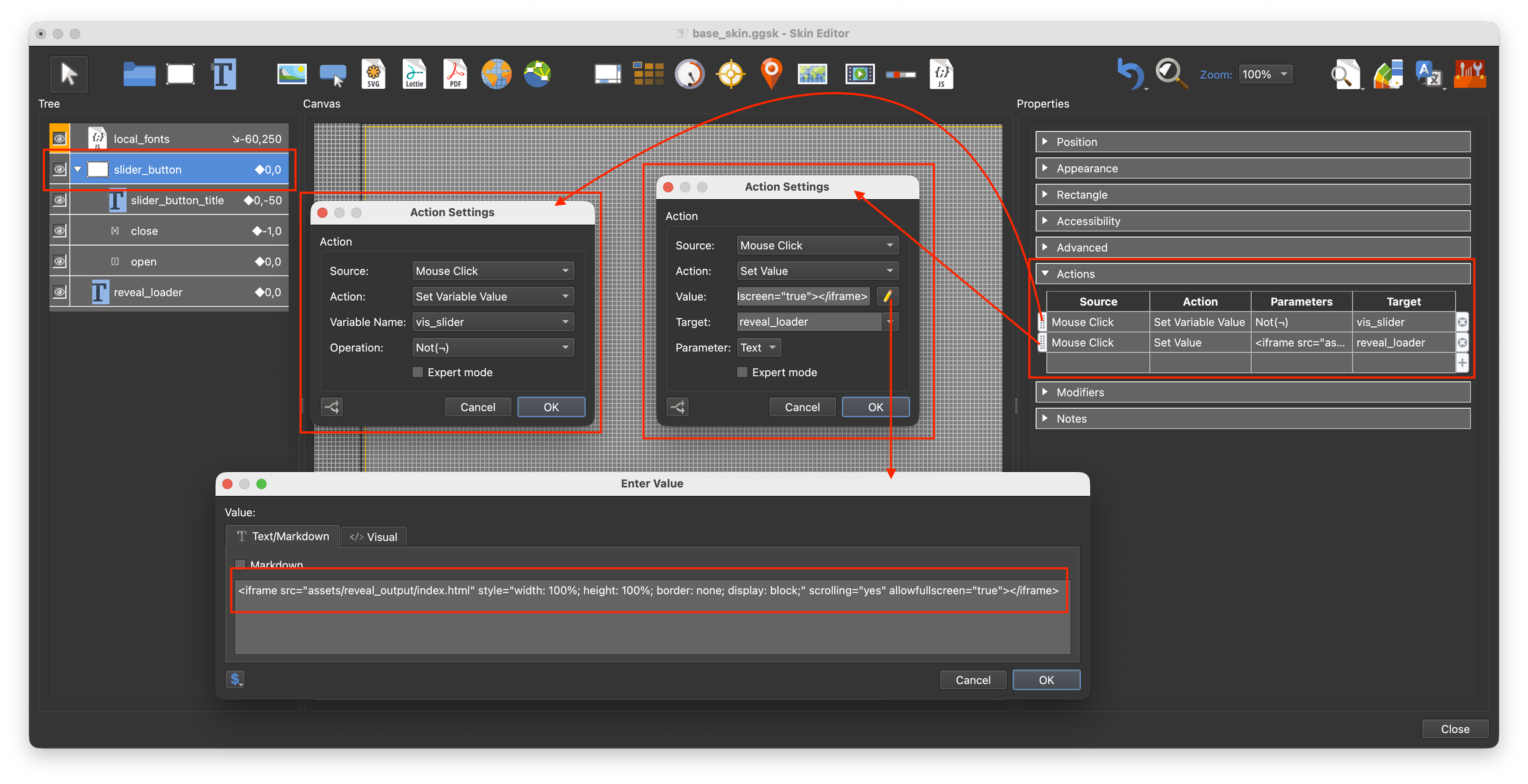
Figure #20: Slider_button Actions
So when you click the slider_button, the variable toggles, if it’s false it becomes true and vice versa. When it’s true the reveal_loader text box has the iframe value set to it and it’s visability is set to true. The iframe loads the contents of the reveal_output folder displaying the Slider Reveal. At the same time, if the device is mobile or the aspect ratio is portrait the slider_button moves to the left.
Step 6: Customising the Reveal UI ⇑
The next step is to modify the UI elements of the Slider Reveal to match the color settings of the Base tour.
2. Open the 2.Mingun_Left.p2vr project
2. In the Properties > Web Output > HTML panel click on the Edit Template button. This will open the HTML Template window. (figures #21 & 22)
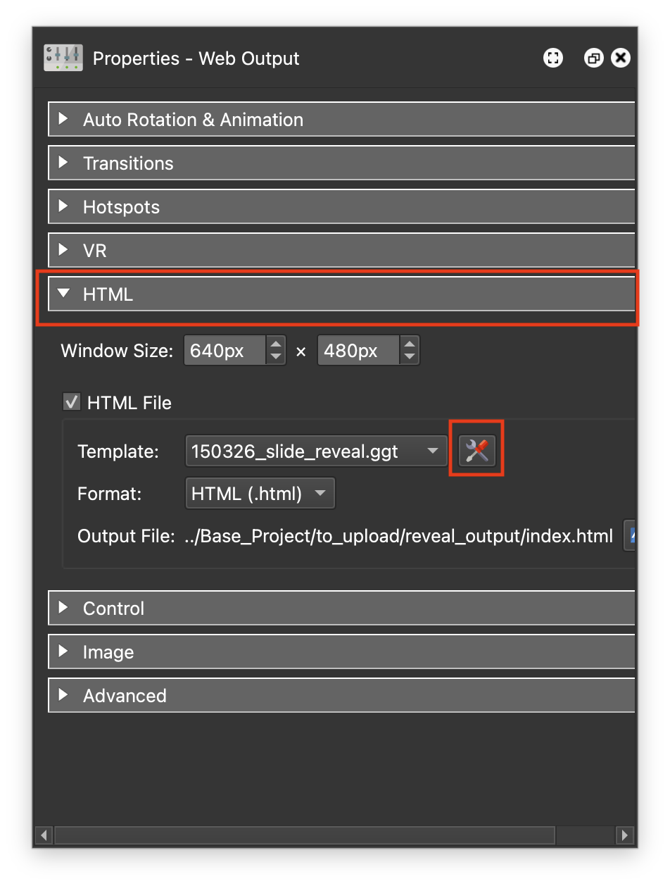
Figure #21: Properties - Web Output > HTML panel
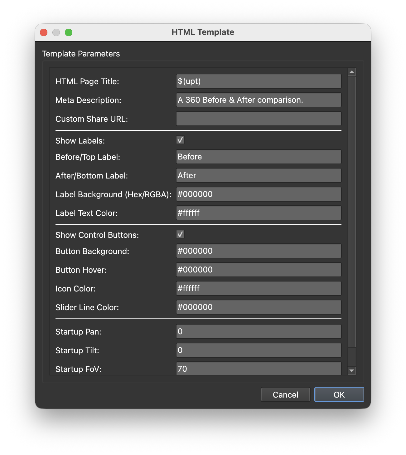
Figure #22: HTML Template options
In the HTML Template there are a number of options;
HTML Page Title: $(upt) is placeholder that automatically display the User Data Title of a panorama node.
Meta Description: Displays the contents when the URL is published on Social Media
Custom Share URL: Used in Social Media to identify the location of files like preview.jpg
Show Labels: If unchecked labels will not be shown
Before/Top Label: Add a custom label name
After/Bottom Label: Add a custom label name
Label Background: Set the background color of labels
Label Text Color: Set the color of label text
Show Control Buttons: When unchecked buttons will not be show
Button Background: Set the background color of the buttons (includes the Slider button)
Button Hover: Set the color of the Slider button on hover
Icon Color: Set the color of the icons (includes the Slider button)
Slider Line Color: Set the color of the Slider line
Startup Pan: Sets the pan position of the Panoramas on load (Quick method to change start position without having to go into each project and re-output it.)
Startup Tilt: As above sets the Tilt
Startup FoV: As above sets the FoV
Note: All color fields accept Hex or RGBA values
In the image below I’ve made the following changes to the HTML Template (figure #23)
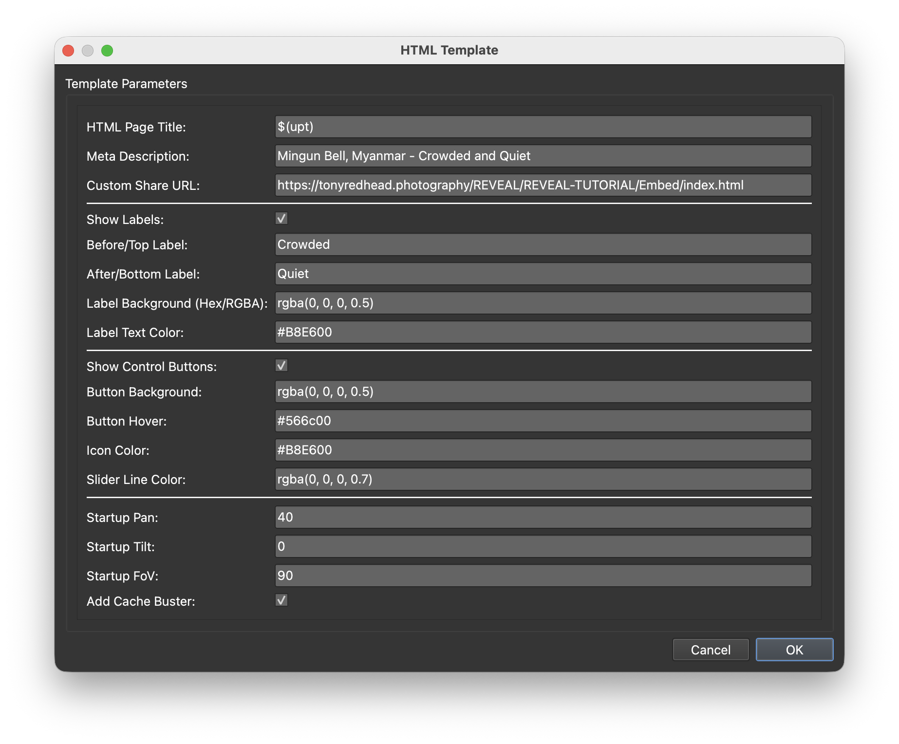
Figure #23: HTML Template options updated
In the HTML Template make the following changes;
Meta Description: Added a new description
Custom Share URL: Added the location of the project
Before/Top Label: Add the label “Crowded”
After/Bottom Label: Add the label “Quiet”
Label Background: Here i’m using RGBA to add an alpha value of 50% to the color.
Slider Line Color: Here i’m using RGBA to add an alpha value of 70% to the color.
Startup Pan: Here i’ve set a startup pan of 40˚. Rather than having Mann (the bell ringer) on the left of the slider by setting the value to 40˚ he is now to the right of the slider on startup.
Startup FoV: I’ve set the FoV slightly higher to zoom out of the panorama slightly
Step 7: Customising the Open/Close Button ⇑
Lets look at the changes to the HTML Template and the base_skin.ggsk we need to make to create a final project as shown below.
Open/Close Button Styling
2. In the Output > Skin: click on the Edit Skin Configuration button to open the Edit Skin Configuration window. (figures #24 & 25)
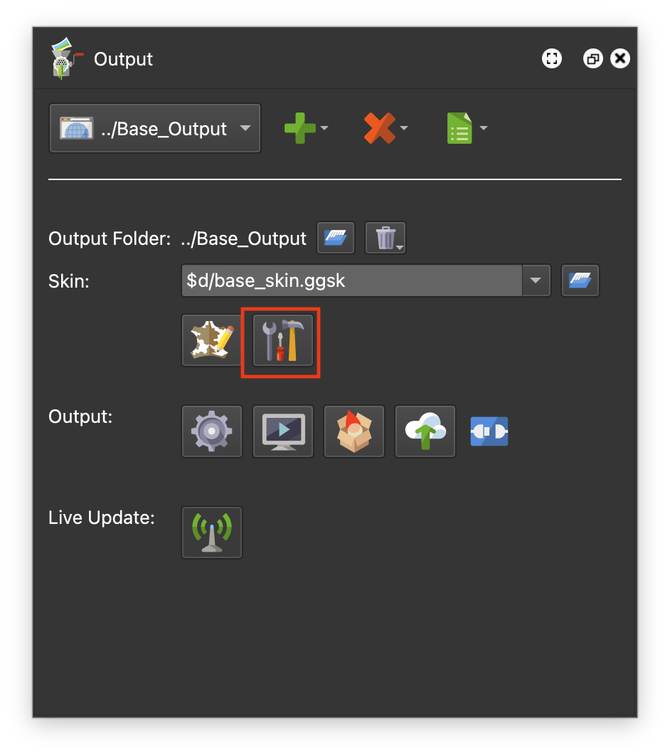
Figure #24: Edit Skin. Configuration button
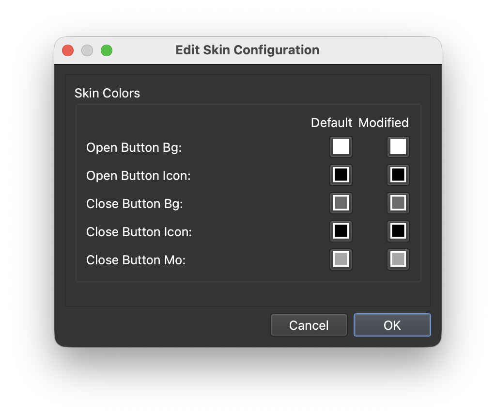
Figure #24: Edit Skin. Configuration exposed colors
Note: the values in the Edit Skin Configuration window represent the exposed colors of the Open/Close Reveal Loader Button.
3. Click in the Open Button Bg: Modified square and change the color to Black #000000 (figure #26)
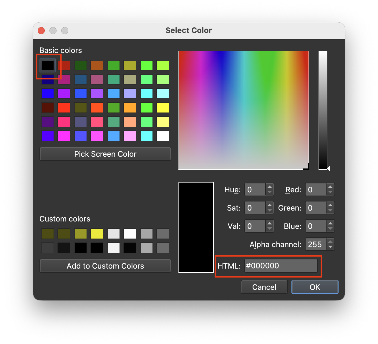
Figure #26: Select black #000000
4. Change the following colors as shown below;
Open Button Icon: #ffffff
Close Button Bg: #000000 Alpha: 130
Close Button Icon: #68e600
Close Button Mo: #566c00 (figure #27)
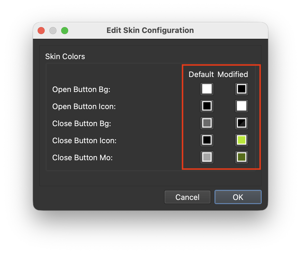
Figure #27: Edit Skin. Configuration button colors updated
5. Save the skin
6. Publish the project
Note: You can see the effect of changing the HTML Template options Pan to 40 and the Fov to 90 in the before (left) and after (right) images below. (figures #28 & 29)
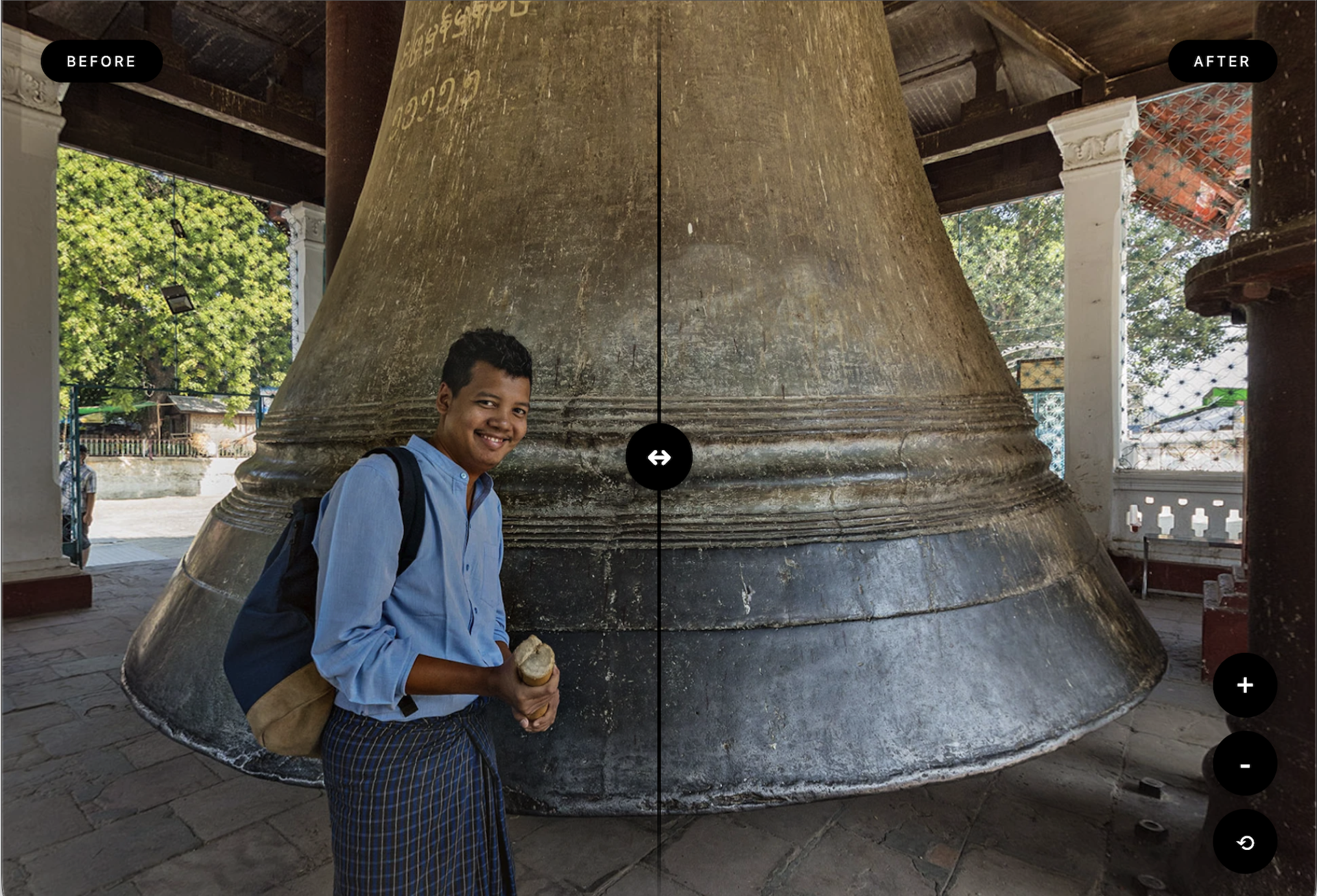
Figure #28: Pan = 0, FoV = 70

Figure #29: Pan = 40, FoV = 90
Note: You can see the position of the close button when the aspect of the browser is landscape (left) and portrait (right) and the horizontal and vertical slider versions (figures #30 & 31)
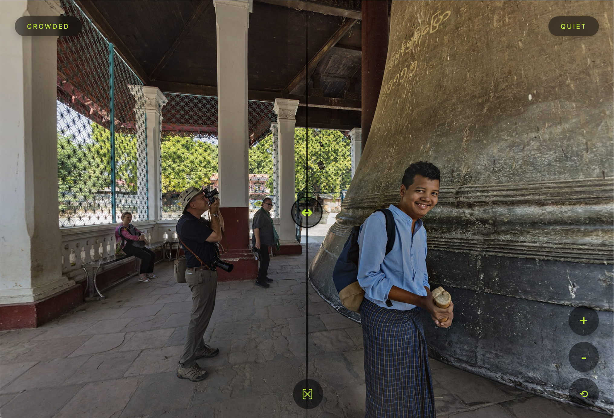
Figure #30: Landscape
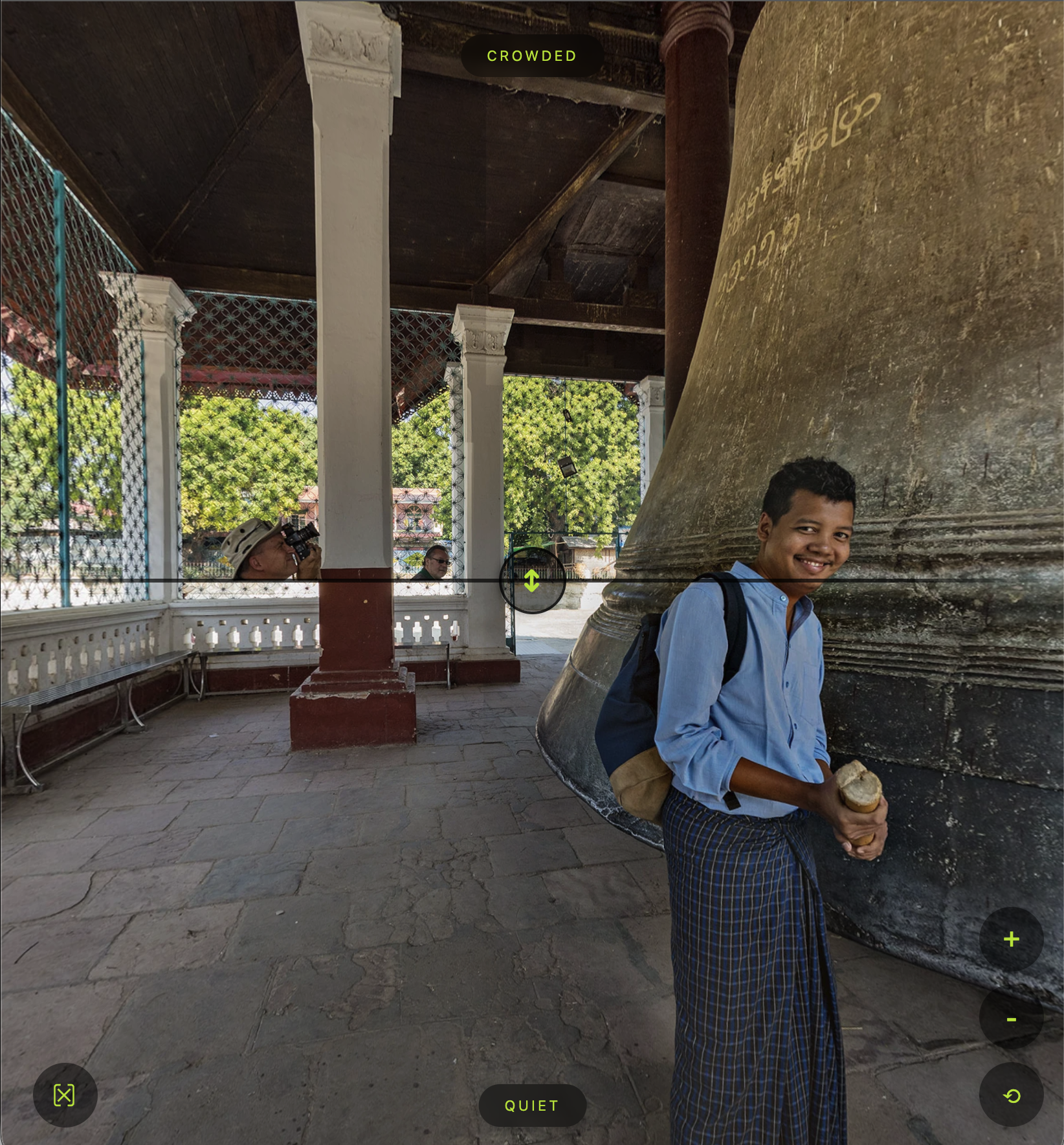
Figure #31: Portrait
Summary ⇑
"Hey there! 👋 This is the end of the tutorial.
If you would like to create your own Panoramic Reveals as a standalone or for embedding in a Pano2VR project you can purchase the Tutorial folder. The cost is $50 USD. Please contact me for more information via WhatsApp or via email tony@tonyredhead.com.”