The Interactive Dual Language Skin lets you quickly add Hotspots Popups to your tours.
Note: prior to starting the tutorial section of this document it is recommended that the Menus tutorials are completed and used as the base for Hotspot Popups.
About Hotspot Popups
Hotspot Popups are interactive areas within the tour indicated by an icon; when the user's mouse rolls or hovers over these hotspots, the user can click on the icon and open a popup window displaying a title, image, and description.
A Hotspot Popup has three components; a Point Hotspot, a Hotspot Template, and a Popup Window (figures 1a,b).
The Point Hotspot defines a point of interactivity in a panorama. The Hotspot Template enables us to add a custom image and actions to the Point Hotspot. When a user clicks on the Hotspot Template, the Hotspot Popup window appears (figure #1)

Figure #1: Hotspot Popup Window - Portrait 3:2 Ratio
Reference: https://ggnome.com/doc/hotspots-point/
There are two types of Point Hotspots; Single Language and Dual Language.
Single Language are identified in the project by the Skin-ID’s;
ht_single_plus
ht_single_help
ht_single_information
ht_single_shop
Dual Language is identified in the project by the Skin-ID ht_popups (figure #2)
Figure #2: Hotspot Popups Skin-ID’s
For both versions, there are four visual 'types' of Hotspot Template Icons: Plus, Information, Shop, and Help to represent each Hotspot Template (figure #3)

Figure #3: Hotspot Template Icons. (left to right) Plus, Information, Shop, Help
There are 5 Popup Window types;
Square
Landscape
Landscape 1:1
Portrait
Portrait 1:1
Popup Window Attributes
Except for Square, all Popups have the following attributes:
Heading
Description
Image
Square only has a Heading and Description.
Heading; It is preferable to keep it short as the text is also used as the tooltip. The headline will wrap to a second line if it is too long to fit on one line.
Description: It can be any length and contain CSS coding for Html attributes such as links etc.
Image: Popup windows have been designed to work with images of a specific ratio;
Portrait: 3:2 ratio
Portrait11: 1:1 ratio
Landscape: 2:3 ratio
Landscape11: 1:1 ratio
Note: Regardless of the type of Hotspot Template used, Dual or Single, the same Popup Window element is used by both versions.
Assets
In the Project Folder, there is a folder called, ‘Assets to be loaded’. This folder, in turn, contains other folders of content used in the project that need to be loaded when the project is published.
The sample project already has the folders assigned to the Output > Advanced > Assets > Files or Folders. Therefore, they will automatically be placed into the Assets folder when the project is published (figure #4).

Figure #4: folders assigned to be loaded at publish
Inside the photos folder are three placeholder images that we can use when we create the Hotspot Popups:
img_1_1.jpg
img_2_3.jpg
img_3_2.jpg
We will use these placeholders for now, but you can replace images in the same ratio to the folder before publishing the project (figure #5).

Figure #5: Placeholder Images
Adding a Single Language Hotspot Popups
The first Hotspot Popup example will be a portrait layout with a 3:2 ratio image and a plus icon hotspot template.
1. Select the green-grid node to make it active
2. Add a Point Hotspot to the Skin
3. Select the Type: URL (if it's not already selected) (figure #6)

Figure #6: Point Hotspot added to the skin
Note: When adding a Single Point Hotspot choose the Type: URL as it offers the largest number of data entry fields
Due to limitations within the existing Pano2VR application, there are not enough data entry fields for dual language entries. Dual language Point Hotspots require the user to add content via Text Logic Blocks. Single Point Hotspots can use the User Data fields.
1. From the Skin-ID dropdown select ht_single_plus
2. In the Title: enter Sample Headline 3:2
3. In the Description: copy and paste the following text
Hotspot Popups in the skin allow us to add and show relevant information to the audience viewing the tour and highlight different aspects of the tour.
There are five popup types; Portrait, Portrait11, Landscape, Landscape11, and Square. These names are referred to as their ratio.
Each popup can have a representative icon selected from the following icons; Plus, Help, Information or Shop
With the exception of Square, which only has Headline and Description, all popups have visual content. This can be still images jpg, png or animated gifs.<p><b>Tony Redhead: </b><span class="gothbold";><A href=https://tonyredhead.services/ style="color:red;font-size:16px;">Visit the Website</a></span></p>
4. In the Link Target URL: enter img_3_2.jpg
5. In the Target: enter portrait (figure #7)

Figure #7: Properties of the Point Hotspot
Note: Single Language Hotspot Popups are only visible when the Single Language (startup) is set to true.
6. Open the Edit Skin Configuration window
7. Scroll to the Language Settings section
8. Check Single Language (startup) if it’s not already checked (figure #8)

Figure #8: Check Single Language (startup)
9. Save the project and select Publish
You will now have a Plus button in the green-grid node that will open a responsive popup window when you click on it. (live example below)
Direct Link: Sample Portrait Popup
Adding Additional Single Language Hotspot Popups
Let’s work through the other Hotspot Popups until we have a sample of each Window version. Start with the Square Popup
1. Select the current Point Hotspot to make it active (red)
2. Right-click and select 'Copy Active Point Hotspot' (figure #9)

Figure #9: Copy Active Point Hotspot
Note: copying the Point Hotspot will also copy all of the data in the Properties panel.
3. Right-click and select 'Paste Point Hotspot' (figure #10)
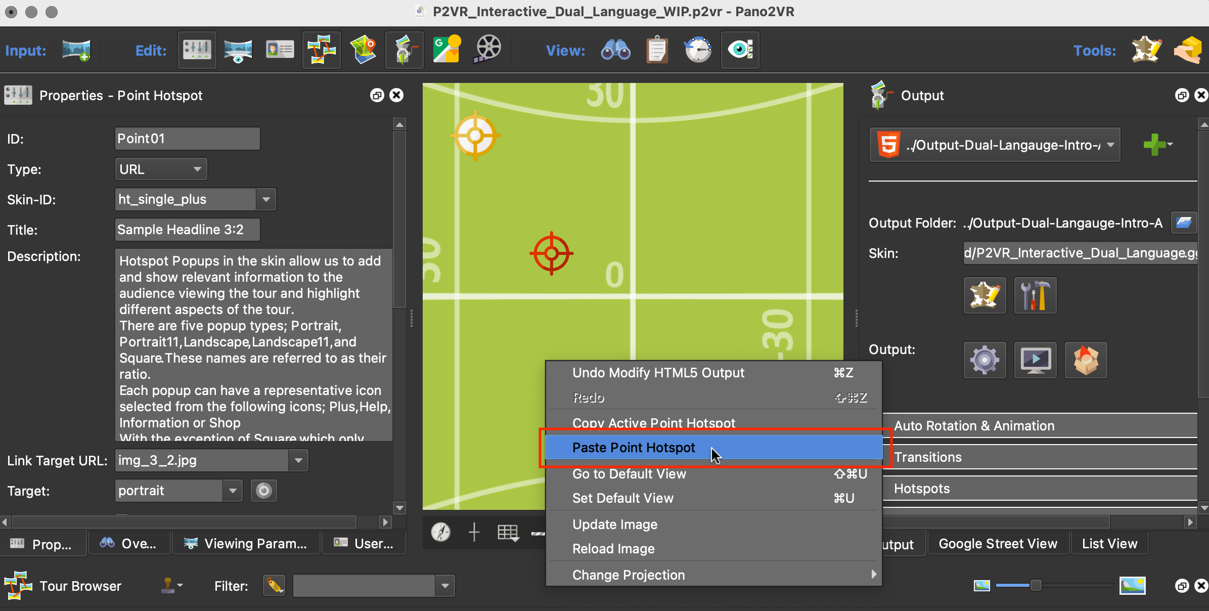
Figure #10: Paste Point Hotspot
4. Leave Type: as URL and the Skin-ID: as ht_single_plus
5. In the Title: enter Sample Headline Square
6. Clear the Link Target URL: so there is nothing entered
7. Set the Target: Square (figure #11)

Figure #11: Updated Properties - Point Hotspot
8. Save the project and select Publish
There are two Plus buttons in the green-grid node that will open a Square and Portrait Hotspot Popup window when they are clicked. (live example below)
Direct Link: Sample Portrait & Square Popup
Note: if the bottom of the text is too close to the bottom of the element, add a couple of returns to the text and an underline. That will give it a bit more space at the bottom.
Add three new Point Hotspots, using the copy and paste technique, and update the Properties - Point Hotspot using the following settings
Skin-ID: ht_single_information
Title: Sample Headline 1:1
Link Target URL: img_1_1.jpg
Target: landscape11
Skin-ID: ht_single_shop
Title: Sample Headline 2:3
Link Target URL: img_2_3.jpg
Target: landscape
Skin-ID: ht_single_help
Title: Sample Headline 1:1
Link Target URL: img_1_1.jpg
Target: portrait11
When you finish republish the project, all 5 Hotspot Popups will be active and working in the green-grid node. (live view below)
Direct Link: Sample 5 Popup Windows
