27 March 2026
Selective Mobile Fixed Buttons
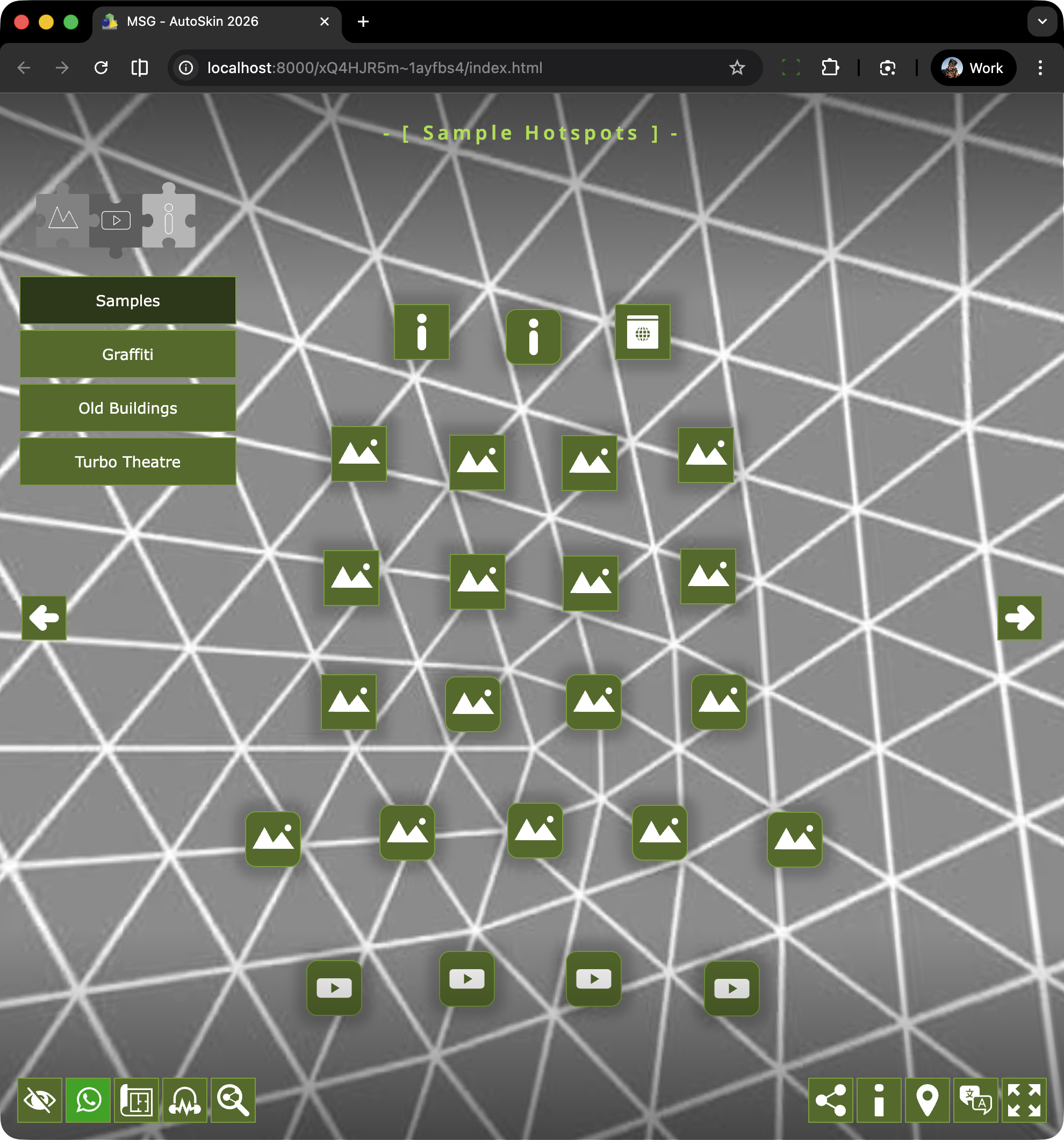
At this stage of development there are two sets of Fixed Buttons: Left and Right. The buttons in each set are as follows:
Left: Hide All | What’s App | Maps (Floorplans, Maps & SVG Map) | Ambient (on/off) | View Social Sites
Right: Share to Social | Info | Google Maps | Languages | Fullscreen
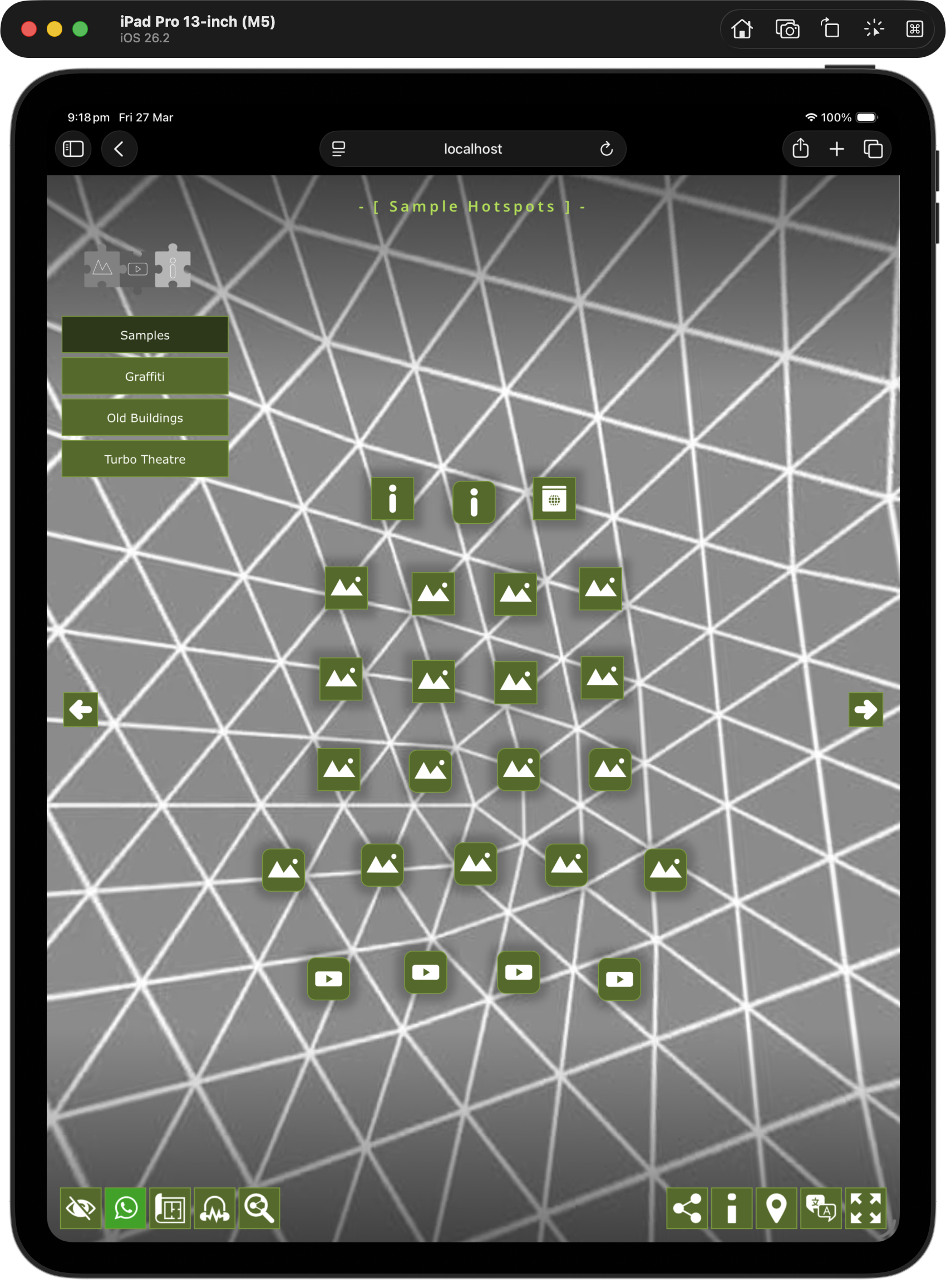
The buttons are positioned at the bottom left and bottom right of the screen respectively as shown in the image below.
The buttons are managed by an Additive Logic Block that automatically adjusts the position of the buttons based on their visability. This means that hiding a button doesn’t leave a blank space but simply condenses the overall space that the buttons inhabit.
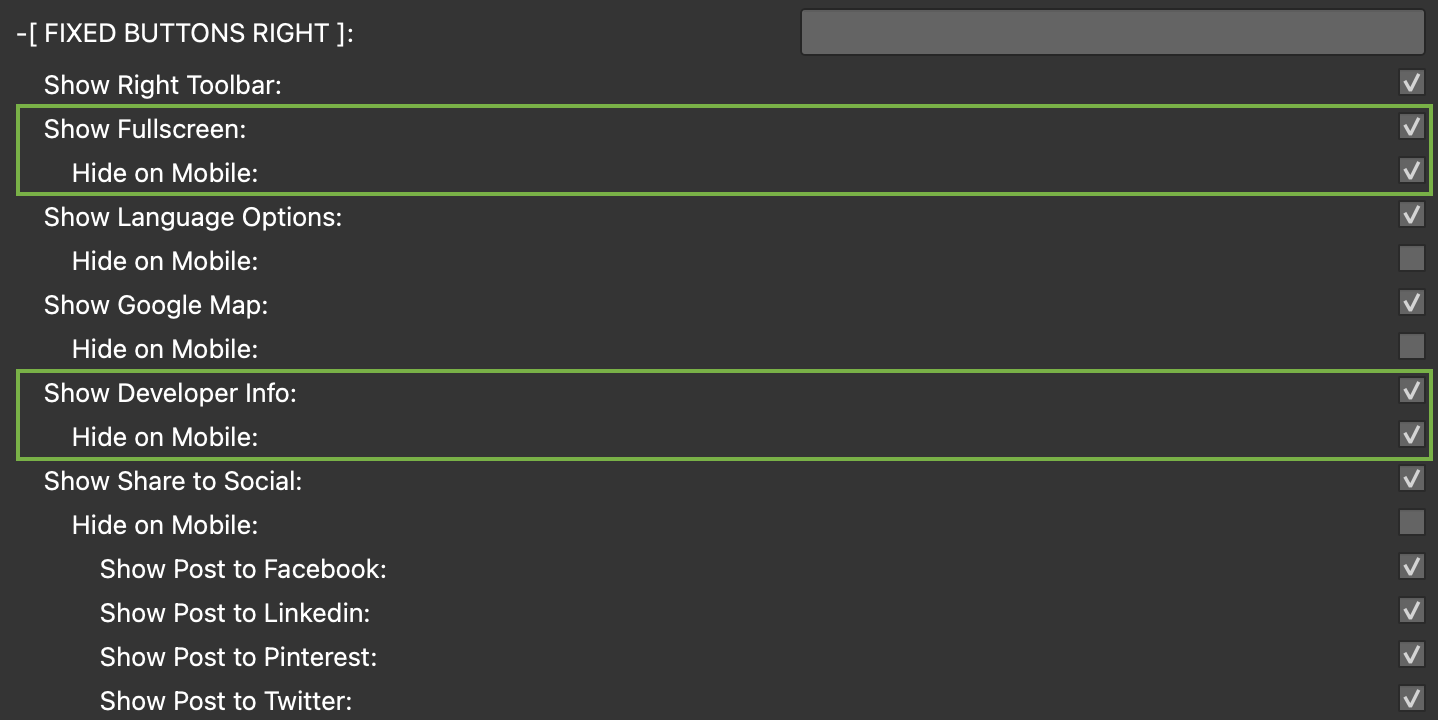
The Mobile Solution
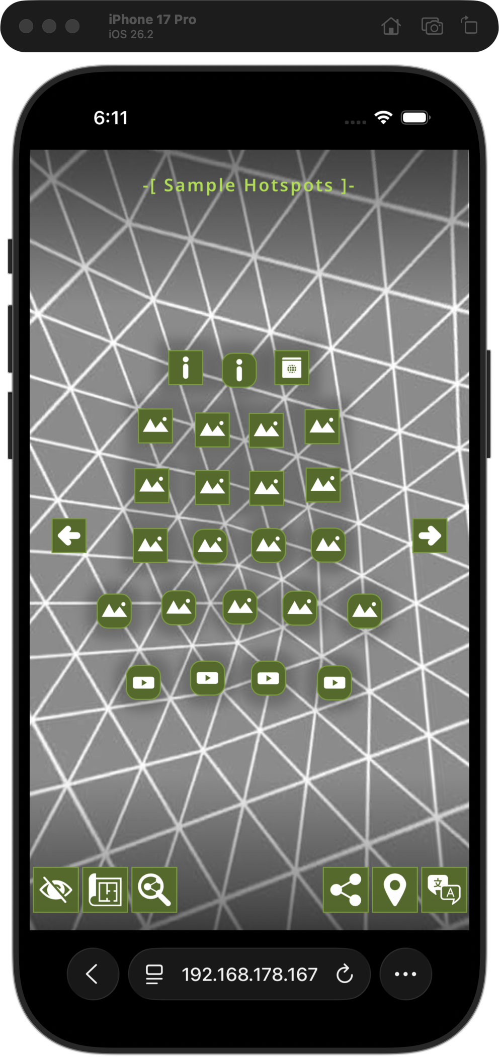
Showing this number of buttons on the Desktop or iPad is fine however on a mobile device (in portrait mode) the room is much more limited. To accomodate a smaller subset of buttons each button can selectively be “hidden” on mobile. For example Fullscreen is not really an option on mobile so it can be shown on desktop but not mobile.
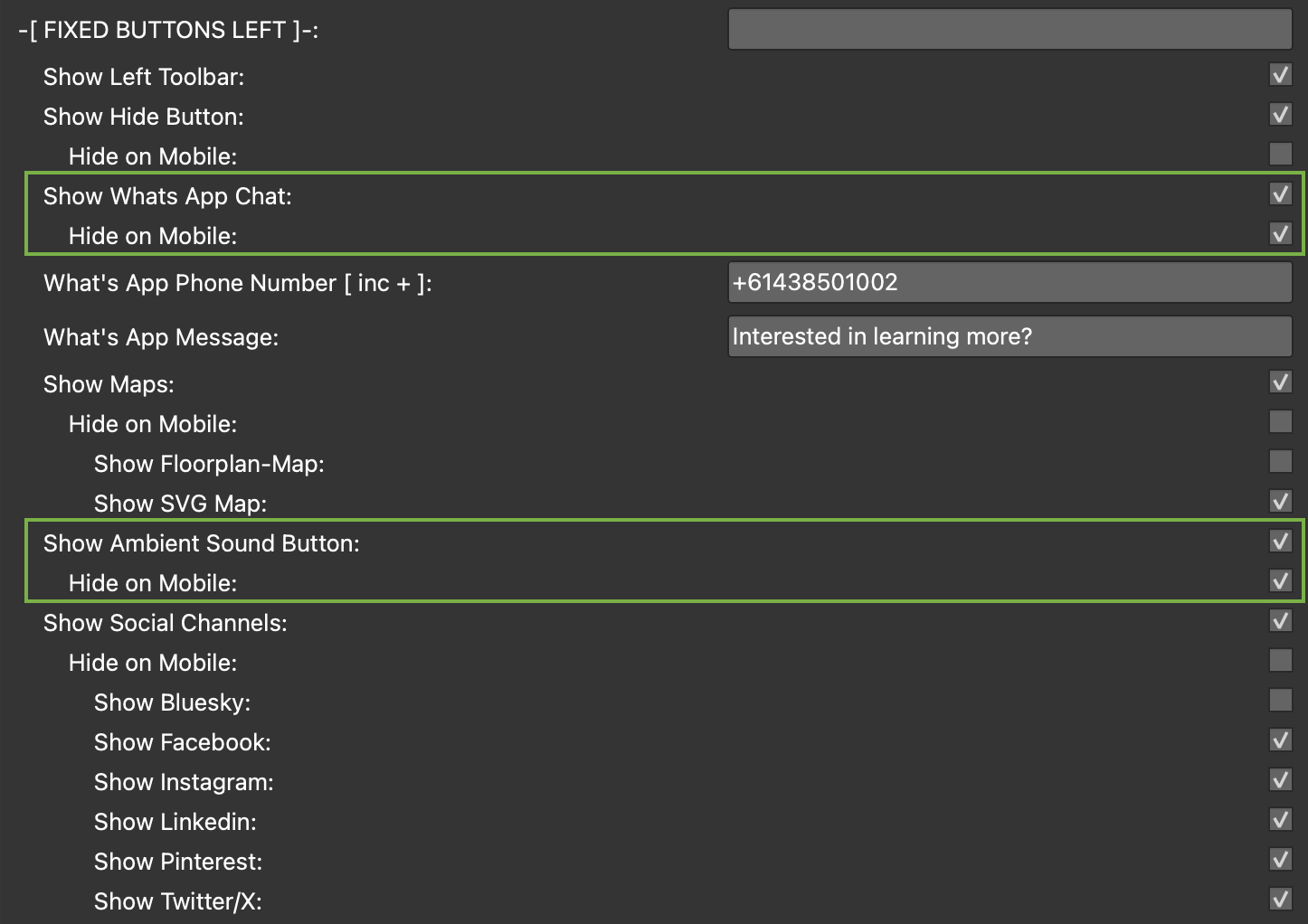
To help in organising the mobile view I’ve added a subset of checkboxes “Hide on Mobile” for each of the Left and Right buttons that when checked hide the buttons on mobile but not Desktop or iPad.
In the images below I’ve highlighted the two buttons on the left and the two buttons on the right that are hidden on mobile.
In the images below you can see the iPad (on the left) is showing the same buttons as the desktop version while the iPhone (on the right) is showing a subset of buttons.