Overview
This “Little Bits” tutorial will show you how to use CSS to maintain the Aspect Ratio (16:9) of an iFrame when the browser window is resized. In this example, we will add CSS to the Position properties of two text elements within the skin
Note: this tutorial was built in Pano2VR V6.110 You can download the software here. As “Little Bits” tutorials don’t go into detail about Pano2VR operations a working knowledge of Pano2VR is an advantage.
Final Output
Final Output: Click to view the output in an external window, resize the browser window to view the iFrame maintain its 16:9 ratio
Tutorial Files
In the tutorial folder, iFrame_Maintain_Ratio, there is an Asset Folder with an equirectangular and tripod cap image. There is also a Project folder with a Pano2VR project '16-9_ratio.p2vr', a skin '16-9_ratio.ggsk' and an Output Folder ‘Maintain_Ratio’ with project files created from the .p2vr and .ggsk elements as well as a Pano2VR image gallery in the ‘Includes’ folder with a selection of images having a 16:9 ratio (Figure #1)
Figure #1: Tutorial Folder
Project Overview
In this tutorial, we will modify the 16-9_ratio.ggsk skin by;
Adding CSS code to the width and height of the iFrame elements
Note: click on any image in the tutorial to enlarge it
Note: all images used in this tutorial are copyright tonyredhead.com and are not to be used without permission of the author
Getting Started
1. Download the zipped tutorial folder here
2. Open the project file ‘16-9_ratio.p2vr’ (Figure #2)
Figure #2: iFrame Maintain Ratio .p2vr file
3. Click on the ‘Open Output’ button to view the project in its current state (Preview #1)
Preview #1: Basic project without iFrame ratio management
Note: resizing the browser window doesn’t affect the web page as it is responsive and resizes it’s layout to accomodate the new ratio. However, if the ‘Gallery’ is selected then resizing the browser window changes the ratio of the iFrame but not the images showing background color around the image. (Figure #3)
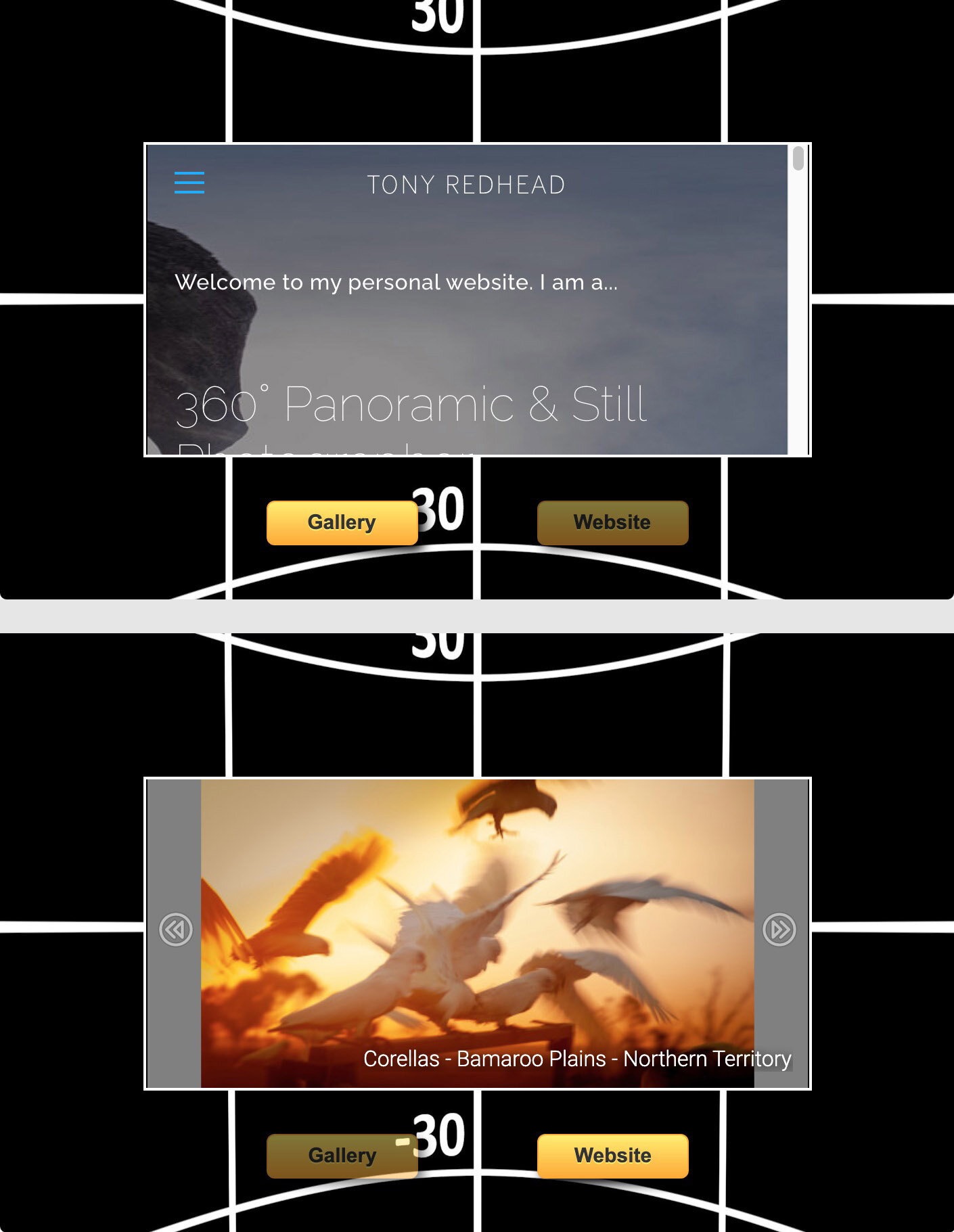
Figure #3: The website changes to reflect the resized iFrame where the fixed size image doesn’t
Note: what we need to do is to make sure the iFrame maintains it’s ratio (16:9) so the image will always fill the iFrame.
Edit the Skin
1. Click on the ‘Edit Skin’ button to open the skin editor (Figure #4)
Figure #4: Skin Editor the skin elements
Note: the following are the elements that make up the tree
txt_iframe_16:9 is a text element that contains the iFrame code that loads the gallery and external website via iFrame code in the elements ‘Text’ logic block.
It’s current Size: is set to Width: 70% Percent and Height: 56.25% Percent. The background is disabled and there is a 2 pixel white frame (Figure #5)
ani_loading is a animated element that plays until the website loads and covers it
txt_bg_16:9 is a text element with a solid black background and a border and position to match the txt_iframe_16:9 element. This hides the underlying panorama while the website loads
txt_bt_website and tx_tbtgallery are the two buttons that load the gallery and website by setting the op_gallery and op_website variable values to true and false
Figure #5: txt_bg_16:9 elements properties
Setting the 16:9 Ratio
1. In the Skin Editor select the txt_iframe_16:9 element
2. In the Properties > Position > Size > Width: change 'percent’ to CSS
3. In the Properties > Position > Size > Height: change 'percent’ to CSS (Figure #6)
Figure #6: Width and Height set to CSS
Note: The CSS values remain the same as the percentage values. In the next step we are going to replace the percentages with Viewport Units.
There are 4 viewport units – vw, vh, vmin, and vmax – they work similarly to existing length units like px or em, but represent a percentage of the current browser viewport.
In our example we are going to use Viewport Width (vw) – is a percentage of the full viewport width. A setting of 70vw will resolve to 70% of the current viewport width. The difference between % and vw is most similar to the difference between em and rem. A % length is relative to local context (containing element) width, while a vw length is relative to the full width of the browser window.
In order to maintain the ratio 16:9 we need to perform a calculation that uses the value of vw, representing the value 16, multiplied by a number that represents the value 9.To find that number we divide 9 by 16 to get 0.5625
4. With the txt_iframe_16:9 element still selected, in the Properties > Position > Size > Width: change 70% to 70vw
5. In the Properties > Position > Size > Height: change 70% to calc(70vw*0.5625)
6. Repeat steps 4 & 5 with the element txt_bg_16:9 (Figure #7)
Figure #7: Updated Size: Width and Height to Viewport Units
Publish the Project
1. Save and close the skin
2. Save the project and Generate an Output
Note: Now the iFrame retains it’s 16:9 ratio as the browser is resized.
Summary
I hope you have enjoyed the tutorial and it has helped you to achieve the best possible project outcome. If it has please take a second to consider a donation so that I can continue to add more tutorials.
