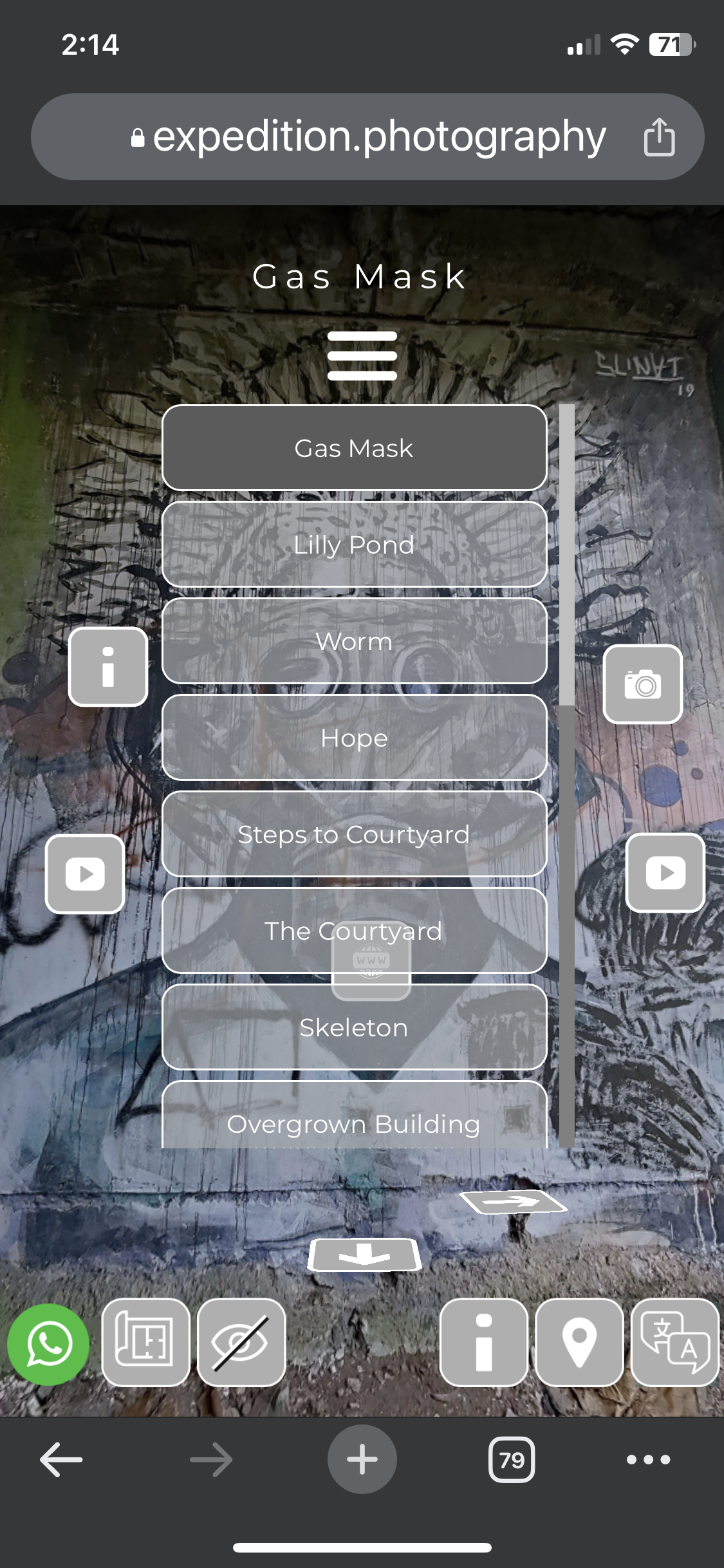
With the release of Pano2VR V7, many new features were included that dramatically changed how Virtual Tours and their “skins” could be developed. In particular, the ability to create Custom Properties for Hotspots and User Data has proved significant in developing customisable tours. V7 also supports using translation files to build projects in multiple languages, easily allowing us to reach a wider audience in their own languages.
Over the past six months, I’ve been working to develop two skins, one that provides a generalised User Interface and one that provides Interactive Popups and a .P2VR file that integrates both skins into a single project. I call the skins DLS (Dual Language System) and RPGTVW [Responsive Popup Gallery, Text, Video & Web]
The overreaching goal of the project was to facilitate the development and customisation of Virtual Tours without having to use the Pano2VR Skin Editor and be optimised to work across Desktop and Mobile Devices. [currently, the development has been tested on iMac, iPad Pro, iPhone 11 & 13 Pro and Pixel 6 Android phone]
To showcase the current development, I’ve created two Virtual Tours using a number of 360˚ panoramas taken on a recent trip to Bali at a unique location called the Taman Festival, an abandoned amusement park near Sanur, Bali.
I’ve published two tours to highlight some of the styling options available in the DLS skin. Each tour has a unique “Splash” page with a choice of 3 languages, English, French and Italian. [click any image for a larger view]
Taman - Splash “A”
Taman - Splash “B”
After clicking on the the “enter” button the tour is active and displays a number of User Interface elements. Taman A has Square Corners, a Menu with sub-categories and a Logo at the top of the menu. Taman B has Round Corners, a Single Menu and no Logo.
Taman Version A - Square Corners/Sub Cat Menu/Logo
Chrome Browser, iMac
Taman Version B - Round Corners/ Single Menu/No logo
Chrome Browser, iMac
Both versions display the same number of functional buttons and popups within the user interface in these examples. The fixed buttons on the bottom of the screen are (from left to right) What’s App Chat, Social Media Links, Map/Floorplan, Hide UI, Sharing to Social Media, Site Information, Google Map, Languages, and Fullscreen.
I’ve done a lot of work on the mobile versions of the project to ensure that the viewer has an optimised experience. This involved creating additional elements, such as mobile menus and specific OS versions running on those devices.
The screens below show the Splash Screen for Version A and B on iPhone and Google Pixel.
V-A Chrome Browser, iPhone 11 Pro
V-A Chrome Browser, Pixel 6 phone
V-B Chrome Browser, iPhone 11 Pro
V-B Chrome Browser, Pixel 6 phone
Both versions display the same number of functional buttons and popups within the user interface in these examples. The fixed buttons on the bottom of the screen are (from left to right) What’s App Chat, Social Media Links, Map/Floorplan, Hide UI, Sharing to Social Media, Site Information, Google Maps, and Languages.
In the next section, “The Skins”, I’ll review the User Interface in more depth, but for now, you can explore each variation by clicking the buttons below.


