My Design Determination
As a Pano2VR developers, we know it isn't just about building a tour; it’s about designing an experience that works across an entire ecosystem of devices.
From monitors of a desktop setup to the tactile tablets and the "letterbox" screens of a smartphone, we find that each device requires a unique method of interacting with the user. This discipline is known as Responsive UI Design, and it’s the challenge I find myself facing in every build.
In this post I’d like to present my design determination for the small smartphone screen.
The Small Screen Challenge
In my experience, the biggest hurdle isn't the desktop or tablet view—it's the smartphone.
While a desktop or an iPad provides a generous canvas, the smartphone presents a unique ergonomic hurdle. On a smartphone, we are constantly fighting for pixels against what designers call "Browser Chrome"—the address bars and navigation buttons that wrap around a website.
In Portrait, we have enough vertical height to comfortably stack our UI. But in Landscape, the Browser Chrome squeezes the view into a thin "letterbox" strip. Trying to force a full set of buttons into that tiny space, resulting in a cluttered mess where the interface actually suffocates the panoramas.
My Solution: Contextual UI
My "Contextual UI" approach treats the phone’s orientation as a functional mode switch—an adaptation of what designers call Orientation-Aware Interface Design. I’ve developed the interface to react to how you are physically holding your device:
Portrait: My Command Center When the smartphone is held vertically, it’s in "Explore Mode." The navigation, interactive hotspots, and info panels are right at your fingertips (optimized for what we call the "Thumb Zone"). It’s the perfect setup for opeing a popup or changing the language.
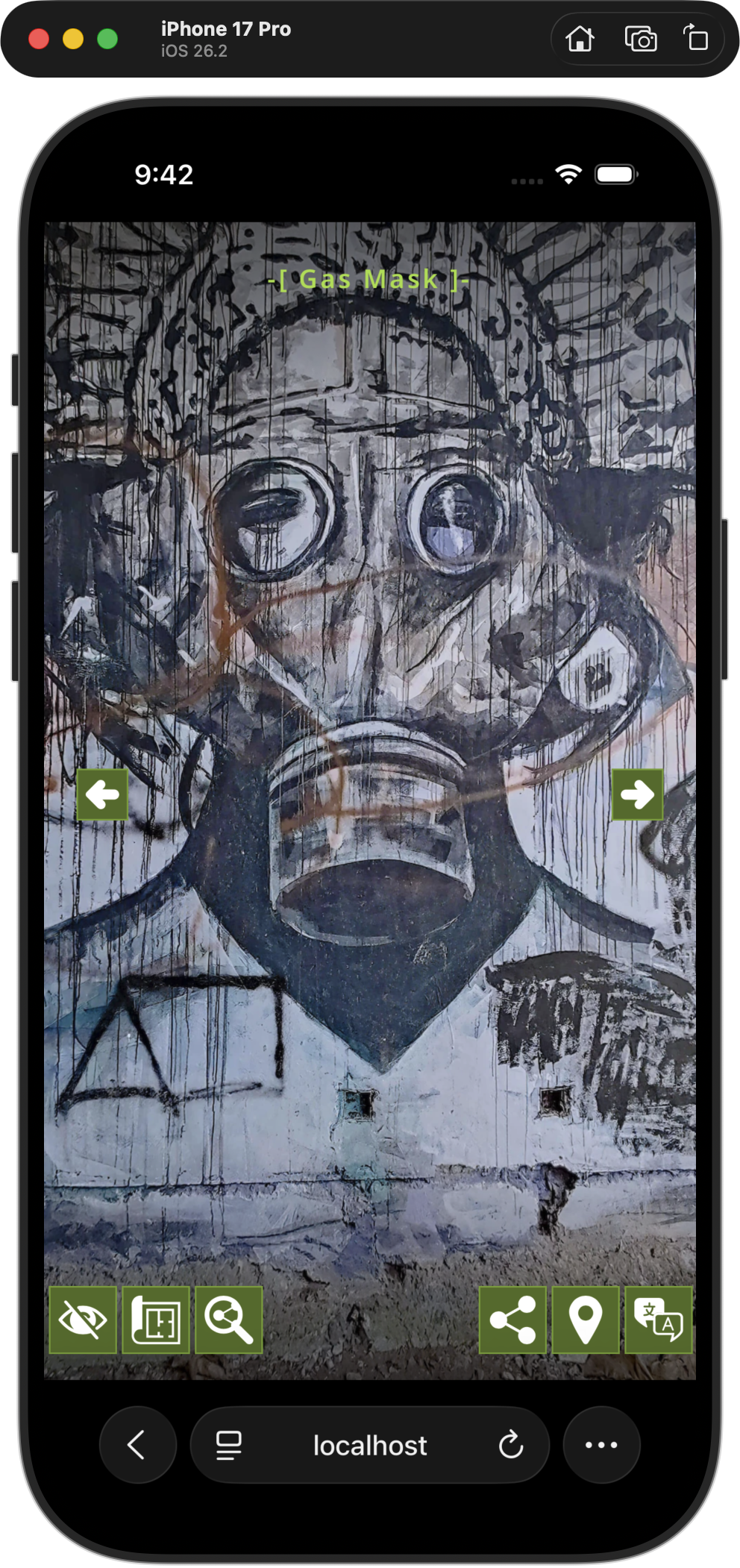
iphone in Explore Mode
Landscape Option A: Pure Viewfinder The moment the smartphone is rotated, as in landscape, the interface is hidden, as the goal is pure immersion. I’ve cleared the "chrome" of the UI to give an unobstructed window into the space. No distracting buttons, no overlapping menus—just the panorama, edge-to-edge allowing the user to fully experience the 360˚ panorama.
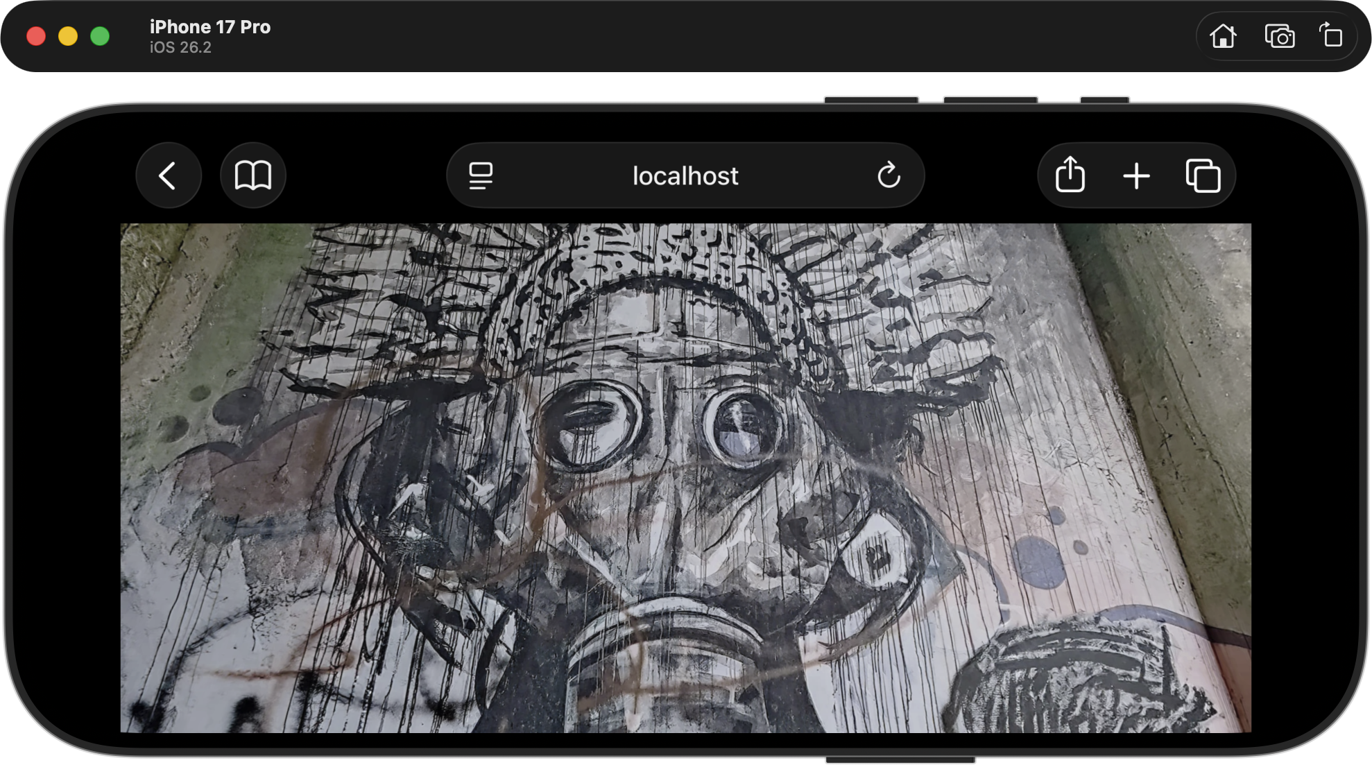
iPhone in Landscape Option A: Pure Viewfinder
Landscape Option A: Simple Tour
As part of the development there is the option to add a simple interface element consisting of a previous next button. This allows users to navigate through the tour node by node.
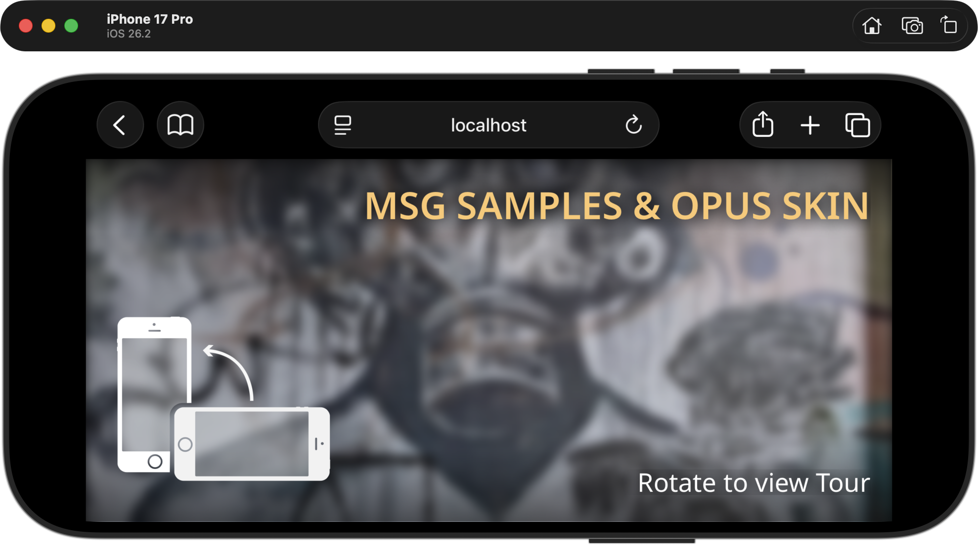
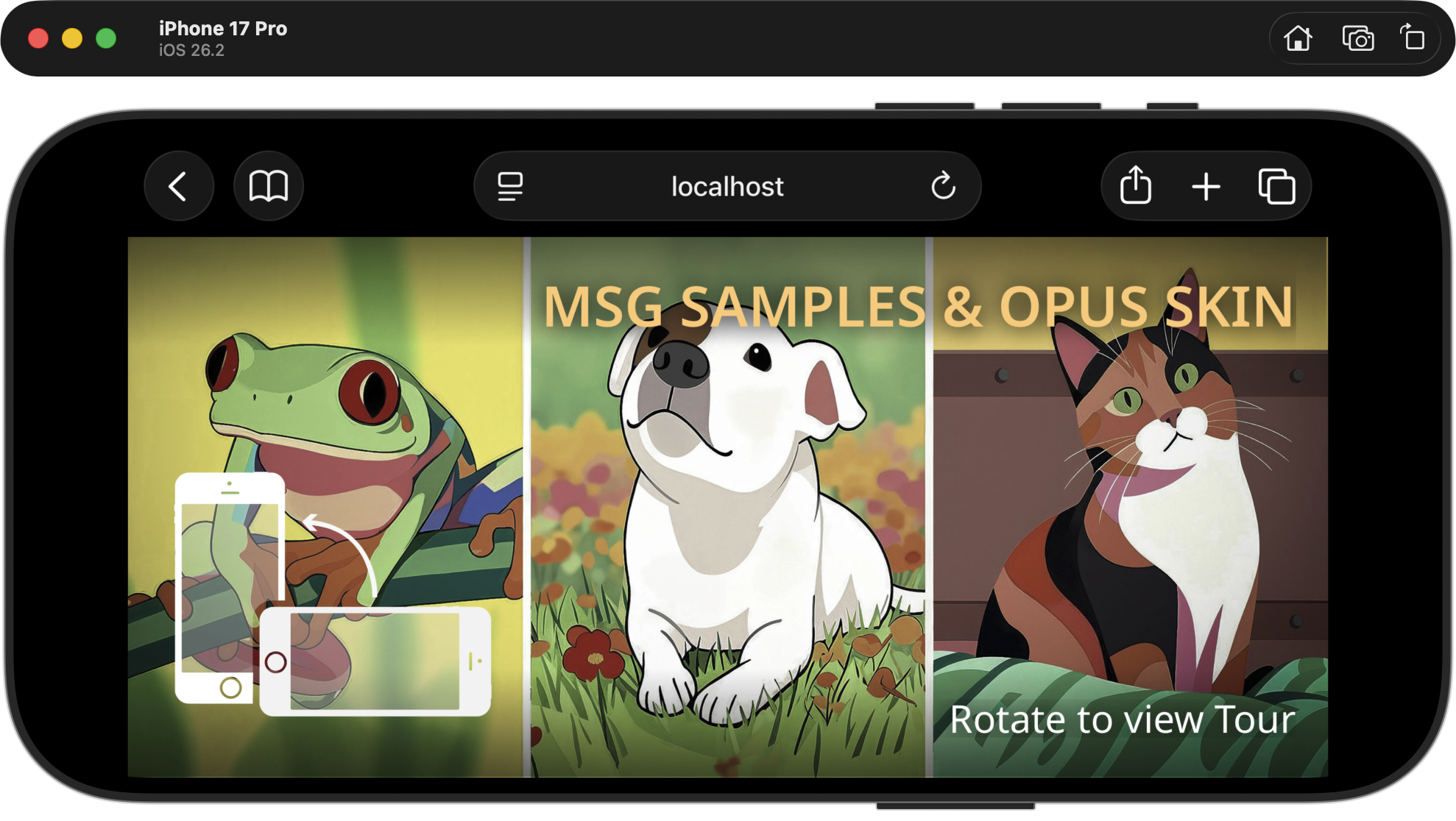
Landscape Option B: The Guided Transition (The "Rotate" State) As an alternative option a "Guided" landscape view can be implement . In this mode, the screen shows a custom image or current node, stylized by a CSS filter—such as a blur, tint, or saturation shift. This can be overlay with a headline, and a clear visual prompt like "Rotate to View Tour." This prompts the user to get the full interactive experience by rotating the device.
iPhone in Guided Transition
Seamless Flow
When you want to dive back into the details, a simple rotation of the smartphone brings you to the full interface view at the current node.
By treating the smartphone's orientation as an intentional choice, I maximize the space without sacrificing the utility of the tools.
The Splash Screen & Guided Transition
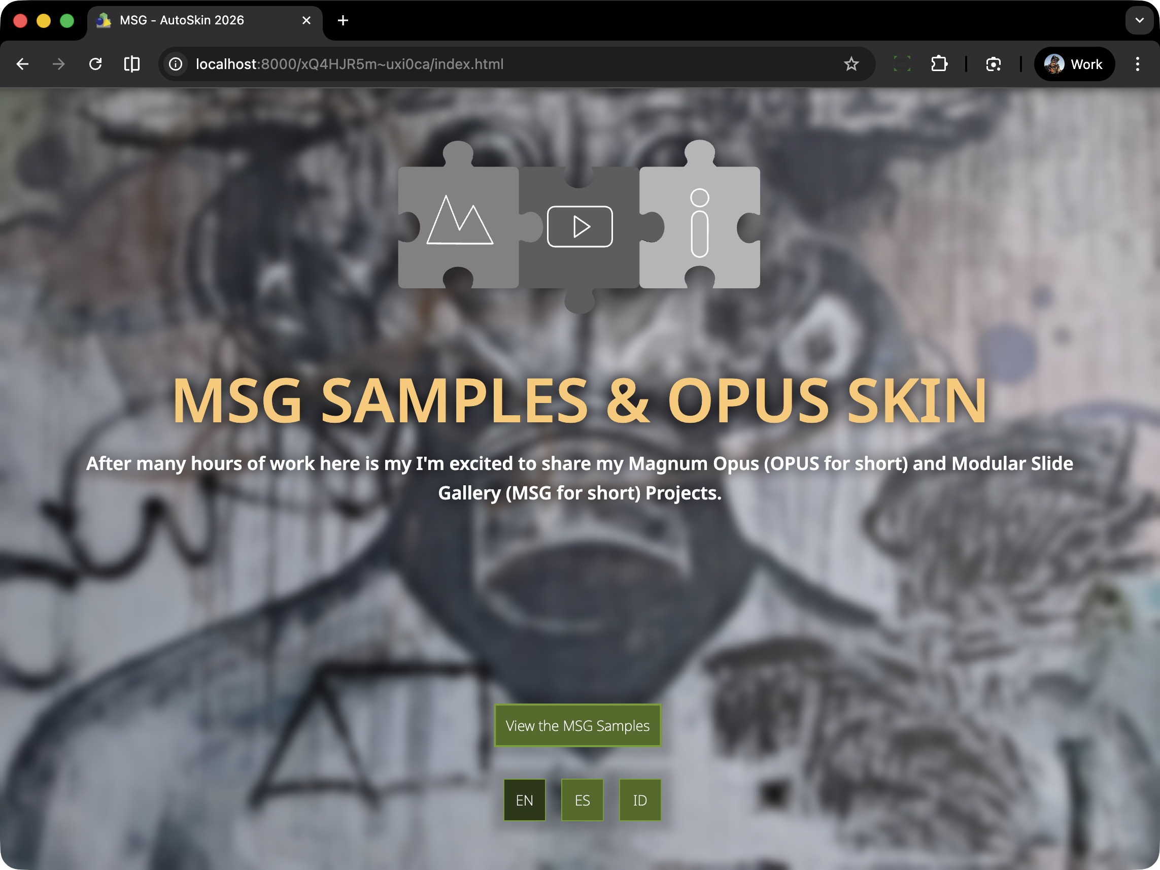
The "Splash Screen" is the entrance to the virtual tour we are building.
In Pano2VR development, it’s often the very first thing we build, and its ubiquity isn't just a trend—technically, this is our handshake with the browser—a necessary step to unlock immersive features like spatial audio and motion sensors.
In the example below the Splashscreen is displaying a full screen image, title, description, “enter” button, logo and language buttons.
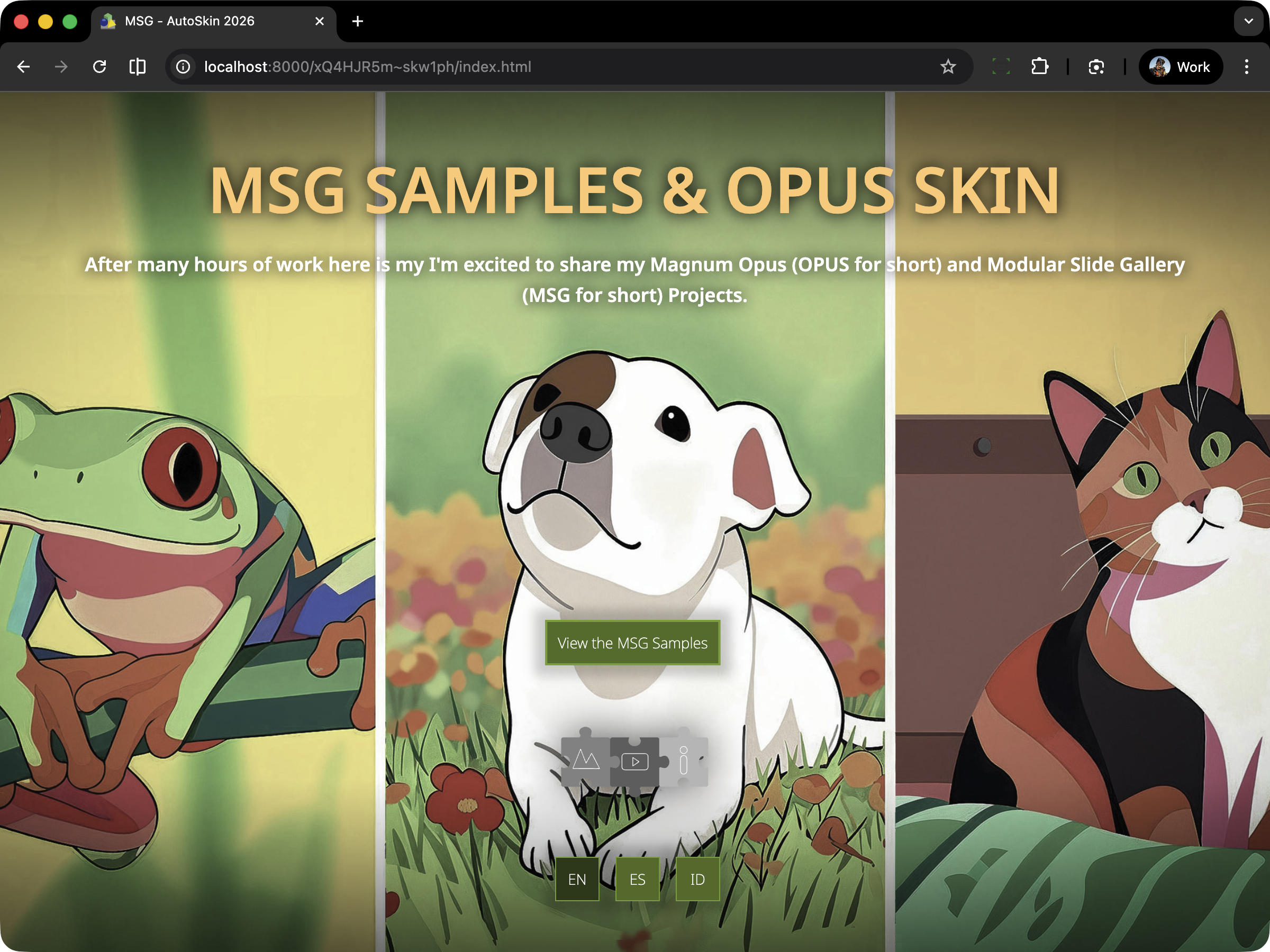
Desktop Splashscreen with fullscreen image
When viewed on a iPad or Tablet the presentation is identical.
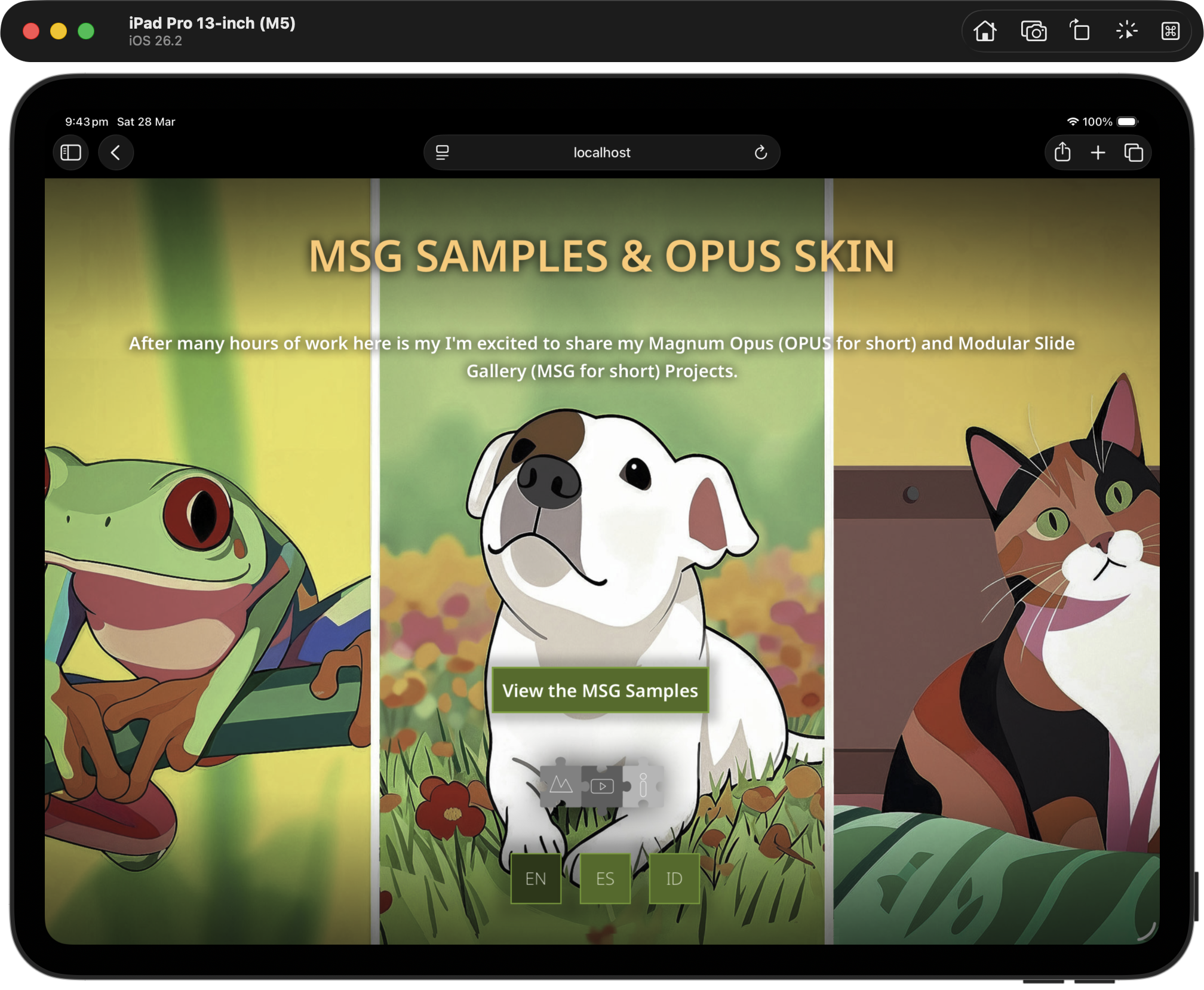
Ipad Splashscreen with Fullscreen image
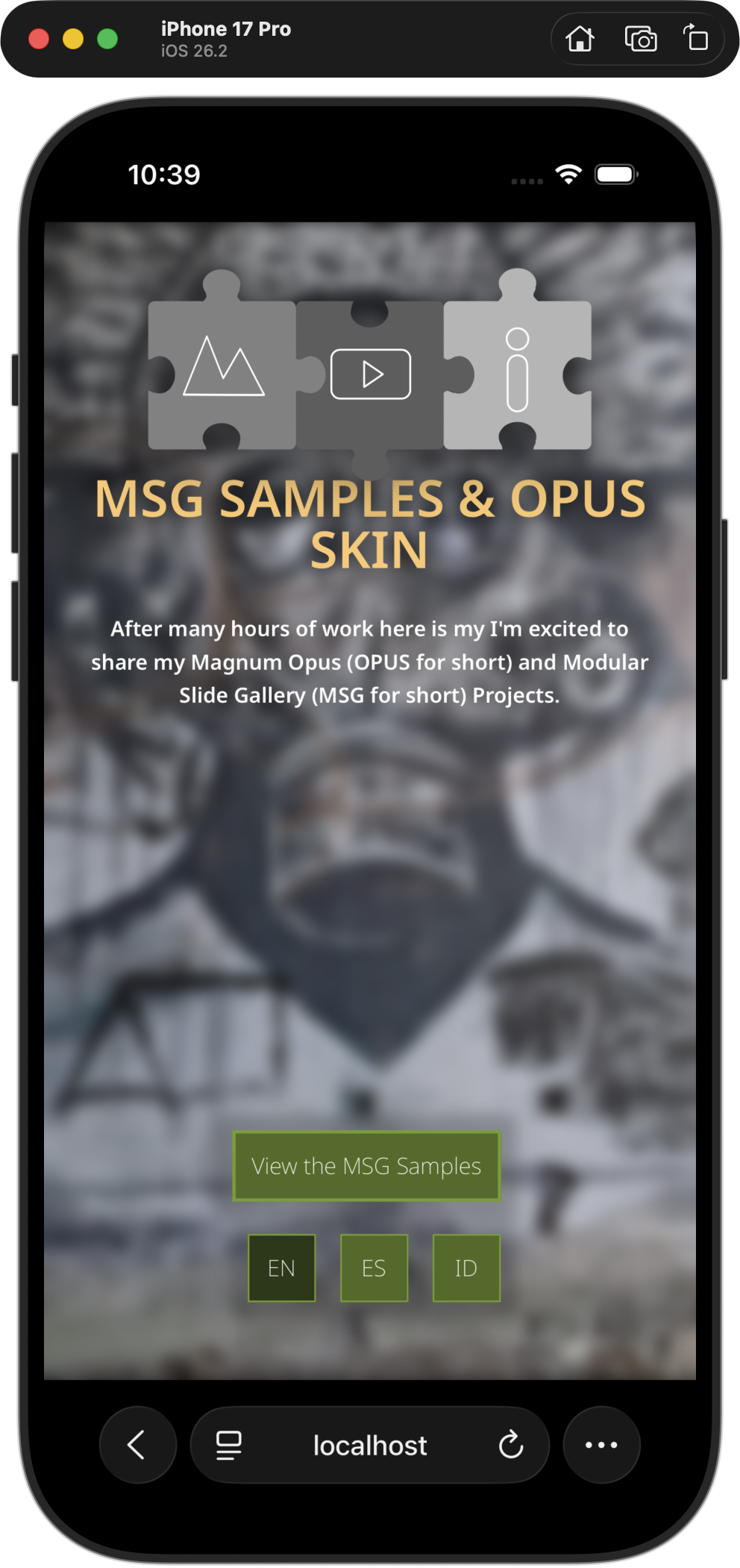
On a Smartphone in portrait mode its very similar however only the central area of the image is visible but for all intents and purposes it’s identical.
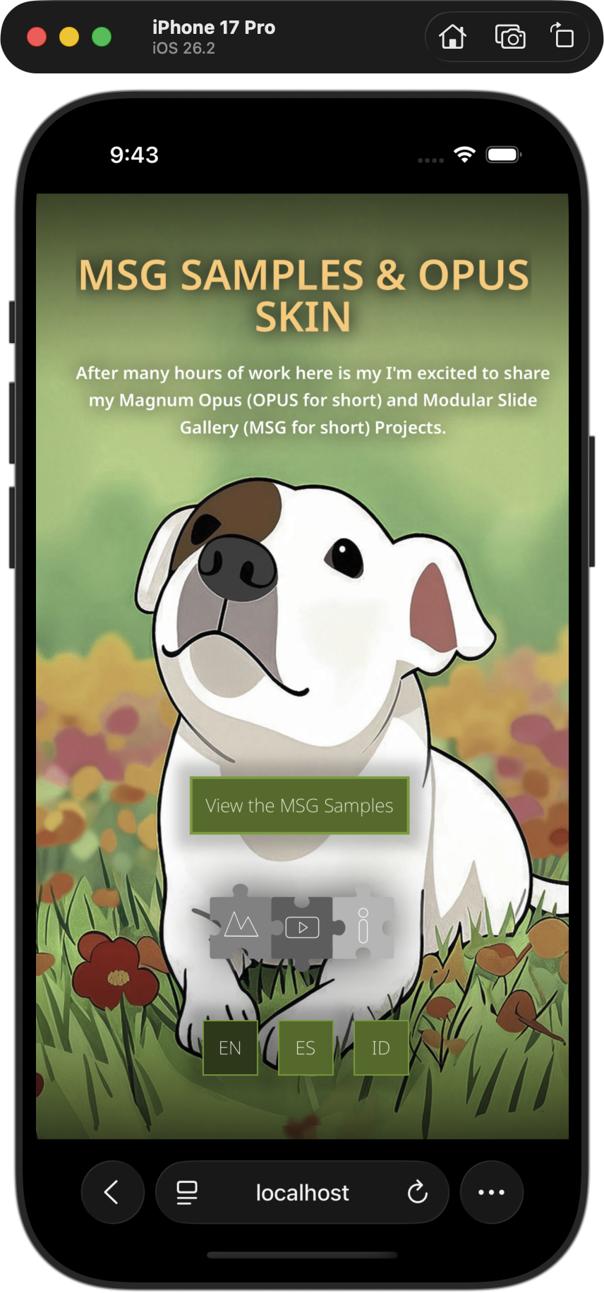
iPhone Splashscreen with fullscreen image
However when viewed in Landscape on the smartphone the available screen size cannot represent all of the elements so the screen automatically displays Landscape Option B: The Guided Transition (Splashscreen)
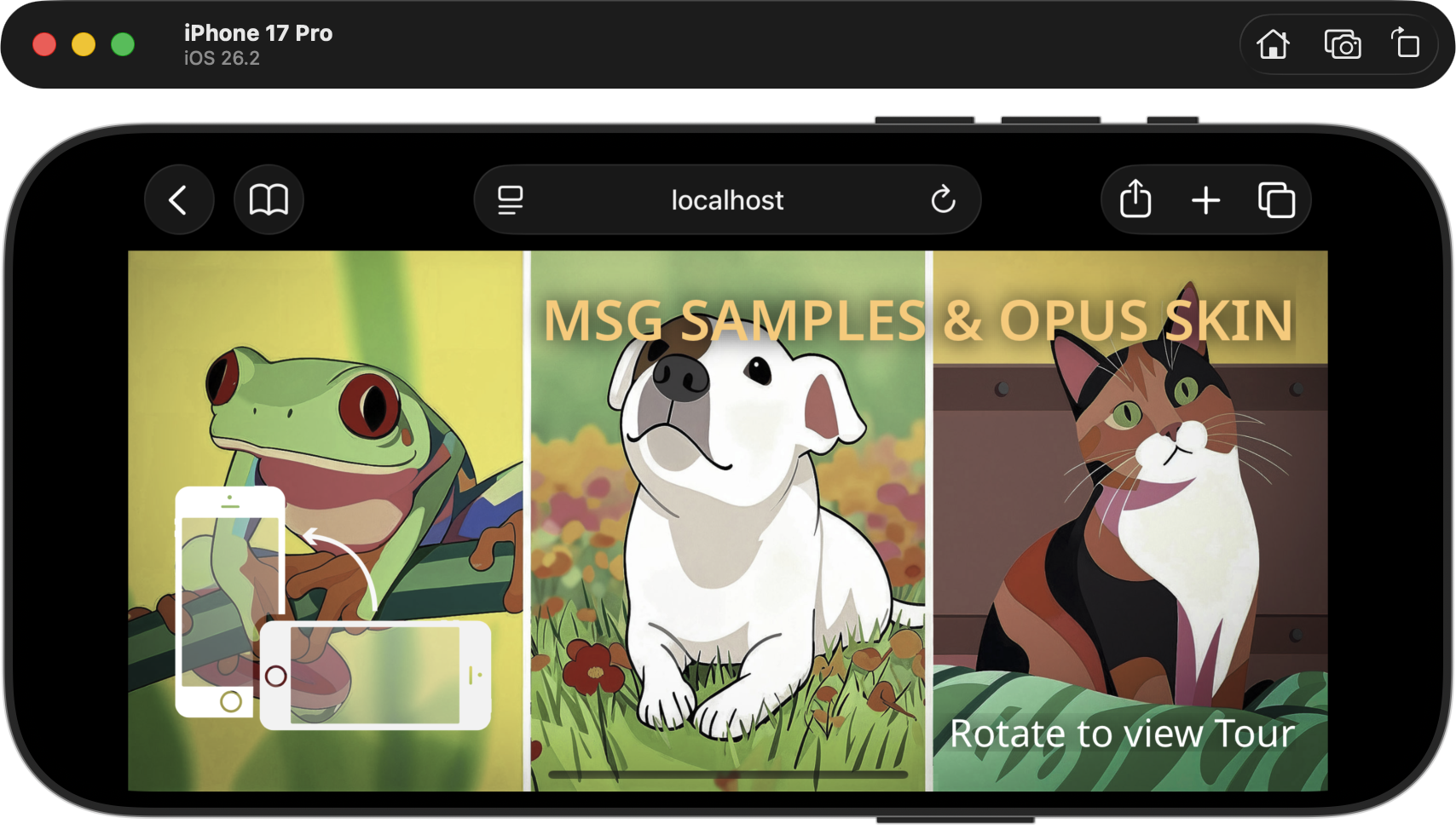
iPhone Splashscreen in Landscape Option B
In the example below an alternate Splashscreen is displaying the first node in the tour, the title and description, the “enter” button, logo and language buttons.
Desktop Splashscreen showing the first node
On a Smartphone in portrait mode its very similar to the desktop version.
iPhone Splashscreen showing first node
However when viewed on a Smartphone the Landscape Option B: The Guided Transition (Splashscreen) now reflects the same visual settings as the desktop splashscreen.