Overview
This “Pano2VR” tutorial show you how to manage textbox button colors and actions using variables in response to a question posted by Andre De Trua on the Pano2VR Users Group page in Facebook.
What Andre wanted to achieve were text field buttons that had different states and actions as follows;
a. Mouseover the button changes the color of the text and the background button color
b. Mouseclick the button makes it active, changes the color and shows several icons
c. Mouseclick the button again deactivates it, hides the icons and resets the colors
d. With one button active clicking another button makes the new button active, changes the color and adds additional icons
e. Clicking an active button deactivates it without affecting any other active buttons
Final Output
Tutorial Files
In the tutorial folder, ‘Managing Textbox Button Colors’, there is an Asset Folder with an equirectangular image ‘Numbered Panos1.png’. There is also a Project folder with a Pano2VR project 'Textbox-Colors.p2vr', a skin 'Textbox-Colors.ggsk' and an Output Folder called 'Textbox-Colors' with project files created from the .p2vr and .ggsk elements. (Figure #1)
Figure #1: Tutorial assets folder
Note: this tutorial is designed for Pano2VR V6.0.6 You can download the software here.
Note: this tutorial assumes a basic knowledge of Pano2VR V6
Note: click on any image in the tutorial to enlarge it
Project Overview
In this tutorial we will modify the Textbox-Colors.ggsk skin by;
Creating Variables that manage the state of the button (active/inactive)
Add logic blocks to manage the visibility of the icons
Add logic blocks to manage the color settings of the text box backgrounds and text colors
Getting Started
1. Download the zipped tutorial folder here
2. Open the project file ‘Textbox-Colors.p2vr’ (Figure #2)
Figure #2: Project window
3. Review the current state of the project by clicking on the ‘generate output’ button in the Output Panel (Figure #3)
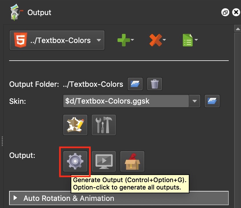
Figure #3: Generate Output button
Note; the output should be same as the example below.
Edit the Skin
Note: at any time during the skin edit you can check the progress by opening the Live Preview window from the main menu bar.
Click on the ‘Edit Skin’ button to open the skin (Figure #4 & 5)
Figure #4: Edit Skin button
Figure #5: Textbox-Colors skin
2. Add two variables to the skin (Figure #6)
1. Name = btn_1_house | Type = True/False | Init Value = false
2. Name = btn_3_house | Type = True/False | Init Value = false
Figure #6: 2 Variables added to skin
Note: these variables will be used throughout the skin in logic blocks to control colors, and the visibility of objects.
3. In the Tree there are two containers, 1-house and 3-houses they contain the graphics that appear when a button is selected. The relative variable will be used to change the alpha value of the container.
4. Select the first container, 1-house, to make it active and in the Properties > Appearance Panel set the Alpha to 0.000 (Figure #7)
Figure #7: Set container Alpha value
5. Click on the Alpha logic block button to open the Logic Block Settings window. Set the following conditions and then click ‘OK’ (Figure #8)
Trigger > Variables: *btn_1_house
Comparison: =
Value: true
Alpha: 1.000
Transition: check enabled | Time 1.00 seconds
Note: in the text button we will be added a mouseclick action that sets the value 0f the variable ‘btn_1_house’ to true. Once the value is true the logic block changes the alpha to 1.000 and the container (and contents) will be visible.
Figure #8: Logic Block for the Alpha value of container 1-House
6. Repeat the same actions for the container 3-houses using the Variable: *btn_3_house
7. For the buttons we will start with, button-1-house, select it to make it active and in the Properties > Rectangle Panel double click in the Set Color box to open the Set Color window. Set the value for the Alpha channel: to 0 and click ‘OK’ (Figure #9)
Figure #9: Set button-1-house background color
8. With the element, button-1-house, still selected, click on the Color logic block button to open the Logic Block Settings window.
Note: in this logic block we are going to set the logic to define the button bg color when the MouseClick Action has occurred. We will also set the logic for the button bg color when a MouseOver Action has occurred when the button is not active.
This will require two expressions
In the first expression set the following conditions;
Trigger > Variables: *btn_1_house
Comparison: =
Value: true
Background Color: #bf0000
Click on the Green ‘+’ button to add a new expression and set the following conditions;
Trigger: Mouse: Mouse Over
Comparison: =
Value: true
Operation: And (requires the second line to be filled in)
Trigger: Variables: *btn_1_house
Comparison: =
Value: false
Background Color: #616161
Finish by setting Transition: check enabled | Time 1.00 seconds and then select ‘OK’ (Figure #10)
Figure #10: Color Logic Block settings
9. Repeat steps 7 & 8 for the element button-3-houses using the Variable: *btn_3_house
10. To set the color of the text, in our textbox button, select the element button-1-house to make it active.
Open the Properties > Rectangle > Background Color Logic Block window and select the ‘Copy’ button. Close the window by selecting ‘Cancel’ (Figure #11)
Figure #11: Copy the settings from the Background: Color: Logic Block
11. Open the Properties > Text dropdown panel and click on the Color logic block button to open the Logic Block Settings window. Click on the ‘Paste’ button to paste in the setting copied previously.
Click on the Background Color: box and set the color to #ffffff for both expressions. Click ‘OK’ (Figure #12)
Figure #12: Paste in copied logic, set colors
13. Repeat steps 10 & 11 for the element button-3-houses
14. The final step is to add the Actions to the two buttons. Select the element button-1-house to make it active. Open the Properties > Actions dropdown panel and double click in the Source. Add the following conditions and select ‘OK’
Source: Mouse Click
Action: Set Variable Value
Variable Name: btn_1_house
Operation: Not(⌝)
Figure #13: Set Action for the button
15. Repeat step 14 for button-3-houses
16. Save and close the Skin, save the Project and select ‘Generate Output’
Summary
I hope you have enjoyed the tutorial and it has helped you to achieve the best possible project outcome. If it has please take a second to consider a donation so that I can continue to add more tutorials.
