Overview
"A Modular Cinematic Sidebar is a skin component that uses CSS Grid, Fluid Typography and Pano2VR Skin Elements to create a balanced, app-like experience that intelligently adapts its shape and content based on the viewer's screen ratio."
Practically it is a responsive skin element (rectangle) that contains an image (external image), a responsive side-panel (rectangle) that contains a headline (text box) and body-copy (text box) with dynamic scrollbar, a slide count, support for mp3 audio files. You can also configure rounded corners and a border (figure #1) When you click on the image you open a larger size version. (figure #2)
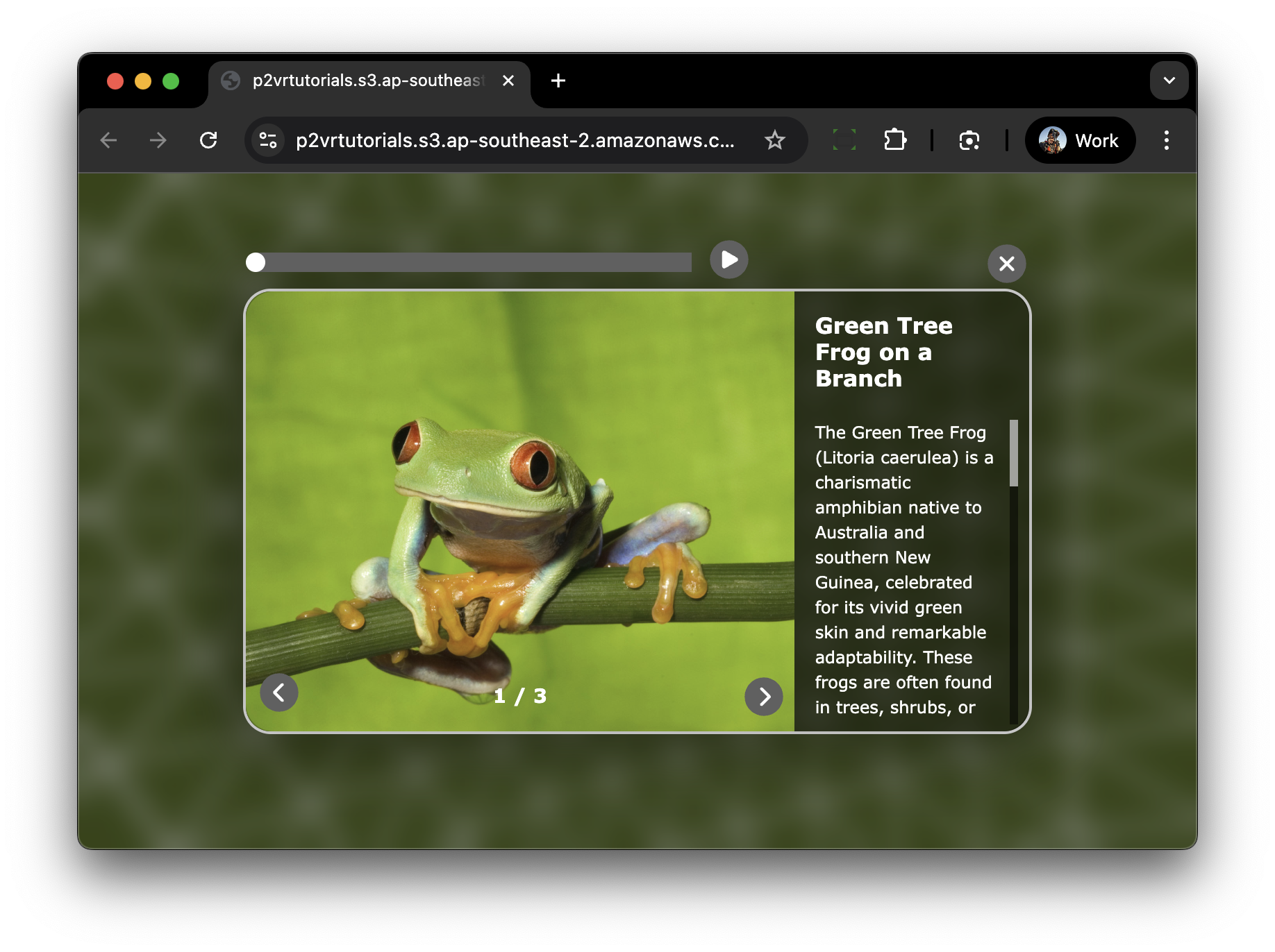
Figure #1: Popup showing image, Headline, Text, Audio and Slide Count
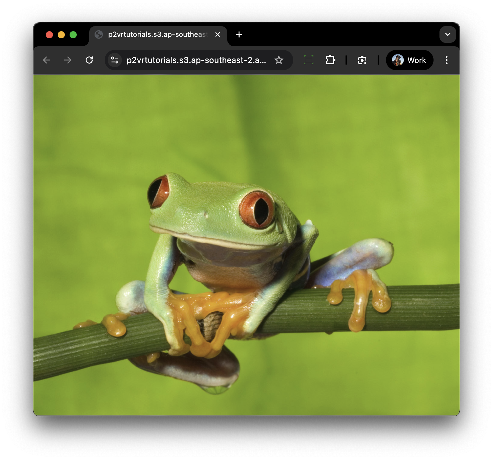
Figure #2: Large version of the image
The key component is the responsive side-panel that has a body-copy element that resizes based on the size of the header element. In the examples below the second image has a header with more text dynamically the body-copy resizes to accomodate the larger header.(figure #3 & 4)
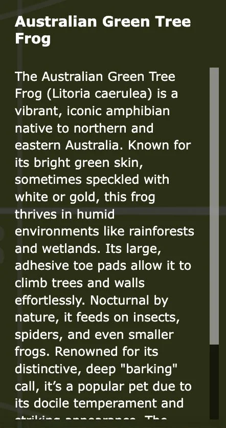
Figure #3: Version 1
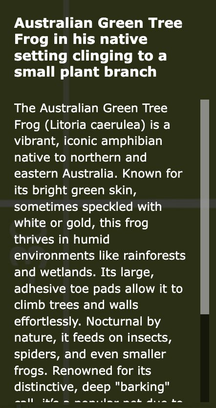
Figure #4: Version 2
This method utilizes CSS Grid for layout and Modular Code Elements to manage typography and layout as can be seen in the portrait aspect ratios of the browser and iPhone 15 Pro. (figures #5 & 6)
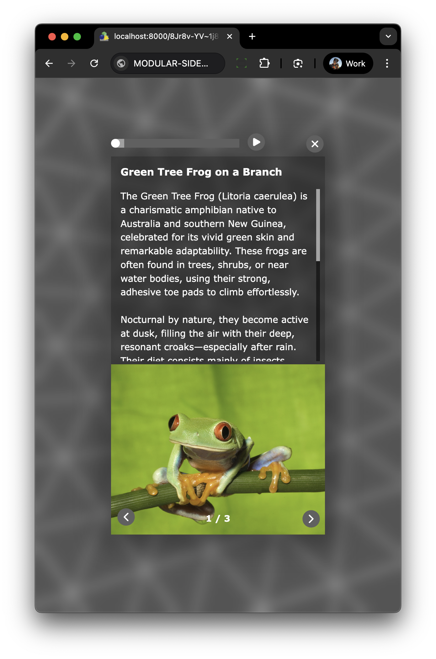
Figure #5: Portrait in browser
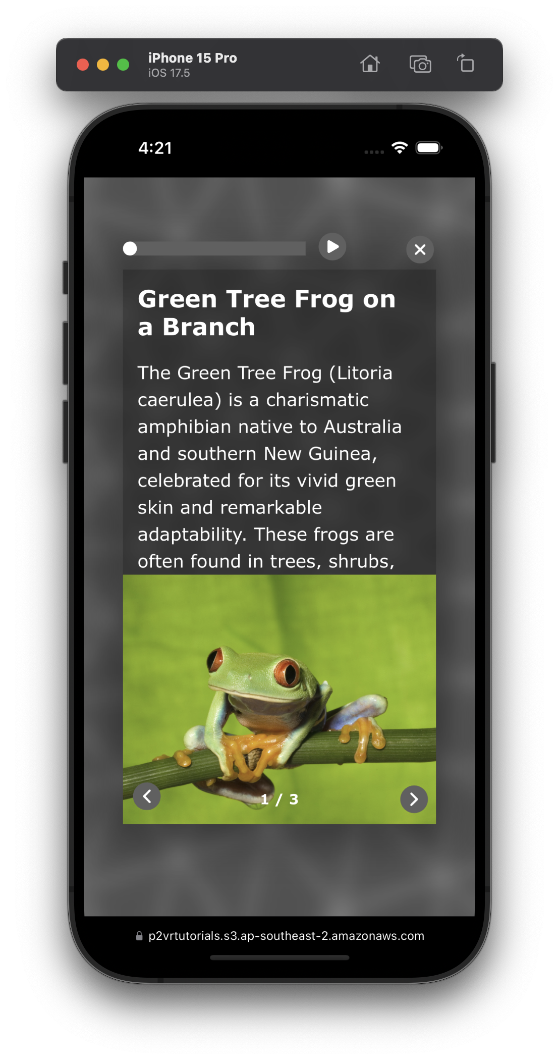
Figure #6: Portrait in iPhone 15 Pro
All Data entry for the component is done via Custom Properties as shown in the image below. Using the “pipe” symbol to delineate the different images, titles, body copy and audio. (figure #7)
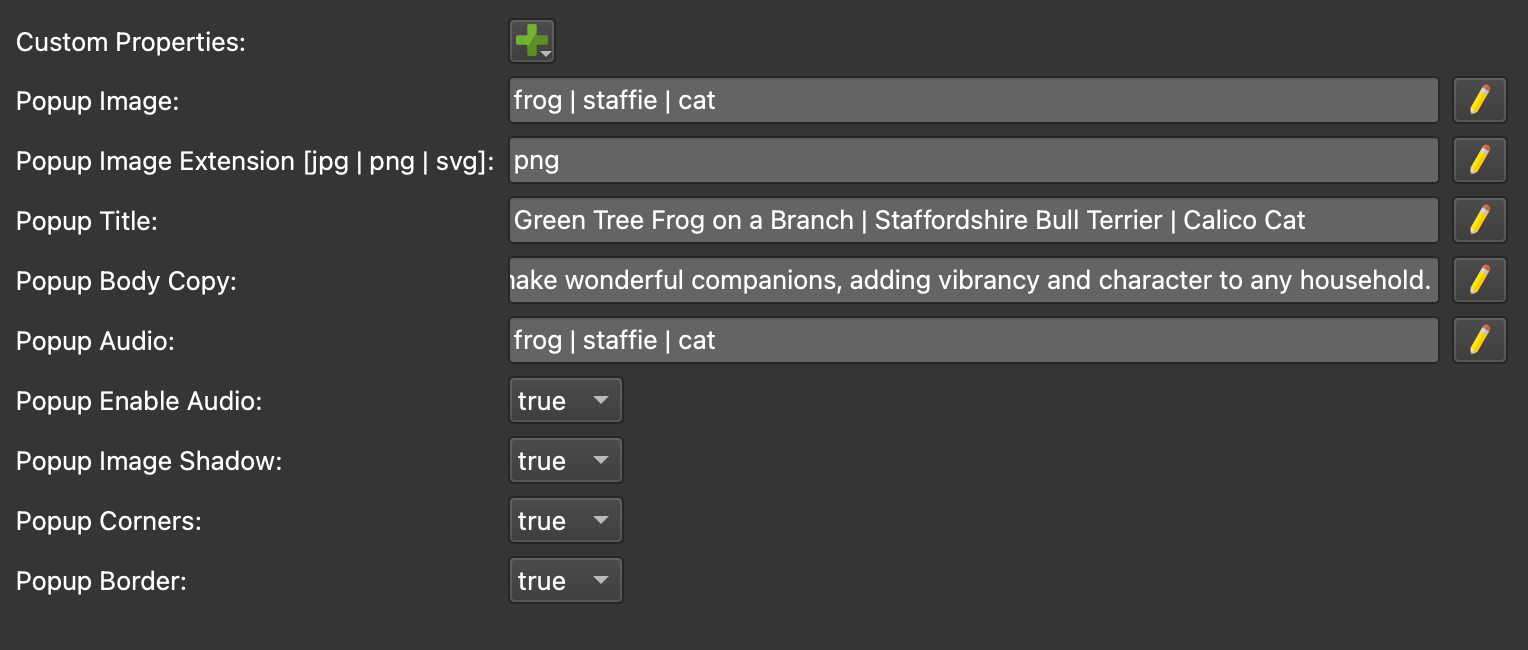
Figure #7: Custom Properties
An expanded view of the Popup Body Copy - Enter Text field (figure #8)
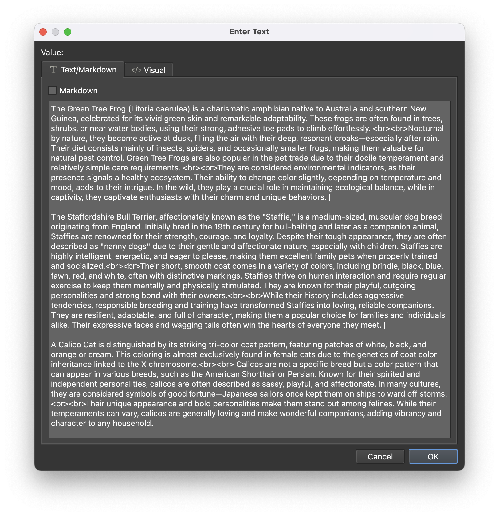
Figure #8: Body copy data for the Frog, Staffie and Cat gallery
Finished Output
Note: for now I’ve removed the tutorial as the component has changed significantly in the past few days with redeveloped CSS and Javascript. I’ll be updating the project in the next couple of weeks and I’ll post on the Pano2VR & Object2VR Users Group in Facebook and on the Pano2VR forum when it’s available.
Summary ⇑
"Hey there! 👋 If my tutorials have made your tech life a little easier (or a lot less confusing) consider buying me a virtual coffee ☕️ or even lunch 🍔 Retirement means more time to help you, but sadly, less income for snacks. Click the Donation button 🙌 and thanks for the love!"
