Overview
"Lottie animations bring life to virtual tours, but they often arrive with colors that don't match our brand or client needs. In this two-part series, we are going to unlock the power of CSS to take total control over our icons. We’ll move from simple 'One-Click' global changes to surgical, layer-by-layer customization—all without ever having to use external editing tools."
Tutorial 1: Focus: Speed, Simplicity, and Interaction.
Tutorial 2: Focus: Precision, Control, and the 'Deep Dive'.
"Ready to go deeper? Sometimes a global change isn't enough—you might need the 'Check' in a checkbox to be white while the 'Box' stays blue. In this second tutorial, we will do a deep dive and learn how to open the hood of a Lottie JSON file. You will learn how to identify specific 'Elements' (layers) and target them individually with CSS, giving you the power to create multi-colored, complex branded animations."
Note: this tutorial is designed for Pano2VR V7. You can download the software here. In following these tutorials a working knowledge of Pano2VR is an advantage.
Note: Click on any image to enlarge it
Final Output
Tutorial Files
The tutorial folder contains all the required files to complete the tutorial. There is a Pano2VR project and a skin file. The Asset folder includes an equirectangular file and the lottie .json. (Figure #1)
If you are carrying on from Part 1 your Tutorial File folder will look like (figure #1) if you are starting at Part 2 it will look like (figure #2)
Figure #1: Tutorial Folder with Project 1 files
Figure #2: Tutorial Folder
Project Overview
In this tutorial, we will modify the lottie_color_change.ggsk project file by;
Step 2. The Visual Audit ⇑
Before touching any code, lets look at the Lottie icon and break it down into its physical parts.
1. Open the Project
2. Publish the Project (figure #2)
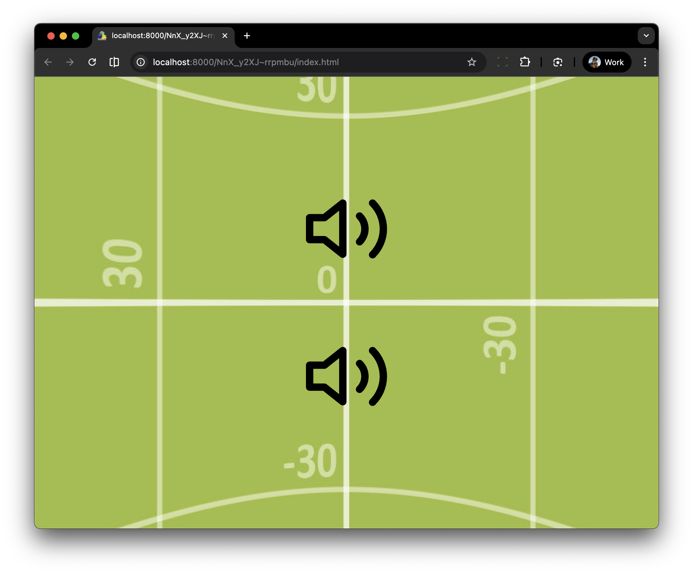
Figure #2: Unmodified Lottie Files
After publishing the project, we can visually identify three distinct elements:
1. The Speaker Body
2. Small Sound Wave
3. Large Sound Wave
Step 3 - Identify the layers in the Lottie ⇑
Before we start, Lottie code is a set of mathematical instructions that tells a player exactly how to draw, move, and color shapes in real-time and it’s going to be messy!
Decoding a Lottie JSON can feel like reading the Matrix, but it's actually very hierarchical.
Lottie code is JSON (JavaScript Object Notation). It is designed to be read by computers, not humans. It uses short abbreviations (like
"ty": 4for "Shape Layer" or"o"for "Opacity") to keep the file size as tiny as possible. Here are som of the more common abbreviations.
nm|Name = The label given to the layer in After Effects (e.g., "Wave 1").
ind|Index = The layer's position in the stack (Layer 1, Layer 2, etc.).
ks|Keyframes = The "Transform" data: Position, Scale, Opacity, and Rotation.
ty|Type = The kind of layer (e.g.,4means a Shape layer).
itItemsThe specific shapes inside a group (Paths, Fills, Strokes).
fl|Fill = The color property for the inside of a shape.stStrokeThe color and width of the outline of a shape.
v|Version = The version of the Lottie creator (e.g., 5.5.7).Note: In order to change the colors for an individual element, we must identify it in the JSON code and ensure it has a CSS Hook. This is usually done by naming the layer (nm), but we can also manually inject a Class attribute (cl) into the code. This gives us a 'handle' to grab with our CSS in Pano2VR."
In this tutorial we will inject a Class attribute as the CSS will be simple and easy to read.
1. Duplicate your copy of Line Sound Icon Animations.json as a backup.
2. Open the Line Sound Icon Animations.json document in a text editor (I’m using Xcode but you can use any plain text editor) (figure #3)
Figure #3: Line Sound Icon Animations code
Note: In a Lottie JSON file, the entire animation is broken down into an array called
"layers". To find our three elements, we just need to look for the"nm"(Name) key inside each layer block.
2. In your text editor do a find on nm (figure#4)
Figure #4: Search results for nm
We can see that there are a number of ‘nm’s’ highlighted in the code for example; ”nm”: ”Wave 2”, “nm”: “Path 1”, “nm”: ”Fill 1” and “nm” : “Volume”
In order to add a “cl” it needs to be immediately after the “nm” (name) and the “nm” needs to be the Layer Name. With so many “nm’s” how do we know which ones are the layer names?
The structure of a layer goes like this:
{ // Start of Layer 1
"ddd": 0,
"ind": 3, // <--- This is the Index (Layer 3)
"ty": 4,
"nm": "Wave 2", // <--- This is the Layer Name
Knowing this, we can modify our search using "ddd":0,"ind" and it will only identify the layer names.
3. In your text editor do a find on "ddd":0,"ind" (include brackets) (figure#5)
Figure #5: search results for "ddd":0,"ind"
Step 4 - JSON Surgery ⇑
Now we can clearly identify the layer names and add our “cl” tags.
Note: To perform this "JSON surgery" without breaking the animation, you have to be very careful with commas. JSON is like a house of cards—if one comma is missing or in the wrong place, the whole file fails to load.
You only need to perform surgery on layers that need to behave differently than the rest. If you want the whole icon to stay Red, leave it alone! If you want the 'Waves' to be Gold while the 'Speaker' stays White, those are the layers that need a Class hook."
4. Add the “cl” class instance immediately after the “nm” tag
For example:
{"ddd":0,"ind":1,"ty":4,"nm":"Wave 2",sr":1, … becomes:
{"ddd":0,"ind":1,"ty":4,"nm":"Wave 2","cl":"wave-2","sr":1, …
{"ddd":0,"ind":2,"ty":4,"nm":"Wave 1",sr":1, … becomes:
{"ddd":0,"ind":2,"ty":4,"nm":"Wave 1","cl":"wave-1","sr":1, …
{"ddd":0,"ind":3,"ty":4,"nm":"Volume",sr":1, … becomes:
{"ddd":0,"ind":3,"ty":4,"nm":"Volume","cl":"speaker","sr":1, … (figure #6)
Figure #6: nm’s with cl’s
5. Save the file as Line Sound Icon Animations Updated.json
Step 5 - From Global to Custom Control ⇑
1. Open the project
2. Open the skin
Note: if you are carrying on from the 1st Tutorial it will be lottie_color_change_part1_blue.ggsk, if not, it will be lottie_color_change_part1.ggsk.
As we have modified the JSON code the first thing we will need to do is update the Lottie already in the skin that we will be targetting.
3. Select the lottie-specific element
4. In Properties > Lottie Animation > File: click on “Change”
5. Open the Tutorial folder > Assets and select Line Sound Icon Animations Update.json
6. Save the skin as lottie_color_change_part2_update.ggsk
7. Close the Skin
"Up until now, our Global CSS has acted like a 'floodlight'—one rule that colors every part of every icon at once. In this tutorial, we are switching to 'laser' focus. By adding specific CSS classes (hooks) inside our Lottie JSON files, we can override our global rules. The best part? Our global scaling and transitions will still work perfectly, but you will gain the power to brand individual components, like speakers and waves, with their own unique color logic and interaction states."
1. Open the lottie_color_change_part2_updated.ggsk skin
2. Open the Lottie-CSS Enter Value window and update the Global CSS code with the bolded Custom CSS code below (figures #7 & #8)
Note: if you haven’t done Part 1 open the skin lottie_color_change_part1.ggsk
/*!
<style>
/**
* LOTTIE THEMED CUSTOM TEMPLATE
* 1. .lottie-global handles the physical behavior.
* 2. .theme-custom acts as the 'Logic Block' trigger for custom colors.
*/
/* 1: PHYSICS & GLOBALS */
/* Target the container class instead of raw svg for better control*/
.lottie-global {
display: inline-block;
transition: transform 0.3s ease-out, fill 0.2s ease !important;
transform-origin: center center !important;
cursor: pointer;
}
/* Base Scaling */
.lottie-global:hover {transform: scale(1.1) !important;}
.lottie-global:active {transform: scale(0.95) !important;}
/* 2: GLOBAL COLOR */
/* Global default for ANY lottie with the .lottie-global class */
.lottie-global svg path {
fill: red;
}
/* THE CUSTOM THEME: Only applies if the Logic Block adds 'theme-custom' */
.theme-custom .speaker path { fill: lime !important; }
.theme-custom .wave-1 path { fill: red !important; }
.theme-custom .wave-2 path { fill: blue !important; }
/* 3: HOVER COLORS */
/* Global Hover */
.lottie-global:hover svg path {
fill: lime;
}
/* CUSTOM Hover: Specific to the theme */
.theme-custom:hover .speaker path,
.theme-custom:hover .wave-1 path,
.theme-custom:hover .wave-2 path {
fill: white !important;
}
/* 4: THE PRESS EFFECT */
/* Global Blue Press */
.lottie-global:active svg path {
fill: blue !important;
transition: fill 0.05s ease !important;
}
/* CUSTOM PRESS: Ensuring specific hooks also turn color on click */
.theme-custom:active .speaker path,
.theme-custom:active .wave-1 path,
.theme-custom:active .wave-2 path {
fill: black !important;
}
</style>
*/
Figure #7: “Blue” version code from Part 1
Figure #8: Global and Custom code
Here is the breakdown of what each part is actually doing:
Block 1: Physics & Globals (.lottie-global)
This is the mechanical engine. It defines how the element feels when the mouse interacts with it, regardless of what color it is.
.lottie-global: Sets the "anchor point" to the center and creates the smooth 0.3s movement.
:hover { scale(1.1) }: The "scale" effect. It provides instant visual confirmation that the icon is interactive.
:active { scale(0.95) }: The "shrink" effect. It makes the digital icon feel like a physical button being pressed down.
Block 2: Resting Colors
This block defines what the icon looks like when nobody is touching it.
.lottie-global svg path: The Global Default. Every Lottie with the global class starts as Red.
.theme-custom ... path: The Custom Override. If your Logic Block adds the .theme-custom class, the "Red" is ignored, and the specific layers (Speaker/Waves) take on their unique colors (Lime/Red/Blue).
Block 3: Hover Colors
This defines the "Highlight" state.
.lottie-global:hover: Global standard icons turn Limegreen.
.theme-custom:hover: For your custom-themed icons, you’ve set all parts (Speaker and Waves) to turn White. This creates a very clean, high-contrast "lit up" look.
Block 4: The Press Effect
This is the "Acknowledge" state. It tells the user the click was registered.
.lottie-global:active: Standard icons turn Blue.
.theme-custom:active: Your custom icons turn Black.
Why it works: Because these rules are at the very bottom of the CSS and use !important, they "win" the color battle during the click, ensuring the user sees a clear change from the hover state.
3. Select OK to close the window
4. Select the lottie-global element
5. In the Properties > Advanced > CSS Classes enter lottie-global
6. Select lottie-specific element
7. In the Properties > Advanced > CSS Classes enter theme-custom
8. Save the skin as lottie_color_change_part2_g2c.ggsk
9. Close the skin
10. Publish the Project
The top Lottie icon now displays the “Red” color on open, “Lime” color and scale up when the mouse is over and “Blue” color when the mouse is down over the icon.
The bottom Lottie icon displays the “Green, Red, Blue” speaker and waves on open, “White” when the mouse is over and “Black” when the mouse is down over the icon.
(published output below)
Step 6: Color Management Dashboard ⇑
This is the final evolution of a professional workflow. By using CSS Variables, we can create a "Dashboard" at the top of your code. You won't need to hunt through lines of CSS to change a hex or color code; just change the value at the very top, and it updates everywhere (Rest, Hover, and Active states) automatically.
1. Open the lottie_color_change_part2_g2c.ggsk
2. Open the Lottie-CSS Enter Value window and update the Global CSS code with the bolded Custom CSS code below. (figures #9 & #10)
/*!
<style>
/**
* LOTTIE THEMED CUSTOM TEMPLATE
* 1. .lottie-global handles the physical behavior.
* 2. .theme-custom acts as the 'Logic Block' trigger for custom colors.
*/
:root {
/* --- THEME DASHBOARD --- */
--global-red: red;
--global-hover: lime;
--global-press: blue;
--custom-speaker: lime;
--custom-wave-1: red;
--custom-wave-2: blue;
--custom-hover: white;
--custom-press: black;
}
/* 1: PHYSICS & GLOBALS */
/* Target the container class instead of raw svg for better control*/
.lottie-global {
display: inline-block;
transition: transform 0.3s ease-out, fill 0.2s ease !important;
transform-origin: center center !important;
cursor: pointer;
}
/* BASE SCALING */
.lottie-global:hover { transform: scale(1.1) !important; }
.lottie-global:active { transform: scale(0.95) !important; }
/* 2: GLOBAL COLOR */
/* Global default for ANY lottie with the .lottie-global class */
.lottie-global svg path {
fill: var(--global-red);
}
/* THE CUSTOM THEME:
*/Only applies if the Logic Block adds 'theme-custom' */
.theme-custom .speaker path { fill: var(--custom-speaker) !important; }
.theme-custom .wave-1 path { fill: var(--custom-wave-1) !important; }
.theme-custom .wave-2 path { fill: var(--custom-wave-2) !important; }
/* 3: HOVER COLORS */
/* Global Hover */
.lottie-global:hover svg path {
fill: var(--global-hover);
}
/* CUSTOM Hover: Specific to the theme */
.theme-custom:hover .speaker path,
.theme-custom:hover .wave-1 path,
.theme-custom:hover .wave-2 path {
fill: var(--custom-hover) !important; }
/* 4: THE PRESS EFFECT */
/* Global Blue Press */
.lottie-global:active svg path {
fill: var(--global-press) !important;
transition: fill 0.05s ease !important;
}
/* CUSTOM PRESS: Ensuring specific hooks also turn color on click */
.theme-custom:active .speaker path,
.theme-custom:active .wave-1 path,
.theme-custom:active .wave-2 path {
fill: var(--custom-press) !important;
}
</style>
*/
Figure #9: Global and Custom code
Figure #10: Color management dashboard code
3. Select lottie-specific element
4. In the Properties > Advanced > CSS Classes enter lottie-global theme-custom (figure #11)
Figure #11: Multi-Classing
Note: This is one of the most powerful features of CSS, called Multi-Classing.
In the Pano2VR "CSS Classes" field, you aren't limited to just one name. You can type lottie-global theme-custom (separated by a space). When you do this, the browser treats that element like a person wearing a Uniform (the global physics) and a Name Tag (the specific colors).Why this is better than writing scaling twice in the CSS?
If you decide later that 0.3 seconds is too slow for the animation, you only have to change it once in the .lottie-global section. Every icon—whether it's theme-custom, theme-one, or theme-two—will immediately get that update because they all "inherit" from the global class.
5. Save the skin as lottie_color_change_part2_cmd.ggsk
6. Close the skin
7. Publish the Project
You shouldn’t see any change because we haven’t changed any of the settings just made it easier to update or modify the settings in the future.
Here is the breakdown of how those layers work together:
Theme Dashboard (:root)
This is the "Control Room." Instead of searching through 100 lines of code to change a color, you change it here once.
Logic: We assign names like --custom-speaker to specific colors.
Benefit: It makes the code readable for humans. If a client wants "Brand Blue" instead of "Lime," you change one line at the top, and every hover and active state updates automatically.
1: Physics & Global (.lottie-global)
This block defines the behavior of the button. It is "color-blind"—it only cares about motion.
The "Rest" State: Sets the transition speed (0.3s) so nothing feels jerky.
The "Hover" State (
scale(1.1)): Creates that 10% growth to invite a click.The "Active" State (
scale(0.95)): Creates the "push-down" effect.The "Multi-Class" Secret: Because this is attached to .lottie-global, these movements apply to every icon, even if they have different theme colors.
Base Scaling (Hover & Active)
This section handles the visual feedback during a user's journey.
The Hover Glow: When you hover, the
.theme-customrule changes the internal paths to White.The Click Acknowledge: When you click, the
.theme-custom:activerule turns everything Black.The
!importantFactor: We use this to make sure the "Click" color always wins over the "Hover" color.
2: Resting Colors (Default vs. Surgical)
This section determines what the icon looks like when it's just sitting there.
Global Default: Targets
svg pathto turn every "standard" icon Red.Theme Override: Targets
.theme-customto surgically paint the Speaker, Wave-1, and Wave-2 using the colors from your Dashboard.The Logic: This is where the
.theme-customclass "wakes up" the specific JSON hooks (.speaker, etc.).
How it works in Pano2VR (The Workflow)
HTML Attributes: You type lottie-global in the CSS Classes field. (The icon is now Red and Animates).
Logic Block: You set a condition that adds theme-custom. (The icon now magically switches to your Lime/Red/Blue surgical colors).
Interaction: The user hovers (it grows and turns white) and clicks (it shrinks and turns black).
Step 7: Lottie Logic Block ⇑
Finally the last step is to add another level of control using a logic block to set the lottie class.
1. Select the lottie_color_change_bt element
2. In Properties > Appearance > Visible: = checked
3. Select the lottie-global element
4. In Properties > Advanced > CSS Classes cut the lottie-global
5. Click on the logic block and paste lottie-global into the trigger CSS Classes: field and select OK (figure #12)
Figure #13: CSS Classes Logic Block for lottie-global
6. Select the lottie-specific element
7. In Properties > Advanced > CSS Classes cut the theme-custom
8. Click on the logic block and paste theme-custom into the trigger CSS Classes: field and select OK (figure #13)
Figure #14: CSS Classes Logic Block for lottie-specific
9. Save the skin as lottie_color_change_part2_button.ggsk
9. Close the skin
10. Publish the Project
Now we have a way of using the Lottie in its native form, no color change, or based on changes in the skin in it’s modified color form.
(published output below)
Summary ⇑
"Hey there! 👋 If my tutorials have made your tech life a little easier (or a lot less confusing) consider buying me a virtual coffee ☕️ or even lunch 🍔 Retirement means more time to help you, but sadly, less income for snacks. Click the Donation button 🙌 and thanks for the love!"
