Overview
"Building Virtual Tours that go beyond a simple showing of 360˚ images and incorporate interactive User Elements that enhance the experience are a standard in today’s virtual tours. However managing them to still show the beauty of the panoramas while providing easily accessed links to other elements and nodes within the tour is essential”
The Tutorial
In this first part of the tutorial, we’ll build a dyanmic side bar that slides on and off the screen, via an animated button, containing a menu that provide access to the nodes in the tour.
Note: this tutorial is designed for Pano2VR V7. You can download the software here. In following these tutorials a working knowledge of Pano2VR is an advantage.
Note: Click on any image to enlarge it
Project Overview
In this tutorial, we will be using the following steps;
Final Output Version: Red ⇑
Figure: Tutorial Folder
Setting up the Project ⇑
1. Open the slider_menu.p2vr
2, If the skin is not already added open the skin slider_menu.ggsk
3. Make sure the Output folder is set to Slider_Menu_Output
4. Publish the project
Note; Now all we are going to see is a single panorama #1 and no other user interface elements. This will be our base to develop from.
Banner and Button ⇑
The first step is to create a simple banner element and a button.
Banner Element
1. Open the Edit Skin window
2. Use Draw Rectangle and add a rectangle to the canvas
3. Set the following properties:
Position
Set ID: menu_bg
Set Anchor: top right
Set X: 0 px / Y: :0 px
Set Width: 250 px / Height: 100 %
Rectangle
Set Border: Width: 0 (figure #1)
Fi9ure #1: menu_bg properties
Add the Button Icon
1. Open the Components Toolbox (figure #2)
Figure #2: Components Toolbox
2. From the Feather > Icons list double-click the arrow-right-circle icon (figure #3)
Figure #3: arrow-right-circle icon
3. Click on the Close button and the icon has been automatically added to the Canvas in the top left corner and has an ID Svg 1 (figure #4)
Figure #4: Svg 1 icon
Elements with Animation ⇑
In this section we are going to build the button, position the button in regard to the menu_bg element and then animate the opening of the menu.
1. Add another Draw Rectangle to the skin and set the following properties:
Position
Set ID: menu_slider
Set Width: 45 px / Height: 45 px
Rectangle
Set Border: Width: 0
Set Radius: 60 (creates a circle) (figure #5)
Figure #5: Menu slider element
5. In the Tree, drag the Svg 1 into the menu_slider element (figure #6)
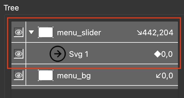
Figure #6: Svg 1 child of menu_slider
6. Select Svg1 and set the following Properties:
Position
Set ID: menu_button
Set Anchor: center
Set X: 0 px / Y: :0 px
Set Width: 45 px / Height: 45 px (figure #7)
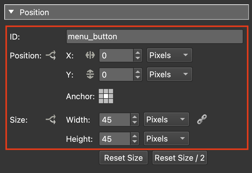
Figure #7: menu_button properties
7. In the Tree select the menu_slider element and drag it into the menu_bg element.
8. Set the menu_slider properties as follows:
Properties
Set Anchor: left-center
Set X: -60 px / Y: :0 px (figure #8)
Figure #8: Menu_slider and menu_button child elements of menu_bg
Note: by adding the button as a child to the menu_bg as the menu moves the button will move with it. Now we will add movement to the menu_bg to bring into the canvas.
9. With the menu_slider element still selected open the Properties > Actions panel and create an action with the following properties:
Source: Mouse Click
Action: Position/Size
Type: Toggle Element Position
Offset X: -250px Y: 0px
Target: menu_bg (figure #9 & 10)
Figure #9: menu_slider mouse action settings
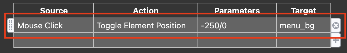
Figure #10: New action
Note: As the menu_bg will initally be off-screen at 0,0 px this will set the distance (-250px) that the menu will move to when it enters on-screen.
10. In the Tree select the menu_button element
11. Open the Properties > Appearance panel
12. Set the Angle = 180.0
Note: as we will start with the menu_bg hidden off-screen the arrow should point to the left. Setting the angle to 180 sets the direction of the arrow element (figure #11)
Figure #11: Set the menu_button angle to 180
Note: When we close the menu_bg we need to reverse this action
13. In the Tree select the menu_slider element
14. Open the Properties > Actions panel and create an new action with the following properties:
Source: Mouse Click
Action: Angle
Type: Toggle Element Angle
Angle: 0.0˚
Target: menu_button (figure #12 & 13)
Figure #12: Sets the direction of the arrow in the menu_button
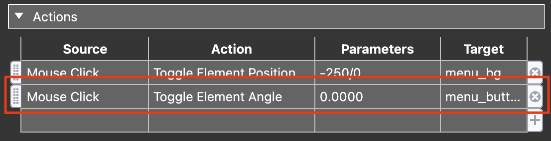
Figure #13: New action
Note: Next we will apply the “bounce” animation to the menu_slider button. This action will reposition the button to overlap the menu and a “Delay” of 1 second allows time for the menu to complete its move onto the screen.
15. With the menu_slider still selected open the Properties > Actions panel and create an new action with the following properties:
Source: Mouse Click
Action: Position/Size
Type: Toggle Element Position
Offset: X: 40 px Y: 0 px
Delay: 1.000sec
Target: menu_slider (figure #14 & 15)
Figure #14: Action settings to reposition the button with a delay of 1 second
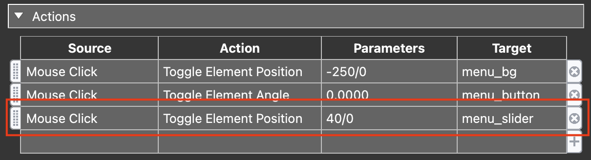
Figure #15: New action
16. In the Tree select the menu_bg element
17. open the Properties > Postion panel and set the position X to -250 px (figure #16)
Note: this will set the start position for the menu_bg off the canvas but the button will still be visible.
Figure #16: Offset the menu
18. Save the skin as slider_basic_button.ggsk
19. Close the skin
20, Publish the project
Menu List ⇑
Continuing on we will start creating the first of the elements that will populate the menu_bg
1. Open the slider_basic_button.ggsk and save it as slider_basic_menu.ggsk
2. Close and re-open the skin
Note: closing and reopening the skin registers it with the project and you can see it in the Output > Skin: field.
3. Use Draw Cloner and add a cloner to the canvas (figure #17)
Figure #17: Draw Cloner
4. Set the following Properties:
Position
Set ID: menu_list
Set Anchor: top left
Set Width: 200 px & Height: 40 px (figure #18)
Figure #18: menu_list position properties
Cloner
Set Clone Direction: Vertical
Set Horizontal: 1 Columns
Set Source: Nodes (figure #19)
Figure #19: menu_list cloner properties
5. Use Draw Text box and add a text box to the canvas (figure #20)
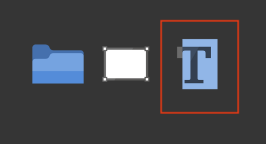
Figure #20 Draw text
6. In the Tree drag the Text 1 element into the menu_list element (figure #21)
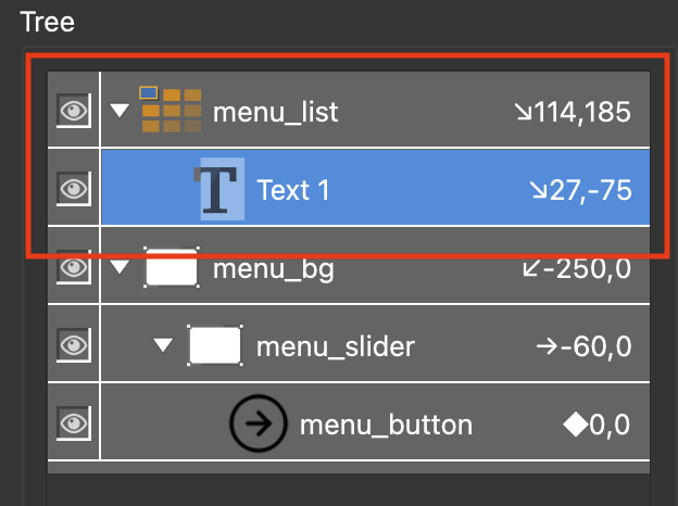
Figure #21: Text 1 child of menu_list
7. With the Text 1 element still selected set the following Properties:
Position
Set ID: menu_list_button
Set Anchor: top left
Set X: 0 px Y: 0 px
Set Width: 100% / Height: 95 % (figure #22)
Figure #22: menu_list_button position properties
Appearance
Set Rectangle > Border: Width: 0 (figure #23)
Figure #23: menu_list_button rectangle properties
and Properties > Text
Text: $(ut) (figure #24)
Figure #24: menu_list_button text properties
Align: Horizontal: Left
Align: Vertical: Center
Padding: 5 - 5 - 10 - 5 (figure #25)
Figure #25: menu_list_button text properties
Note: This is a good time to test the cloner
8. Save the skin and publish the project (figure #26)
Figure #26: Testing the cloner
Note: we can see that each button in the cloner is displaying the Properties > User Data > Titles of each node in the tour. However we can’t use the buttons until we add some actions.
9. In the Tree select the menu_list_button element
10. Open the Properties > Actions panel and create an new action with the following properties:
Source: Mouse Click
Action: Open Next Panorama
URL: Hotspot URL
View: Default View (figure #27 & 28)
Note: in the dropdown URL and View there are different options as to what the next panorama should be and the view when the panorama is opened.
Figure #27: menu_list_button actions
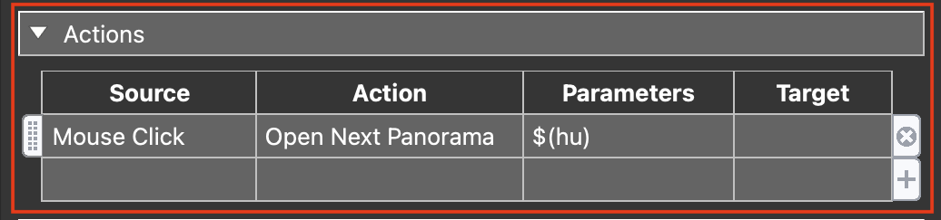
Figure #28: Open Next Panorama action
Note: we don’t want to be able to click on the current node as it would simply reload it. So we will set a modifier to disable clicking on the button that represents the current node.
11. Click on the Action Settings window Action Filter button (figure #29)
Figure #29: Action Filter button
12. In the Action Filter click in the first empty field and from the dropdown select State > Active (figure #30
Figure #30: Setting the Trigger to Active
13. Then set Comparison: = | Value: false (figure #31)
Figure #31: Action Filter settings
14. Select OK to close the Action Filter and OK to close the Action Settings
Note: there is an * next to the Mouse Click source that indicates it has a filter attached (figure #32)
Figure #32 menu_list_button actions with filter
Note: before we test again lets put the menu_list into the menu_bg
15. In the Tree drag the menu_list element into the menu_bg element (figure #33)
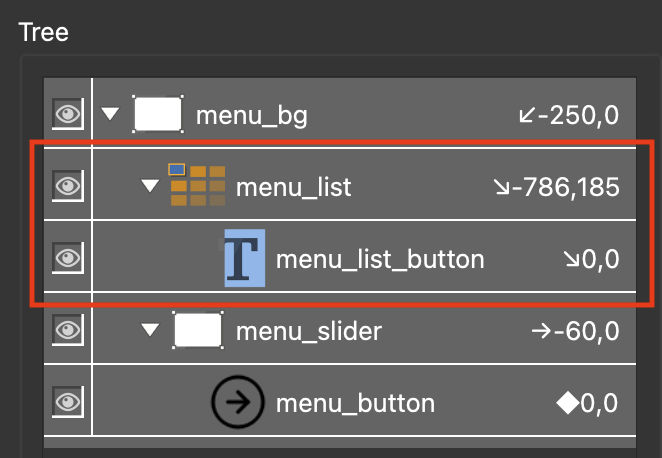
Figure #33: menu_list child of menu_bg
16. Select the menu_list element and set the following Properties > Position:
Set Anchor: top left
Set X: 25 px / Y: 25 px (figure #34)
Figure #34: menu_list postion in menu_bar element
Note: as we have moved the menu_bg element off the canvas it may not be visible. To see the element go to the main application menu item “View” and select the option Show Off-Canvas Elements. Now you will see elements that are positioned off the canvas. You may need to reduce the size of the canvas or make your Skin Editor window larger (figure #35)
Figure #35: Skin Editor showing off-canvas elements at a zoom of 50%
17. Save and close the skin
18. Publish the project
Note: before we move on to Part 2 of the tutorial lets add a couple of small changes that make it easier for us to see the mouse over on the menu buttons and their current state.
19. Open the slider_basic_menu.ggsk
20. Select the menu_list_button and and set the following Properties > Appearance:
Cursor: Hand (figure #36)
Figure #36: Set cursor to hand
21. With the menu_list_button still selected set the following Properties > Rectangle:
Background: Enabled: checked
Click in the Color: box and set the following;
Background: Color: #ababab (light grey) (figure #37)
Figure #37: Rectangle Background settings
22. Click on the Color: Logic Block icon and set the following Logic Block Settings:
Trigger: Active
Comparison: =
Value: true
Background Color: #6b6b6b (mid tone grey) (figure #38)
Figure #38: Background color logic block setting
23. With the menu_list_button still selected change the Properties > Text > Color: to #ffffff (white) (figure #39)
Figure #39: Set text to white
24. Save the skin and republish the project
Note: now the active menu button has a dark background signifying its the active node and it changes as we change nodes.
Summary ⇑
This brings us to the end of Part 1.
In Part 2 of the tutorial we wiil add additional elements to the side bar including a Logo and control buttons. We will also be add variables, creating an Addative logic blocks and exposing variables.
"Hey there! 👋 If my tutorials have made your tech life a little easier (or a lot less confusing) consider buying me a virtual coffee ☕️ or even lunch 🍔 Retirement means more time to help you, but sadly, less income for snacks. Click the Donation button 🙌 and thanks for the love!"
