Simplex & RPGT Interaction
Note: we have added the RPGT Component to the Simplex Skin but they don’t interact with each other. In this example the main requirement is that the Simplex Controller is hidden when the gallery or text popup window is open.
Making the Connection
1. Open the RPGT_Tutorial_Simplex.p2vr project if it’s not already open
2. Open the Skin Editor
3. Click on the controller element to highlight it
4. Open the Properties > Appearance panel (figure #1)
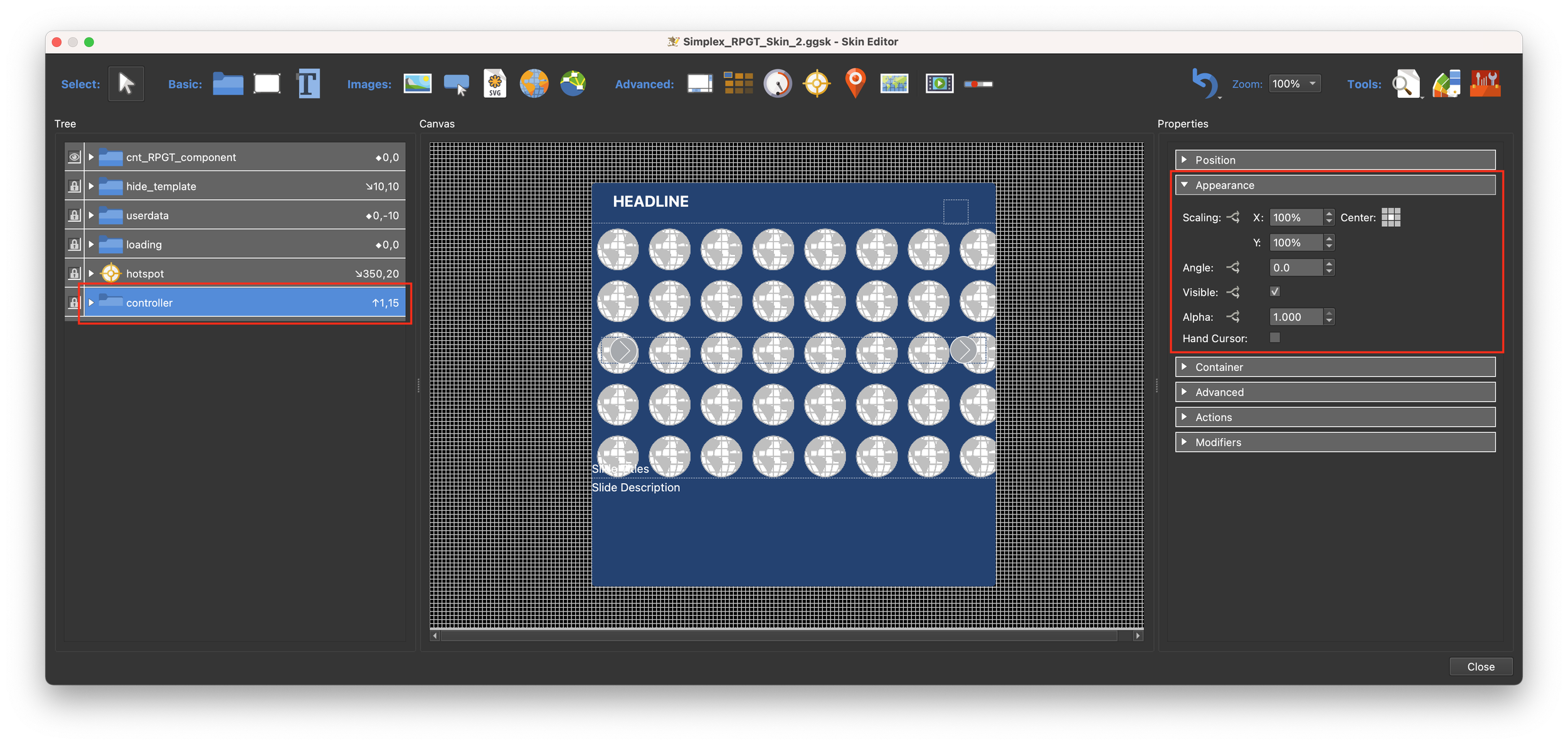
Figure #1: controller and Appearance panel
4. Click on the Appearance > Visible: Logic Block to open the Logic Block window
5. Add a new expression with the Trigger: rpgt_gallery_popup = Value: True then Visible: false
6. Select OK to apply the expression (figure #2)
Figure #2: logic block to control the visibility of the controller element
8. Save the skin
9. Output the project
Note: now when we click on the hotspots and the popup appears the Simplex controller disappears and when we close the popup the Simplex controller reappears.
Variable Previews
Reviewing the Variable Previews
Note: When working on developing a tour skin things can go wrong! Sometimes it’s hard to see what combination of variables are being used at a particular time and what values are being set.
Variable Previews are a great help in debugging your work.
Let’s review the Variable Previews that come with the RPGT Component
1. Open the RPGT_Tutorial_Simplex.p2vr project if it’s not already open
2. Open the Edit Skin Configuration window
3. Check ‘Show Variable Previews (Debug): and ‘Show Floating Tooltip’ (figure #1)
Figure #1: Check ‘Show Variable Previews (Debug): & Floating Tooltip
4. Output the project
Note: In the left top corner of the screen are a set of skin elements that display information on the value and appearance of elements used in the RPGT Component.
The information can be broken down into two types ‘values’ and ‘change appearance’ (figure #2)

Figure #2: On screen variable previews
Values
Note: the first 6 variable previews display information relevant to the content and status of the gallery popup.
For example if we click on the Australian Nature hotspot we see the following;
Gallery Folder Name= nature
Number of Slides = 1
Current slide = 1
Description = 1
Image type = jpg
Popup type = gallery. (figure #3)
Note: If we click on the Australian Outback hotspot we see the following;
Gallery Folder Name = outback
Number of Slides = 3
Current slide = 1
Description = 2
Image type = jpg
Popup type = gallery (figure #4)
Figure #3: Australian Nature values
Figure #4: Australian Outback values
Note: the remaining variable previews show the current status either True or False of the elements in the skin. All of the variables are global. For example if ‘Show Individual Descriptions’ = true then all galleries will show individual descriptions.
These previews also have a switch, the black box to the left, clicking on this will change the value from True to False or vise versa.
4. Open the Australian Outback gallery and click the button next to ‘Show Individual Descriptions’.
Note: the preview changes color to red and the value changes to false. At the same time the individual description is hidden and the global description is shown.
Figure #5: Show Individual Descriptions: true
Figure #6: Show Individual Descriptions: false
4. Click the button next to ‘Show Titles Visible’
Note: the preview changes color to red and the value changes to false. At the same time, the slide title is hidden
4. Click the button next to ‘Slides Holder Visible’
Note: the preview changes color to red and the value changes to false. At the same time, the slide image is hidden and the gallery popup changes to a text popup
4. Click the button next to ‘Responsive Popup’
Note: the preview changes color to red and the value changes to false. At the same time, the the text popup becomes a fixed size.
4. Click the button next to ‘Slides Holder Visible’
Note: the preview changes color to red and the value changes to false. At the same time, the slide image is revealed and the gallery popup box becomes a fixed size.
5. Close the gallery and click the button next to ‘Show Custom Images’
Note: the custom image icons are hidden revealing the default Hotspot Icons
6. Click the button next to ‘Floating Tooltip’
Note: the standard tooltips are replaced with floating tooltips on the RPGT hotspot elements
One Last Thing
Note: Before we finish one last thing. The Simplex controller icons are glaringly white in our finished tutorial, lets quickly add them to the Skin Colors
1. Open the RPGT_Tutorial_Simplex.p2vr project if it’s not already open
2. Open the Skin Editor
3. In the Tree, open the controller folder to reveal all the icons
4. Hold down Shift & Command (Mac)/Shift & Control (PC) and select all of the icons (figure #7)

Figure #7: controller icons selected
5. Open the Color Tool
6. Right-click on the New Color: White panel
7. Select ‘Expose Color As’ > ‘Hotspot Icon’ (figure #8)

Figure #8: Set all selected icons with a Exposed color ‘Hotspot Icon’
Note: the the value is assigned to the Svg Element Fill of all selected icons (figure #9)

Figure #9: Value assigned
8. Select ‘Apply’
9. Save and close the skin
10. Output the project
Note: this brings us to the end of the RPGT Tutorial I hope it’s given you a better understanding of how the component works and how you can integrate it into your workflow.
If you have any questions don’t hesitate to get in touch with me via email at tony@tonyredhead.com
