The Tutorial
In Part 1 of the tutorial, we built a dyanmic side bar that, via an animated button, slides on and off the screen. The side bar contains a menu that provide access to the nodes in the tour.
In Part 2 of the tutorial we wiil add additional elements to the side bar including a Logo and control buttons. We will also be add variables, creating an Addative logic blocks and exposing variables.
Note: this tutorial is designed for Pano2VR V7. You can download the software here. In following these tutorials a working knowledge of Pano2VR is an advantage.
Note: Click on any image to enlarge it
Note: Download the tutorial folder here
Project Overview
In this tutorial, we will be using the following steps;
Step 1: Adding a Logo ⇑
1. Open the slider_menu.p2vr project
2. Open the final skin from Part 1, slider_basic_menu.ggsk in the Edit Skin window
3. Use Draw External Image and add it to the canvas
4. In the Tree drag the element External 1 into the menu_bg element and set the following properties:
Position
Set ID: logo_holder
Set Anchor: top center
Set Position: X: Y: to 0 : 25 px
Set Size: Width: Height: to 200 : 200 px
Rectangle
Set Border: Width: 0
External Image
Set Content Scaling: Min | Never enlarge = unchecked | Alignment: Center (figure #1)
Figure #1: Adding the Draw External Element
Note: By setting the Content Scaling to Min: The image is resized to be as large as possible without clipping, maintaining its original aspect ratio. Depending on the container's shape, this may result in empty space around the image edges.
Note: in order to load an image we need to give the logo_holder a location where it can find the image. To do so we will automatically upload the “Logo” folder containing our logo to the “assets” folder of the output.
5. In the slider_menu project window open the Properties - Web Output panel and then open the “Advanced” tab.
6. Drag the “logo” folder from the Tutorial Folder onto a blank field in the Assets: Files or Folders table (figure #2)
Figure #2: Drag logo folder to Assets: Files or Folder table
Note: when the project is published the contents of the logo folder will be placed in an “Assets” folder in the Output.
7. Select the logo_holder element and set the following properties:
External Image
External URL: assets/ggsw.jpg (figure #3)
Figure #3: External Image URL
Note: obviously placing the logo element has covered our menu_list element so we will need to select the menu_list element and move it by updating the following properties:
8. Select the menu_list element and set the following properties:
Position
Set Position: X: Y: to 25 : 250 px
8. Save the skin as slider_menu_logo.ggsk and close it
9. Save the project and publish the project
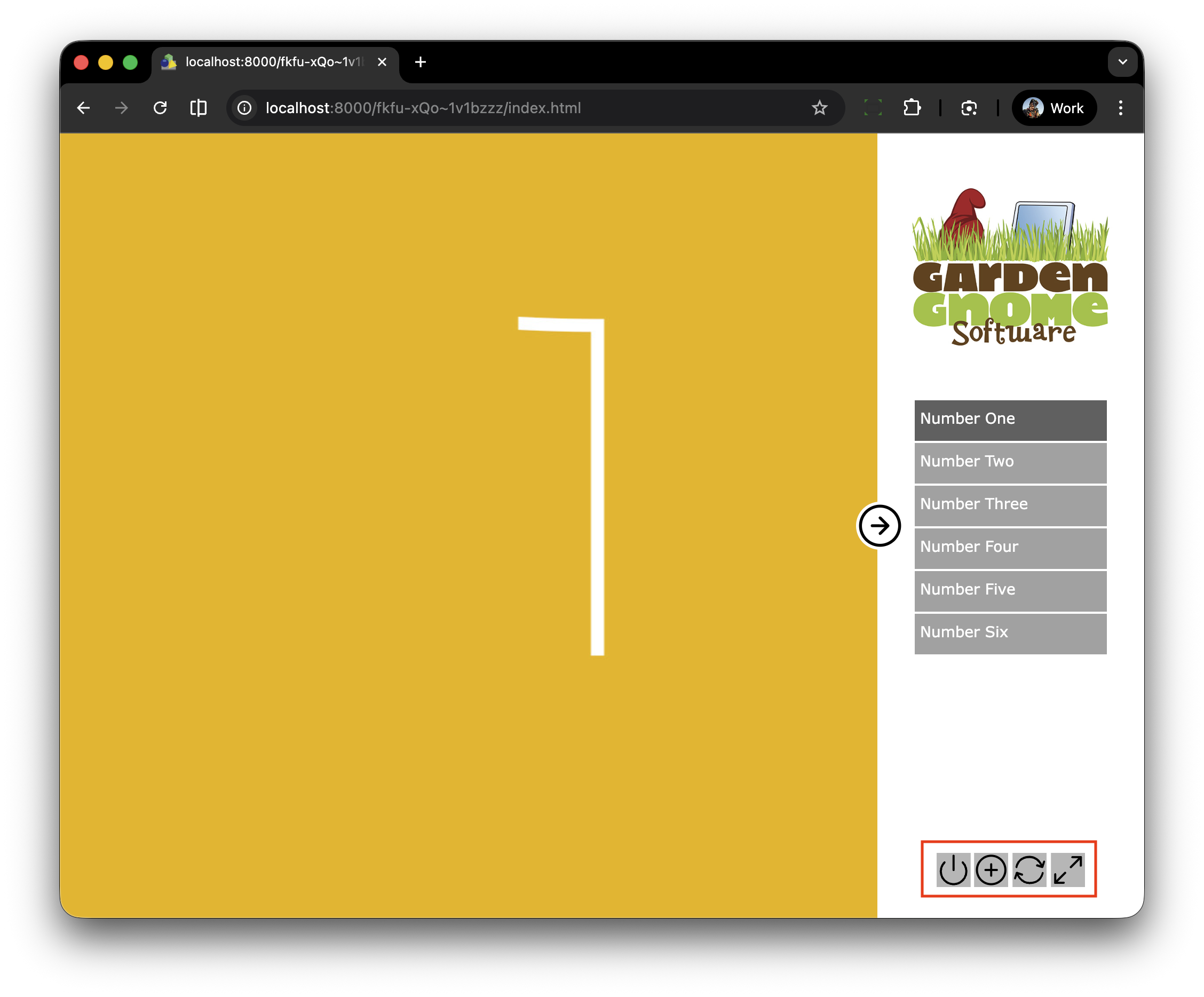
Note: now we can see our logo and below it our menu list.
Step 2: Adding Control buttons ⇑
The last element for our menu_bar will be a set of control buttons used to reset the view, zoom in and out, start/stop autorotate, pan left/right and open fullscreen.
1. Open the tutorial folder >
2. Open the svg_buttons folder
3. Double click on the controllers.ggsk to open it
4. In the Tree select the “controllers” folder and copy it (figure #4)
5. Close the skin and open the slider_menu.p2vr project
6. Open the slider_menu_logo.ggsk in the Skin Editor
7. Paste the controllers container into the Tree (figure #5)
Note: we will manage the elements of the controller using logic blocks to show hide individual elements via the Edit Skin configuration window. To do so we will be using Adaptive Mode.
In simple terms this means we can have several buttons in a row but have the option to hide/disable a button without leaving a space where the button sits in the line of buttons. It will become clear once we finish and test it.
Note: the buttons already have actions added that reflect their functions
Note: The first step is to resize all the elements and stack them together.
8. Open the controllers, zoom and fullscreen containers and and select all of the elements (figure #6)
Figure #6: Select all elements
9. Set the Properties: Position: Size: 40:40 px
10, Right-click in the skin and select Align Elements: Left Edges (figure #7)
Figure #7: Resize and align all elements
Note: now all of the elements have been resized and stacked on top of each other (figure #8)
Figure 8: All elements are stacked on top of each other
11. Save the skin as slider_menu_controller.ggsk
Step 3: Adding Variables ⇑
Note: to manage the individual buttons we must add a variable to the skin for each button
12, In the Properties > Variables click in the first empty name field and add the following;
Name: vis_controller | Type: True/False | Init Value: true | Expose: checked | Description: Show Controller (figure #9)
Figure #9: First Variable
Note: this variable will show/hide the whole controller including the buttons.
13. Right-click on the first variable and select “Copy” (figure #10)
Figure #10: Copy variable
13, In the next empty name field right-click and select “Paste” and change the following:
Name: vis_reset | Description: Show Reset Button (figure #11)
Figure #11: Paste and update variable
14. Repeat for the following:
Name: vis_zoom| Description: Show Zoom Button
Name: vis_autorotate | Description: Show Autorotate Button
Name: vis_pan_left | Description: Show Pan Left Button
Name: vis_pan_right | Description: Show Pan Right Button
Name: vis_fullscreen | Description: Show Fullscreen Button (figure #12)
Figure #12: Variables for the complete container
15. Save the skin
4. ADDING LOGIC BLOCKS ⇑
Note: now it’s time to start adding our logic blocks using the addative mode to manage our buttons. For an overview of the addative logic function check out Hopki’s tutorial video “Logic Blocks and Embedded Fonts” on YouTube
16. In the Tree > controllers select the “reset” element and add the following properties:
Position: Position: X: 6 px Y: 0 px
Appearance: Visible = uncheck
Appearance: Visible: logic block: Trigger = *vis_reset | Comparison = | Value = True | Visible = true (Figures 13 & 14)
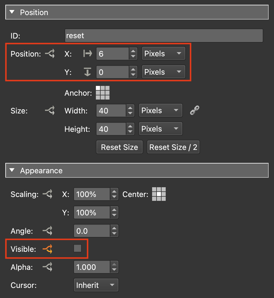
Figure #13: reset element properties
Figure #14: reset element visible logic block
17. Select the “zoom” container and add the following properties:
Position: Position: X: 5 px Y: 0 px
Position: Position: logic block:
Mode: Additive (set this first)Trigger = *vis_reset | Comparison = | Value = True | Visible = true
∆X: 45 ∆Y: 0
Appearance: Visible = uncheck
Appearance: Visible: logic block: Trigger = *vis_zoom | Comparison = | Value = True | Visible = true (Figures 15 & 16)
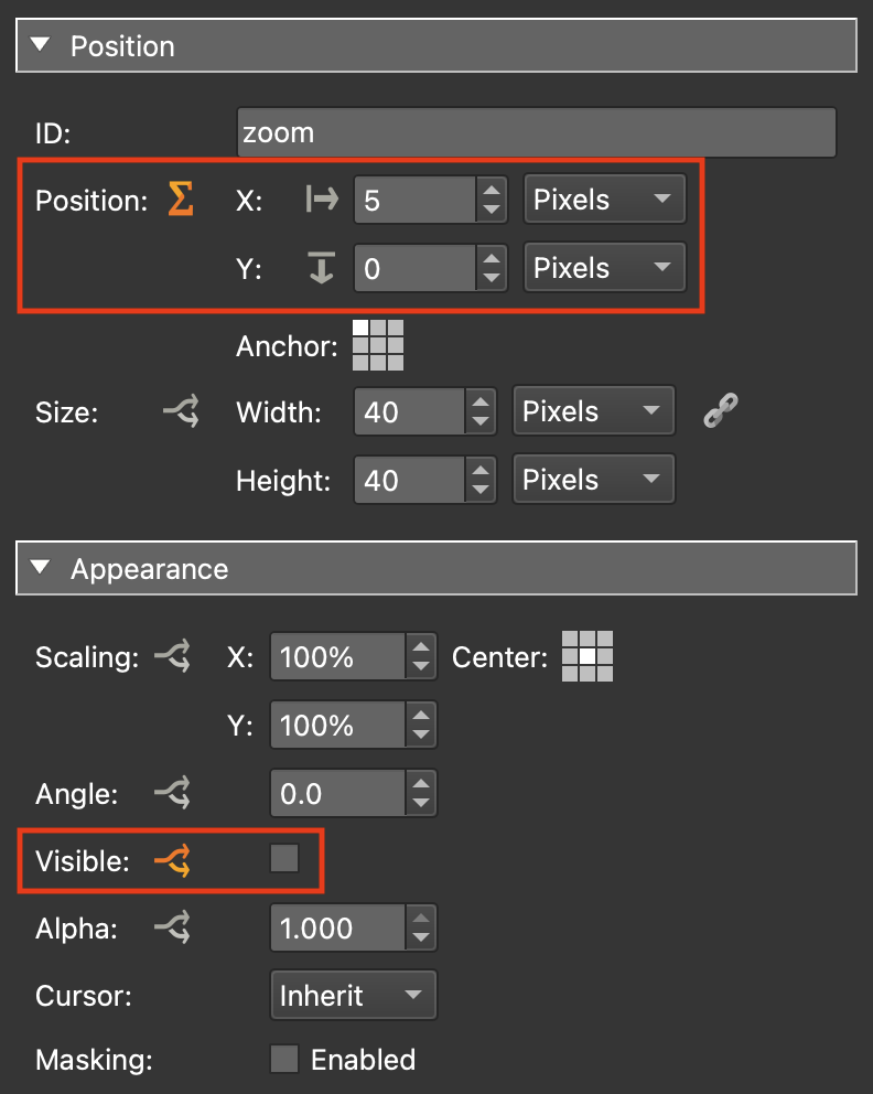
Figure #15: zoom element properties
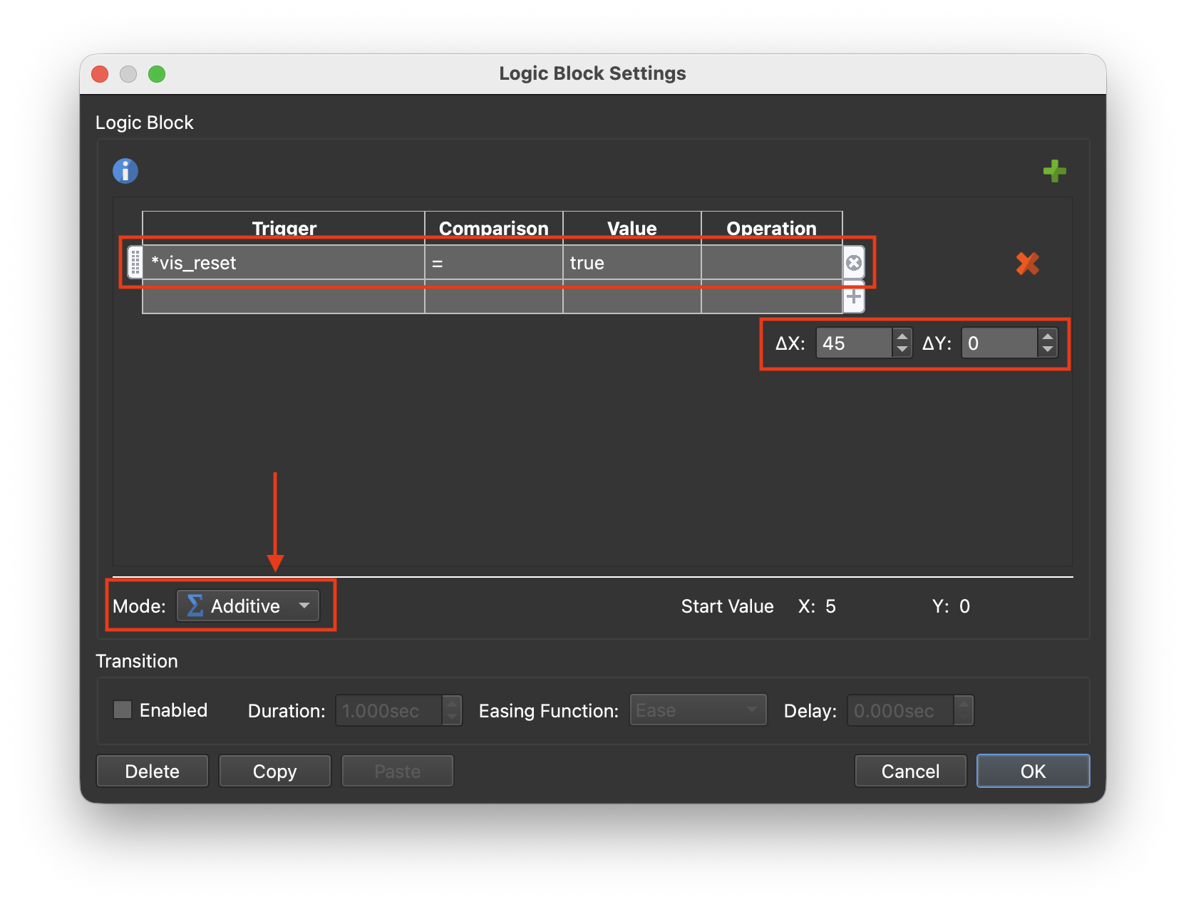
Figure #16: zoom element additive logic block position settings
Note: This may look a little counter intuative using referencing the reset element in the zoom element properties but what it’s defining is the fact that if the reset element is visible then set me (the zoom container) to a position 45 pixels to the right. If the reset element is not visible then set me to the default position 5 pixels to the right
18. Select the “autorotate” element and add the following properties:
Position: Position: X: 5 px Y: 0 px
Position: Position: logic block:
Mode: Additive (set this first)Trigger = *vis_reset | Comparison = | Value = True | Visible = true
∆X: 45 ∆Y: 0
Trigger = *vis_zoom | Comparison = | Value = True | Visible = true
∆X: 45 ∆Y: 0
Appearance: Visible = uncheck
Appearance: Visible: logic block: Trigger = *vis_autorotate | Comparison = | Value = True | Visible = true (Figure 17)
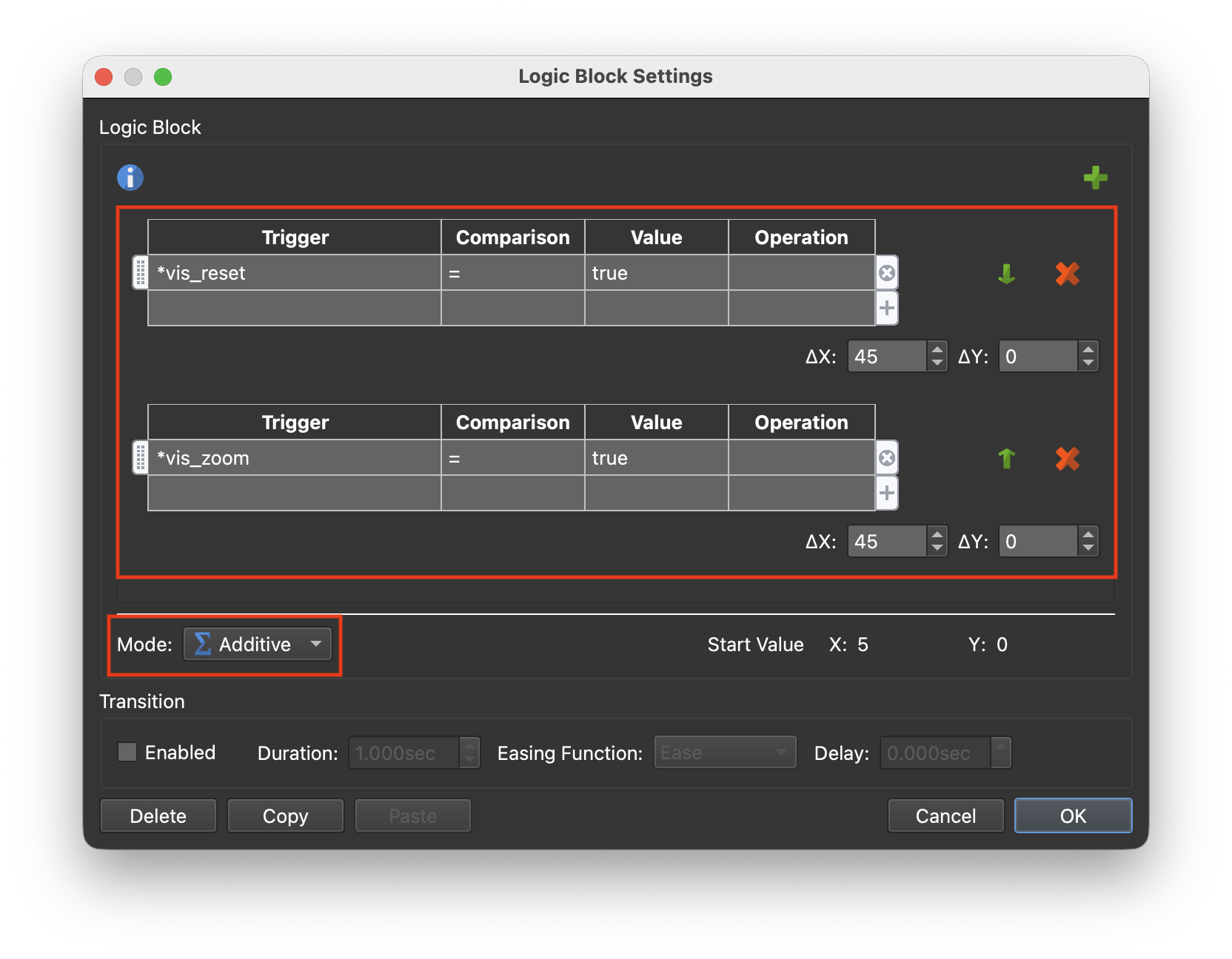
Figure #17: autorotate element additive logic block position settings
19. Repeat for the other elements in the controllers container.
Note: a good trick is to select the copy option in the logic block window and paste that in to the logic block window for the next element and then simply add the new element. Copy and re-use.
Your final element, fullscreen, logic block should look like this (figure #18)
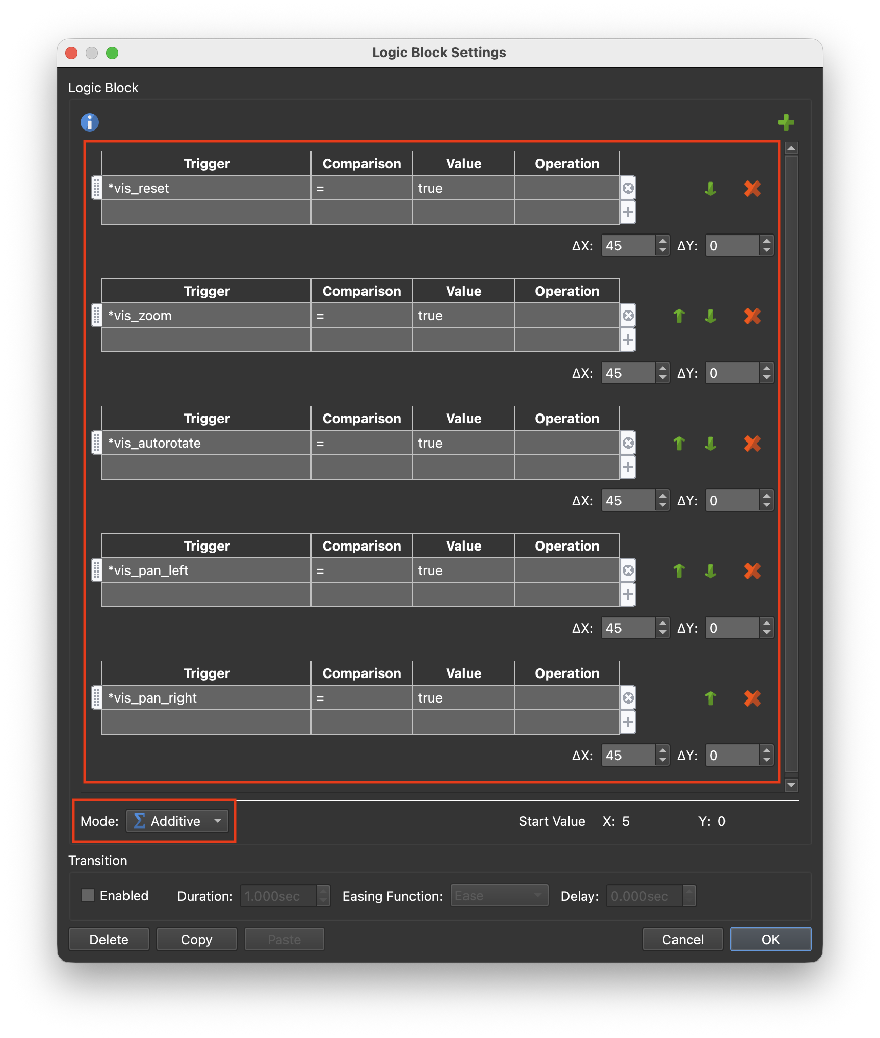
Figure #18: fullscreen element additive logic block position settings
Note: when we place the controllers container into the menu_bar element we will want it to maintain a center position in the bar. To do so we must resize the container to match the elements.
20. In the Tree dragthe “controllers ” container into the menu_bg element
21. Select the “controllers ” container and add the following properties:
Position: Anchor: bottom-center
Position: Position: X: 0 px Y: 25 px
Position: Size: Width: 1 px Height: 40 px (figure #19)
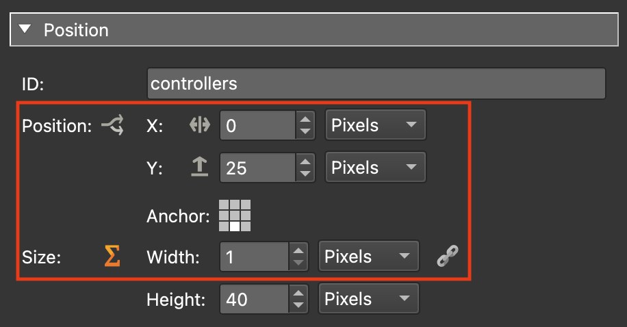
Figure #19: controllers element positions
Position: Size: logic block: as shown below (figure #20)
Note: a good trick here is to copy the Fullscreen element additive logic block. Paste it into the containers logic block, add in the width amounts and add the vis_fullsreen trigger at the end making sure to have the vis_fullsreen width 50.
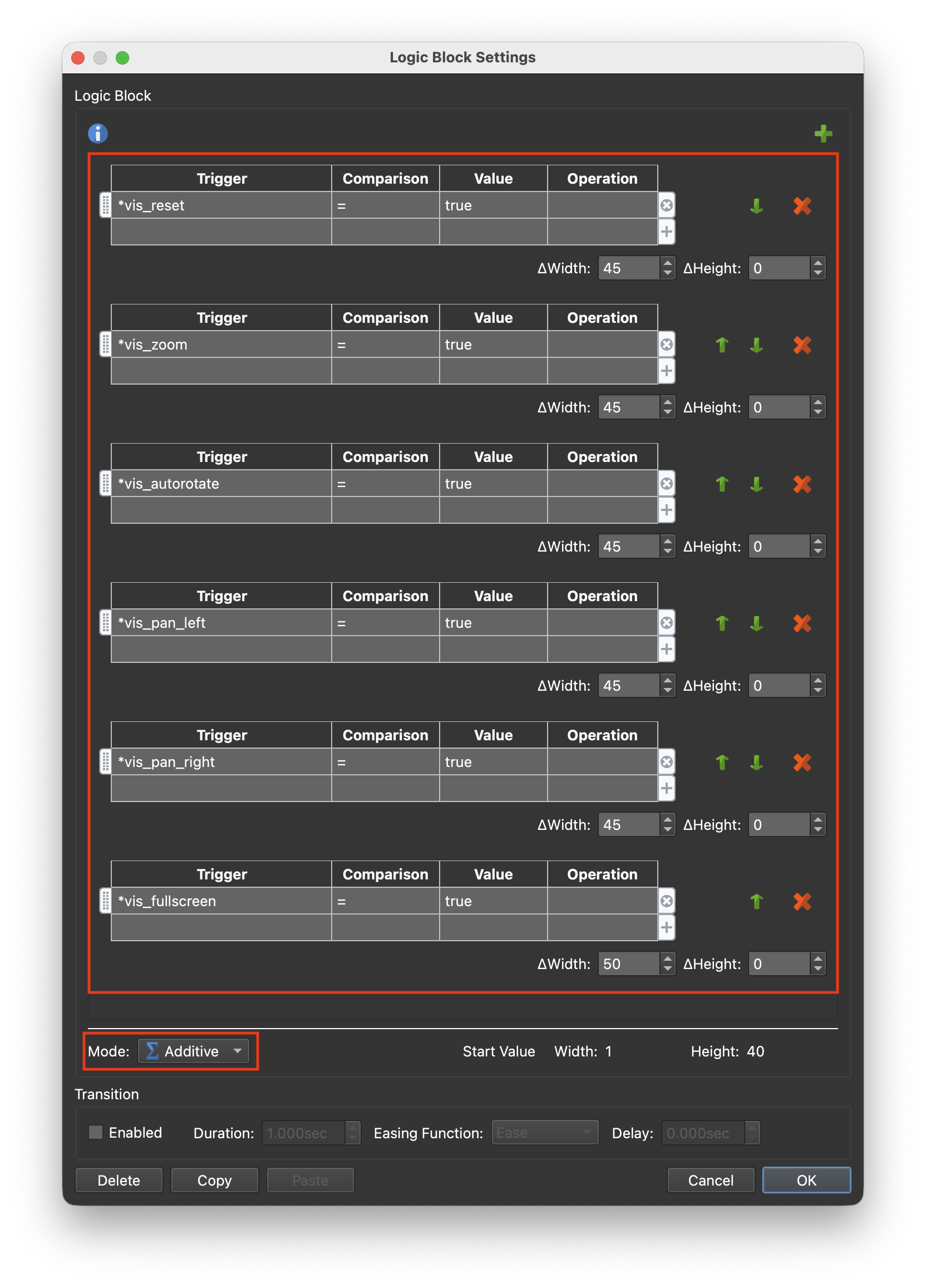
Figure #19: controllers additive logic block
Appearance: Visible: logic block: Trigger = *vis_controller | Comparison = | Value = True | Visible = true (figure #21)
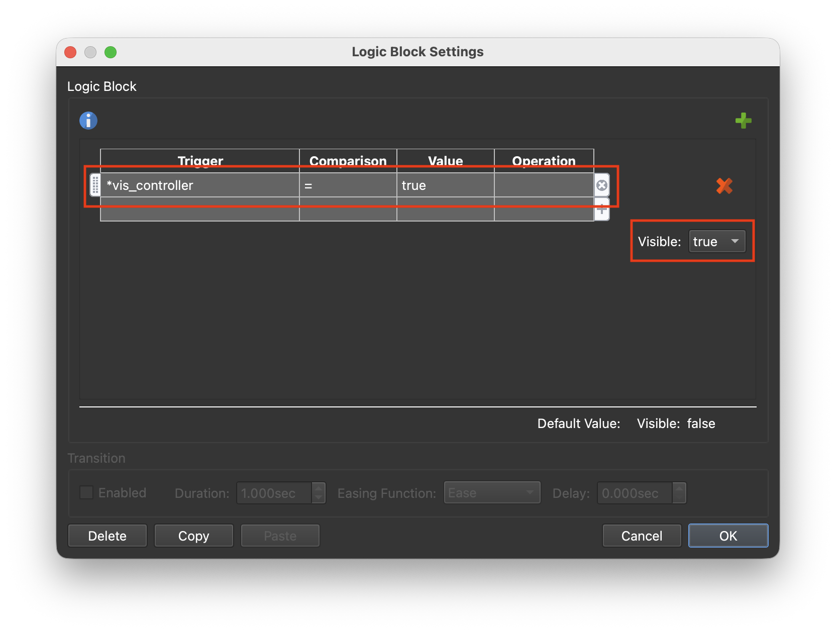
Figure #19: controllers visible logic block
Note: in its current configuration, with all buttons visible, it’s going to be too wide and will exceed the width of the menu_bg so we will scale it down a bit. We will also set the Cursor to “Hand” so the hand cursor will appear when we mouse over the buttons.
22. In the Tree select the controllers container and set the following properties:
Appearance: Scaling: X: 8o% Y: 80%
Appearance: Cursor: Hand (figure #22)
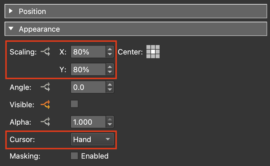
Figure #22: controllers container appearance settings
23. Save the skin and close it
24. Publish the project.
Step 5: Exposed Variables ⇑
Note: in Step 3: Adding Variables section 14 we added a number of variables and exposed each of them. By exposing them it allows us to define a set of buttons for individual tours without having to use the Edit Skin function (figure #23)
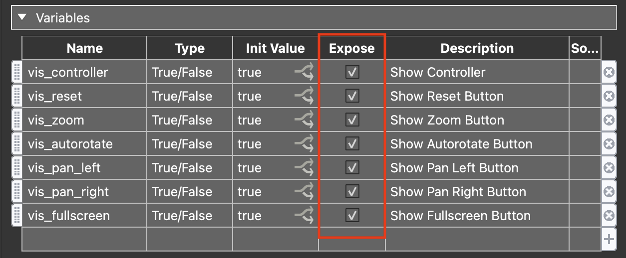
Figure #23: Exposed variables
For example in the current output we are showing all buttons. Lets say in our next tour we don’t want to show the pan-left/pan-right buttons. We can simply hide them by using the fact that they have been exposed.
25. In the project window click on the Edit Skin Configuration button (figure #24)
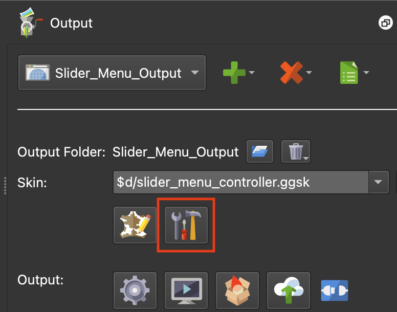
Figure #24: Edit Skin Configuration button
26. Uncheck the two “pan” buttons (figure #25)
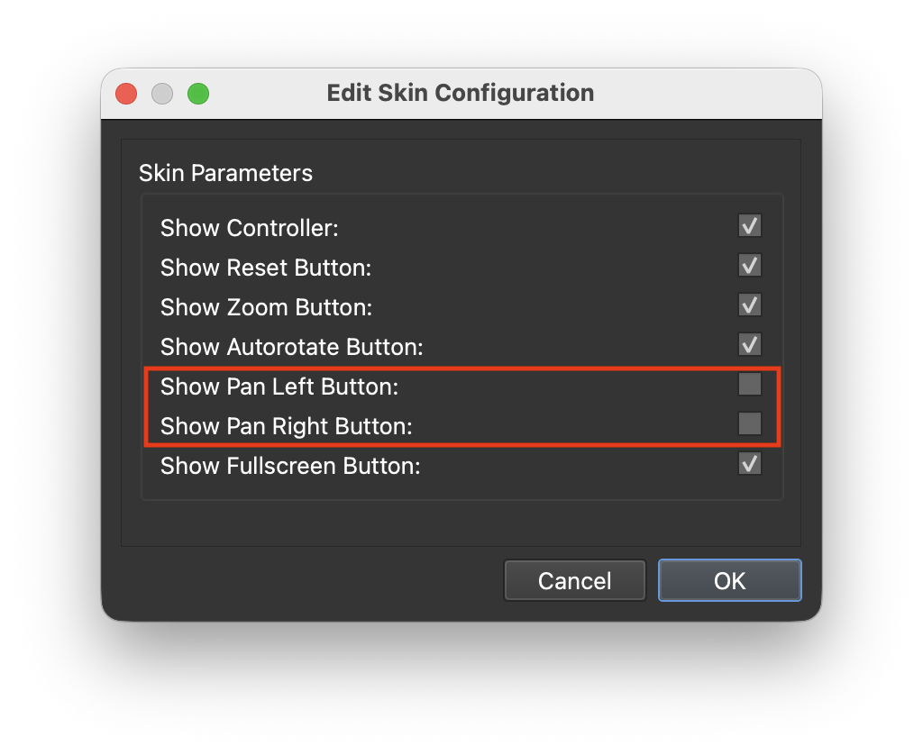
27. Close the Edit Skin Configuration window
28. Publish the project
Note: in the output we can see that the “pan” buttons are no longer visible but because of the Addative logic block the spaces left by the “pan” buttons aren’t visible and the controllers element has changed size and remains centered in the menu_bar element.
Summary ⇑
This brings us to the end of Part 2.
In Part 3 we will add variables to mange the image element, a scroll area for the menu_list element, expose the element colors and create a finished color version.
Note: Part 3 Coming soon.
"Hey there! 👋 If my tutorials have made your tech life a little easier (or a lot less confusing) consider buying me a virtual coffee ☕️ or even lunch 🍔 Retirement means more time to help you, but sadly, less income for snacks. Click the Donation button 🙌 and thanks for the love!"
